Hans Hermann Palette 3

Palette Analysis
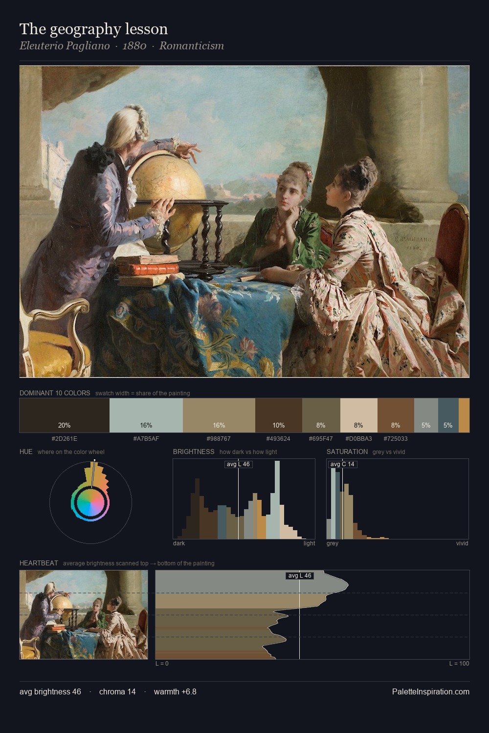
Values in Hans Hermann rest in the mid-range - neither dramatically lit nor steeped in shadow. Cool tones set the register here - the blues and greens easily outweigh any warm accents. Muted throughout, the palette achieves its effects through value and temperature rather than chromatic force. At 38.0%, #B6BEC8 functions less as a colour accent and more as a complete atmospheric environment. Only 2.0% is devoted to #AF7729, yet that small allocation delivers the palette's entire chromatic tension. Value range is moderate at 54 units - enough contrast for legibility, not so much as to fragment the tonal unity. The palette has the character of outdoor light: cool, mid-bright, with colour rendered faithfully rather than expressively. Palette 3 sits within the larger chromatic argument that Hans Hermann's complete body of work advances.
Example use cases
- museums & galleries
- academic publishing
- heritage brands
- auction houses
- exhibition design
I Love This!
Copy, export, or download for your project