Alexander Roslin Palette 1

Palette Analysis
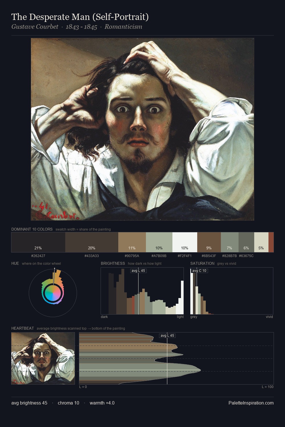
Alexander Roslin sits in the centre of the value range, lending the palette a sense of even, sustained light. Alexander Roslin tilts toward cool - blues and silver-greys carry the structural weight. All colours lean toward grey, building depth through value rather than colour punch. A single dominant - #FFFFFF at 28.2% - sets the character of the whole composition. The saturated accent, #4C4031, registers at 5.1% - sparse enough to feel like a deliberate surprise. From deepest dark to palest light, the palette traverses 72 units of the value scale - a span that creates natural depth. The mid-to-high key, cool bias, and moderate chroma point to outdoor observation - sky and diffused daylight as the dominant light source. This is palette 1 of Alexander Roslin's sequence - a single chapter in a chromatic story told across many works.
Example use cases
- exhibition design
- foundation branding
- estate management
- art education
- museums & galleries
I Love This!
Copy, export, or download for your project