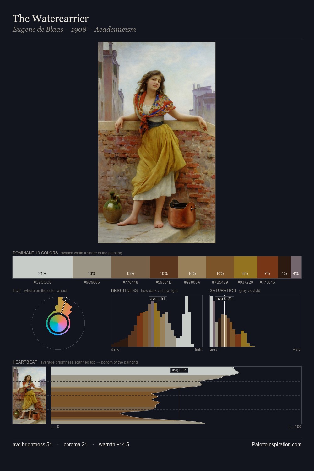
Hans Dahl Palette 5

Palette Analysis
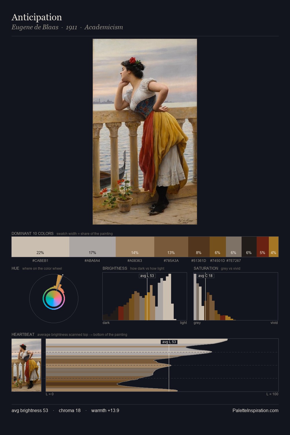
Hans Dahl occupies the comfortable middle of the value scale, avoiding both extremes to hold the eye in a sustained middle grey. Warm and cool are kept in productive tension, creating the kind of chromatic harmony that sustains the eye. All colours lean toward grey, building depth through value rather than colour punch. #B1AFAE at 25.0% of the palette: an overwhelming presence that pulls all other colours into its gravitational field. The highest-chroma note - #453614 - appears at just 7.1%, deployed as a precision accent against the quieter ground. A value spread of 57 units gives the palette both depth and air - shadows are genuinely dark, lights genuinely light. In the context of Hans Dahl's full range of palettes, group 5 represents one movement in an ongoing chromatic dialogue.
Example use cases
- food packaging
- leather accessories
- travel & outdoor
- natural cosmetics
- interior design
I Love This!
Copy, export, or download for your project