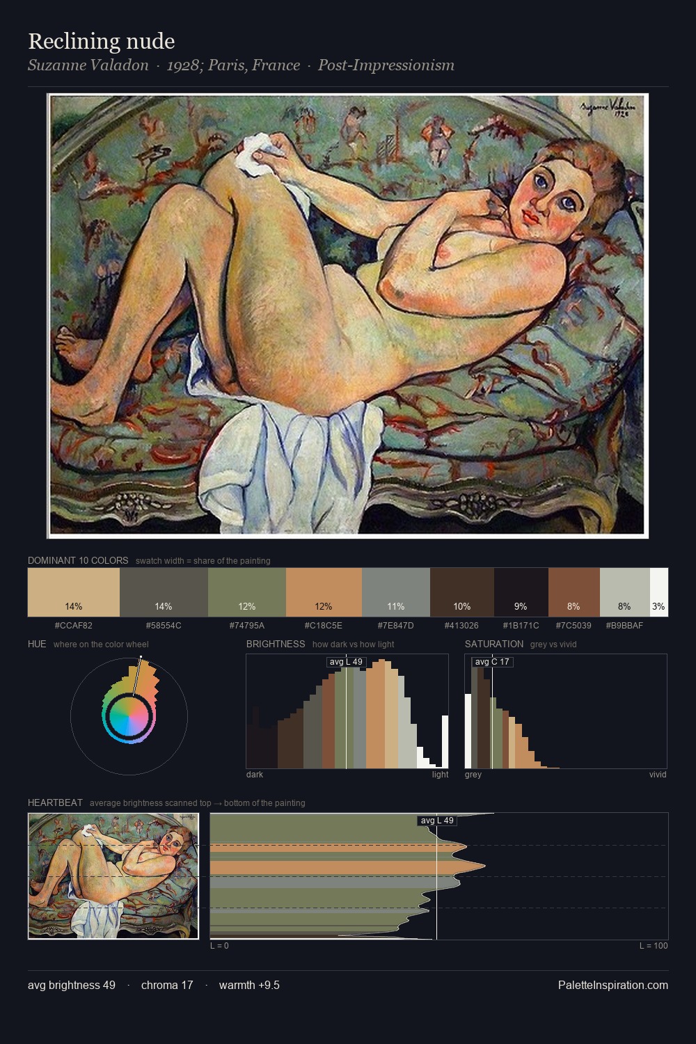
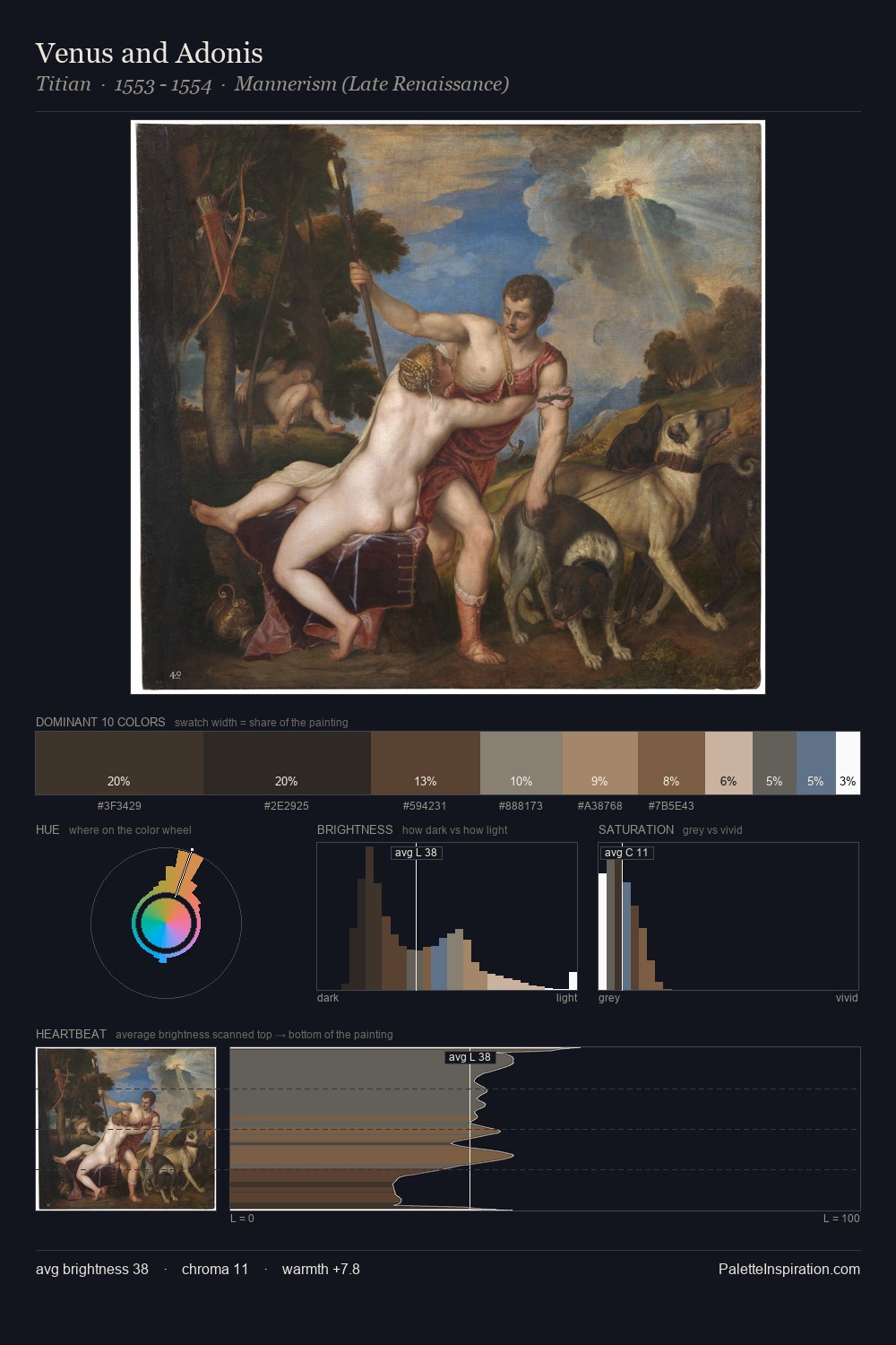
Giovanni Francesco Romanelli Palette 3

Palette Analysis
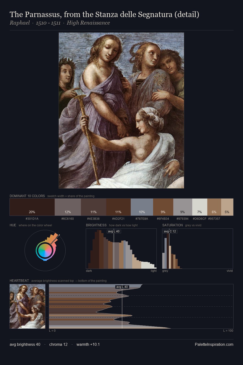
Giovanni Francesco Romanelli sits in the centre of the value range, lending the palette a sense of even, sustained light. Warm and cool tones are held in careful balance - neither family dominates, creating tension and resolution simultaneously. Chroma hovers near zero; colour declares itself through subtle shifts in hue rather than outright saturation. 30.0% of the palette belongs to #FFFFFF, a concentration that makes it the unmistakable visual centre. The highest-chroma note - #76503A - appears at just 4.4%, deployed as a precision accent against the quieter ground. The value range spans 73 units across the palette, providing the full gamut from deep shadow to near-white and ensuring clear tonal hierarchy. Giovanni Francesco Romanelli's palette 3 carries its own internal logic while remaining in conversation with the artist's broader colour intelligence.
Example use cases
- exhibition design
- foundation branding
- estate management
- art education
- museums & galleries
I Love This!
Copy, export, or download for your project