Giovanni Battista Ruoppolo Palette 5

Palette Analysis
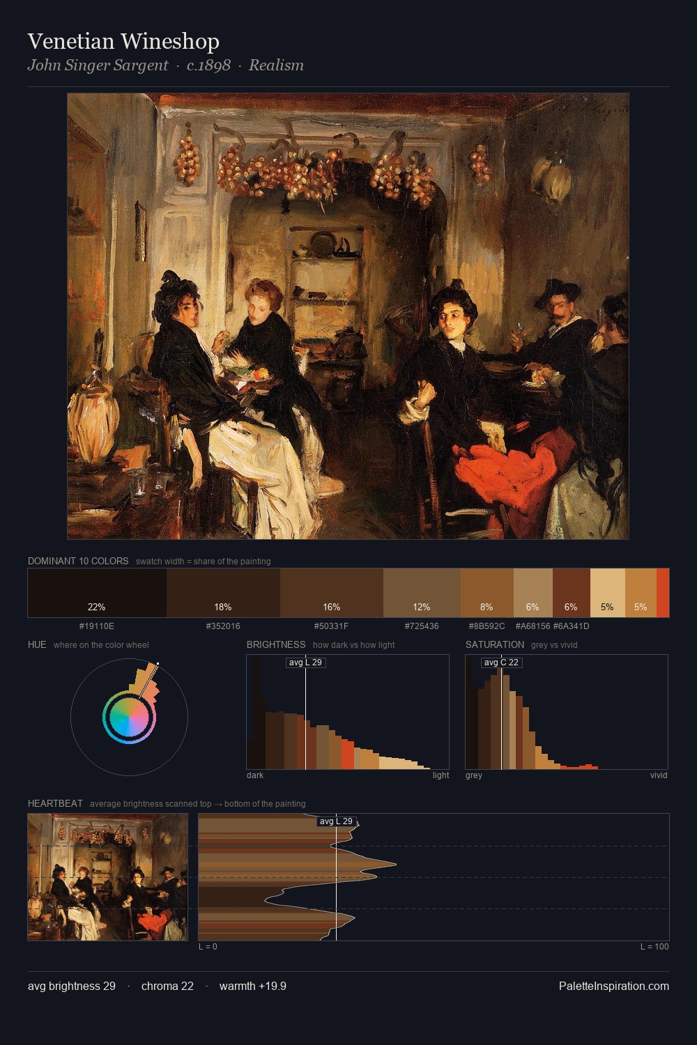
Giovanni Battista Ruoppolo is built on dark foundations, with values clustered toward shadow. Heat pervades this palette; warm chromatic identities outweigh cool ones at almost every weight. Saturation is deliberately withheld - the beauty here lies in the near-monochromatic gradations rather than colour difference. At 47.1%, #130B06 functions less as a colour accent and more as a complete atmospheric environment. #703213 delivers the chromatic peak at only 2.6% - a small shot of colour with outsized visual impact. Value range is moderate at 45 units - enough contrast for legibility, not so much as to fragment the tonal unity. Together these qualities place Giovanni Battista Ruoppolo firmly in the tonal tradition - concerned with mood and atmosphere rather than chromatic display. Palette 5 sits within the larger chromatic argument that Giovanni Battista Ruoppolo's complete body of work advances.
Example use cases
- theater design
- jewelry brands
- tobacco-adjacent retail
- event branding
- film & entertainment
I Love This!
Copy, export, or download for your project