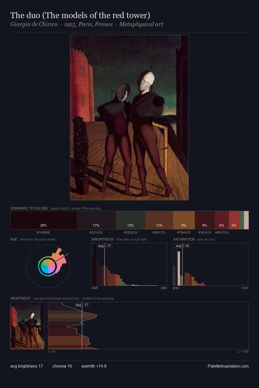
Giorgio de Chirico Palette 10
Abyssal Bister
Abyssal Deepest shadow - values near absolute black, suggesting the bottom of an abyss.
Bister Dark warm brown - a traditional ink and wash pigment made from wood soot.

Palette Analysis
Giorgio de Chirico is built on dark foundations, with values clustered toward shadow. Yellow, ochre, sienna: warm hues that Giorgio de Chirico deploys as the palette's primary energy. All colours lean toward grey, building depth through value rather than colour punch. The saturated accent, #963932, registers at 4.9% - sparse enough to feel like a deliberate surprise. The value range spans 63 units across the palette, providing the full gamut from deep shadow to near-white and ensuring clear tonal hierarchy. This tonal restraint is characteristic of the Giorgio de Chirico approach: colour serves light, not the reverse. This is palette 10 of Giorgio de Chirico's sequence - a single chapter in a chromatic story told across many works.
Example use cases
- theater design
- jewelry brands
- tobacco-adjacent retail
- event branding
- film & entertainment
I Love This!
Use This Palette
Copy, export, or download for your project
Copy, export, or download for your project
Copy:
Download:
Share: