Gerard van Honthorst Palette 7

Palette Analysis
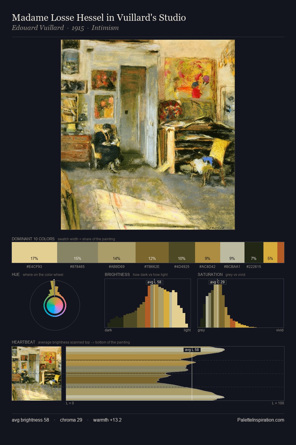
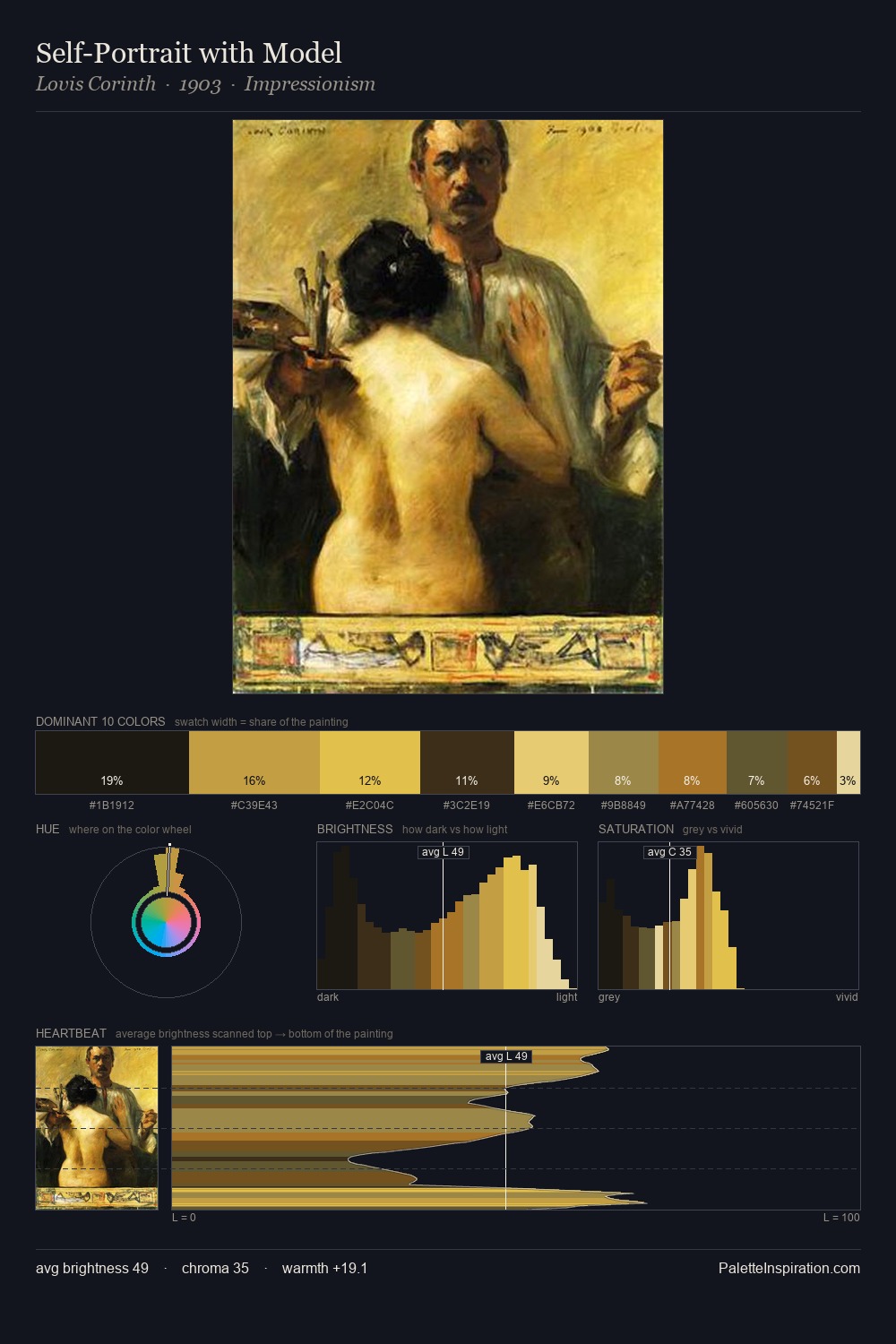
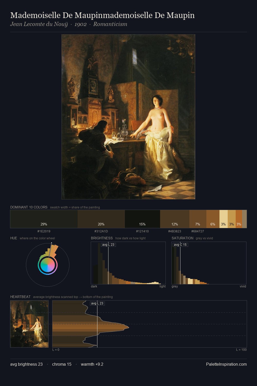
Mid-key values give Gerard van Honthorst its characteristic quietness - nothing blazes, nothing disappears. A distinctly cool atmosphere runs through this palette: sky, water, and mist given colour form. Saturation is deliberately withheld - the beauty here lies in the near-monochromatic gradations rather than colour difference. The saturated accent, #ECDB99, registers at 1.5% - sparse enough to feel like a deliberate surprise. 69 units of value range underpin the palette's structural clarity: the eye always knows where light falls. The mid-to-high key, cool bias, and moderate chroma point to outdoor observation - sky and diffused daylight as the dominant light source. This is palette 7 of Gerard van Honthorst's sequence - a single chapter in a chromatic story told across many works.
Example use cases
- theater design
- jewelry brands
- tobacco-adjacent retail
- event branding
- film & entertainment
I Love This!
Copy, export, or download for your project