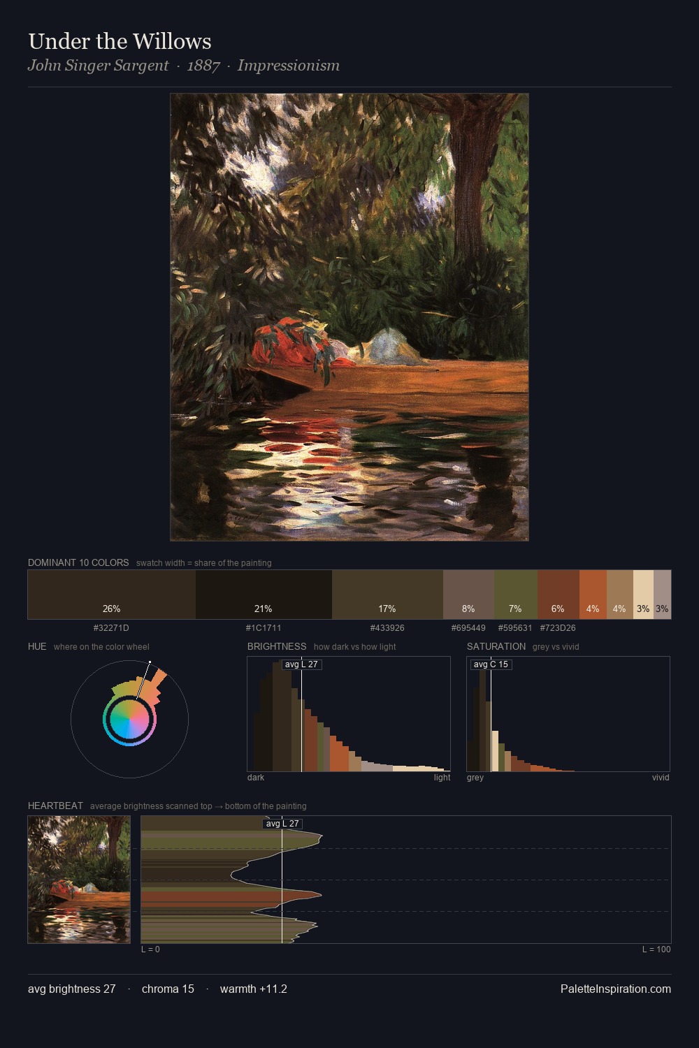
Gerard Terborch Palette 6

Palette Analysis
Gerard Terborch dwells firmly in the shadows, with no more than a whisper of light. Blues and teal-greys govern the palette, lending it an aquatic or atmospheric quality. All colours lean toward grey, building depth through value rather than colour punch. At 44.4%, #2D2D2D functions less as a colour accent and more as a complete atmospheric environment. At 2.1%, #DCCBB1 carries the palette's sharpest chromatic charge: an accent that earns its place precisely because it is withheld. The full value range is 65 units: broad enough to build convincing three-dimensional form. This tonal restraint is characteristic of the Gerard Terborch approach: colour serves light, not the reverse. In the context of Gerard Terborch's full range of palettes, group 6 represents one movement in an ongoing chromatic dialogue.
Example use cases
- theater design
- jewelry brands
- tobacco-adjacent retail
- event branding
- film & entertainment
I Love This!
Copy, export, or download for your project