Frederick McCubbin Palette 3

Palette Analysis
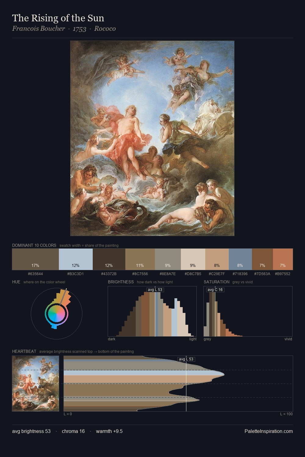
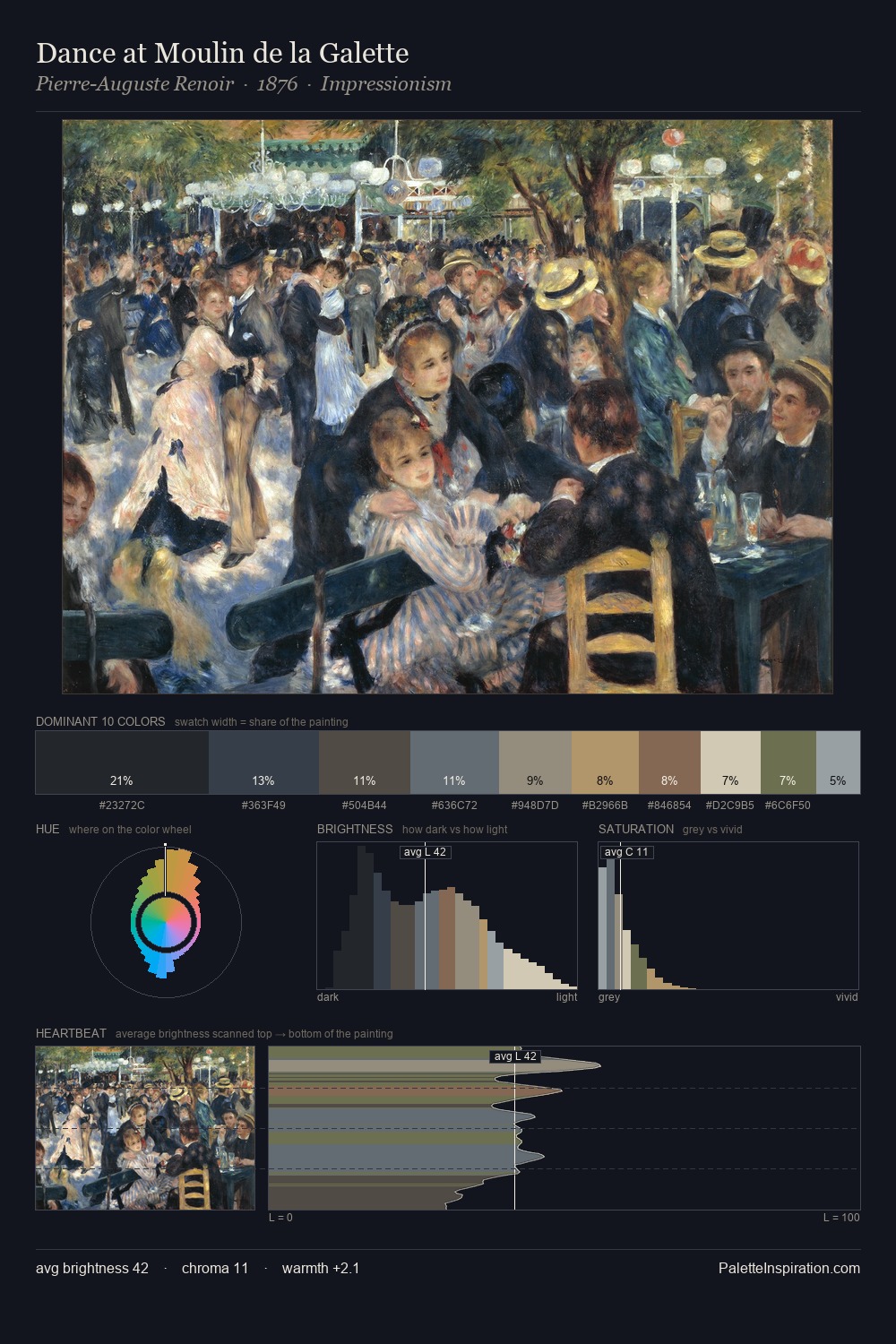
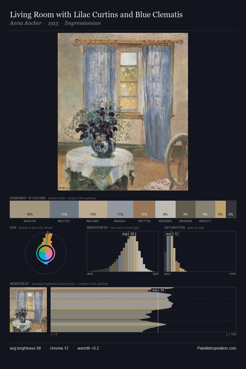
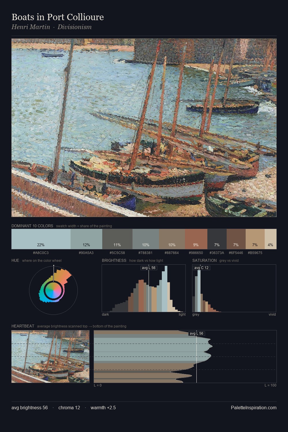
The high-key values of Frederick McCubbin give it an effulgent, almost bleached quality. Frederick McCubbin builds on cool foundations: the palette favours the blue-cyan-green arc. Chroma hovers near zero; colour declares itself through subtle shifts in hue rather than outright saturation. At 4.1%, #A68679 carries the palette's sharpest chromatic charge: an accent that earns its place precisely because it is withheld. Spanning 49 units on the value axis, the palette achieves the balance between tonal flatness and fragmentation. The mid-to-high key, cool bias, and moderate chroma point to outdoor observation - sky and diffused daylight as the dominant light source. In the context of Frederick McCubbin's full range of palettes, group 3 represents one movement in an ongoing chromatic dialogue.
Example use cases
- museums & galleries
- academic publishing
- heritage brands
- auction houses
- exhibition design
I Love This!
Copy, export, or download for your project