Frantisek Kupka Palette 2

Palette Analysis
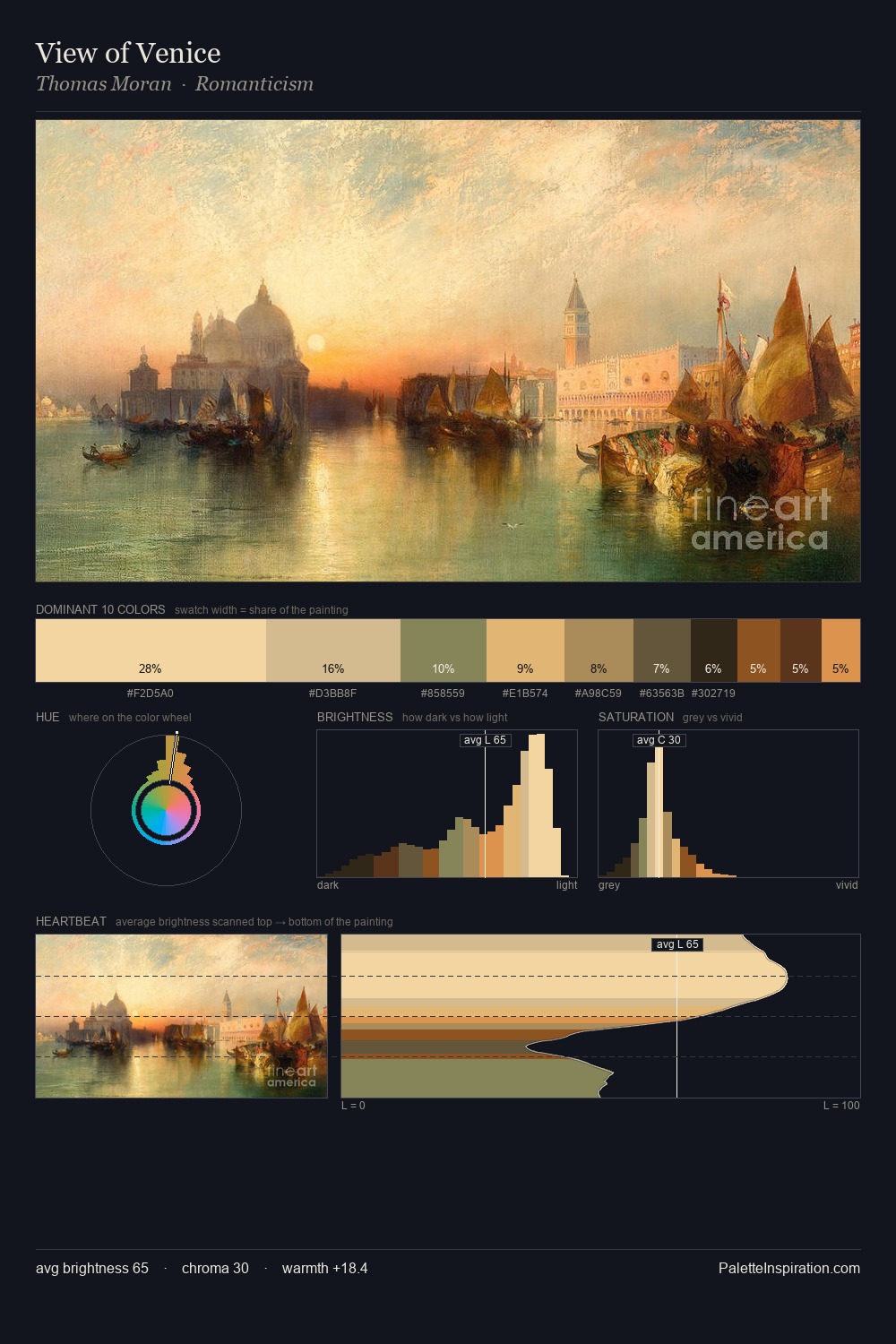
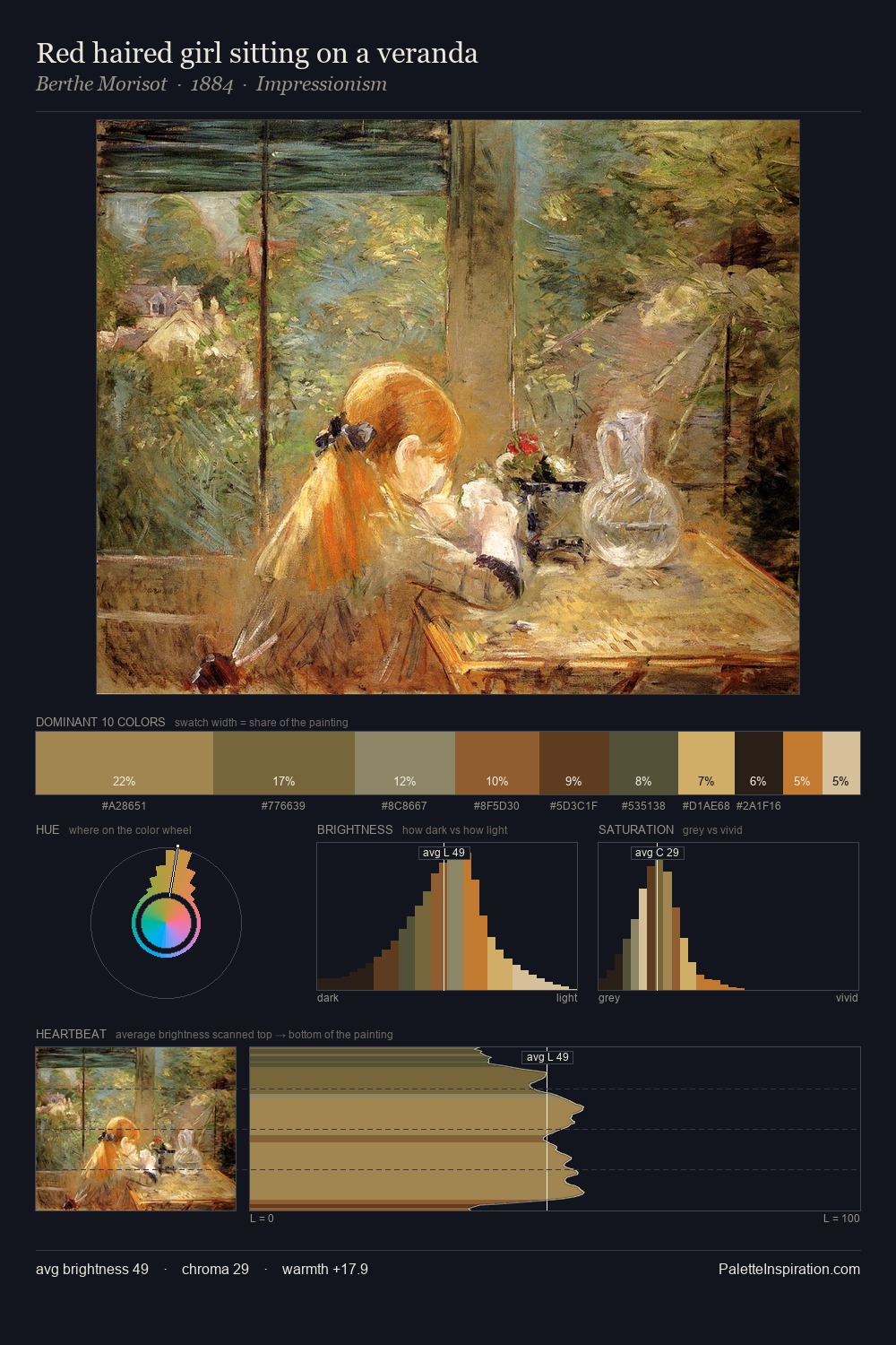
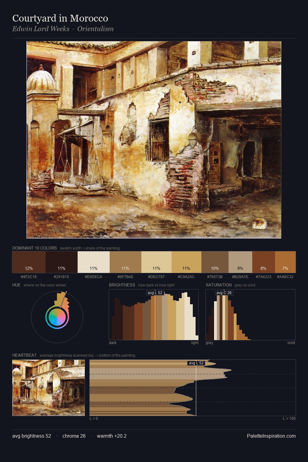
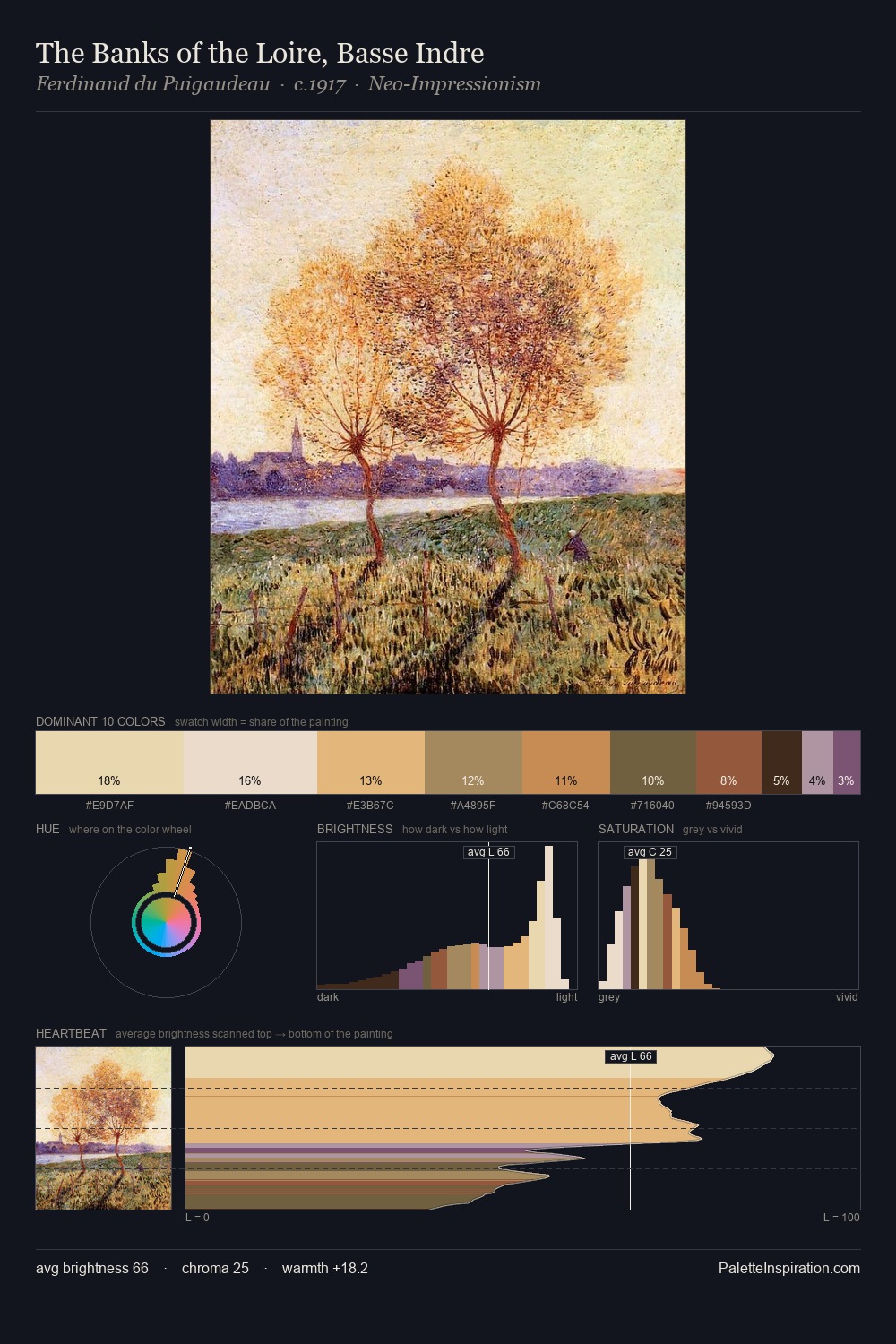
Frantisek Kupka works in the upper reaches of the value scale, creating an atmosphere of brightness and expansiveness. Neither warm nor cool has the upper hand here; the equilibrium between the two generates the palette's visual energy. Chroma is moderate: colours carry enough saturation to be read as colour, but the palette stops well short of garish intensity. The most saturated colour, #7D4520, is reserved to 7.0% of the surface, where it acts as a focal punctuation. The value range spans 60 units across the palette, providing the full gamut from deep shadow to near-white and ensuring clear tonal hierarchy. The combination of mid-to-high key, balanced temperature, and elevated chroma is characteristic of Impressionist observation: light broken into its component hues. Frantisek Kupka's palette 2 carries its own internal logic while remaining in conversation with the artist's broader colour intelligence.
Example use cases
- design agencies
- product brands
- e-commerce
- editorial sites
- publishing
I Love This!
Copy, export, or download for your project