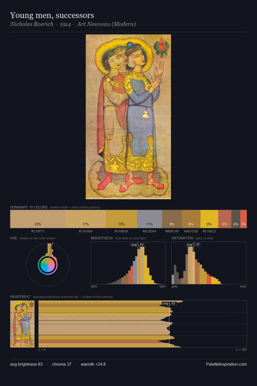
Facundus Palette 8
Muted Tawny
Muted Deliberately desaturated - chroma pulled toward gray, the restraint of tonal painting.
Tawny Warm orange-brown - a traditional term for the color of tanned leather or lion fur.

Palette Analysis
Facundus distributes its values across the middle register, creating harmony without high contrast. Heat pervades this palette; warm chromatic identities outweigh cool ones at almost every weight. Colours are neither washed out nor blazing; they occupy the productive middle ground of the chroma scale. The most saturated colour, #D54A2F, is reserved to 10.0% of the surface, where it acts as a focal punctuation. Value range is moderate at 51 units - enough contrast for legibility, not so much as to fragment the tonal unity. Facundus's palette 8 carries its own internal logic while remaining in conversation with the artist's broader colour intelligence.
Example use cases
- food packaging
- leather accessories
- travel & outdoor
- natural cosmetics
- interior design
I Love This!
Use This Palette
Copy, export, or download for your project
Copy, export, or download for your project
Copy:
Download:
Share: