Facundus Palette 2
Muted Vermillion
Muted Deliberately desaturated - chroma pulled toward gray, the restraint of tonal painting.
Vermillion Brilliant red-orange - the classic mercury sulfide pigment, vivid and warm.

Palette Analysis
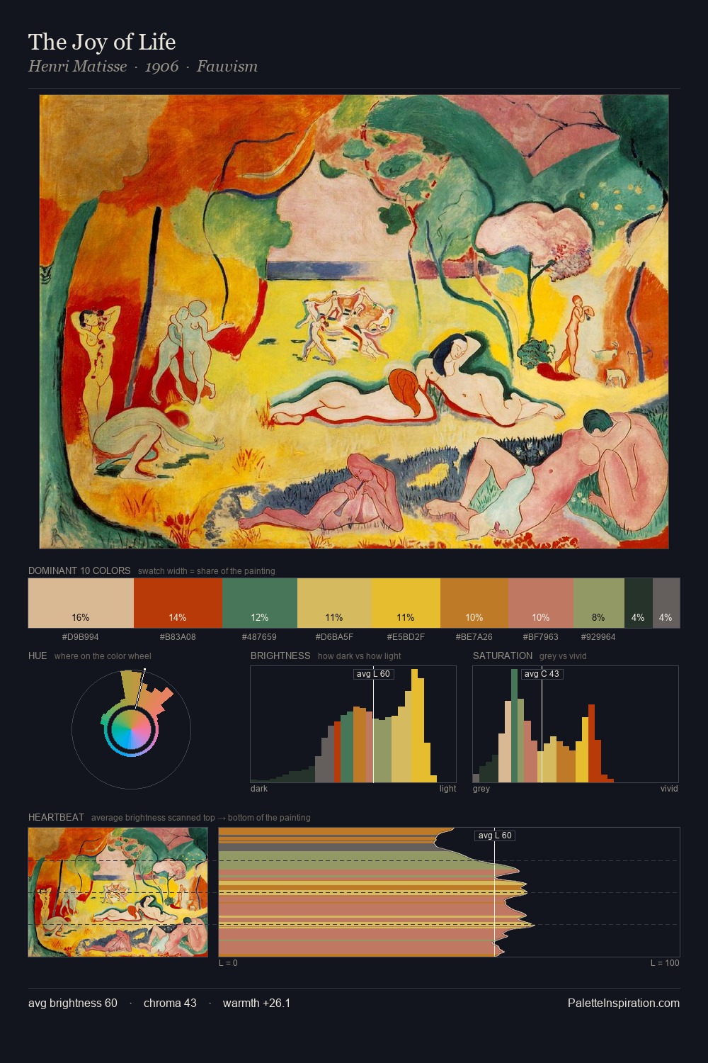
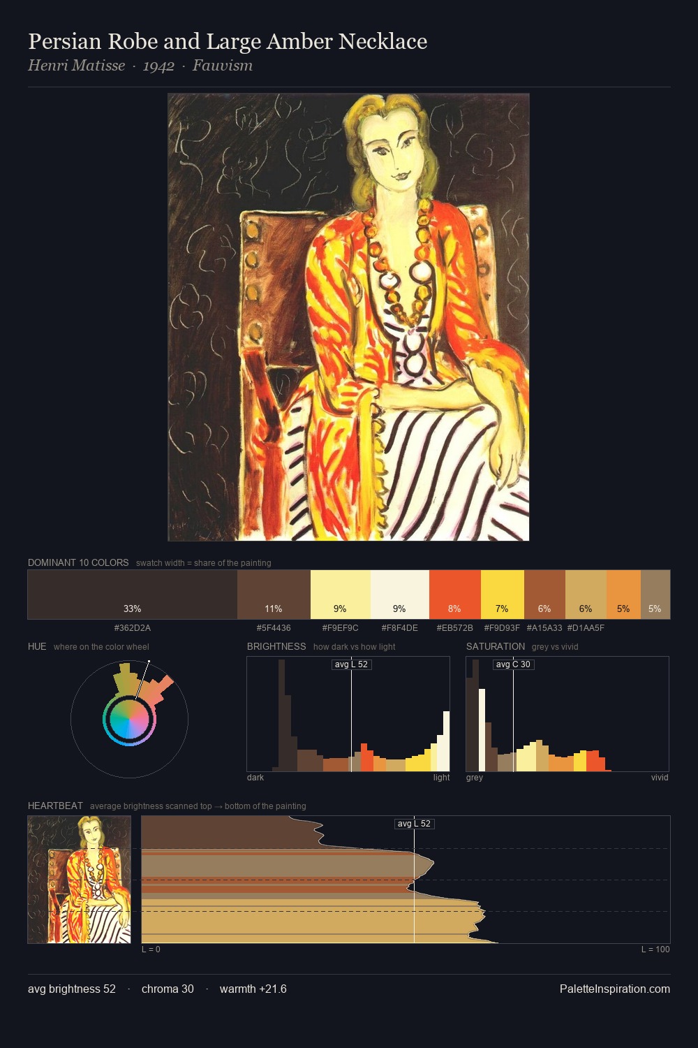
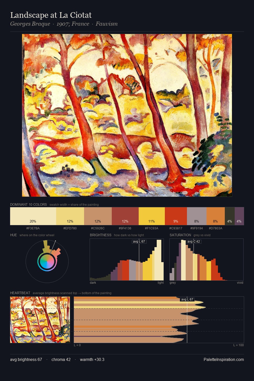
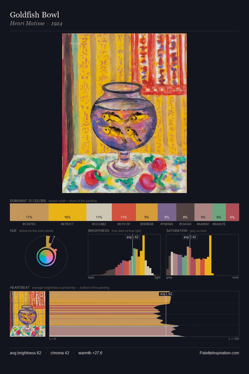
The value structure of Facundus is mid-key: quiet, controlled, and cohesive. Heat pervades this palette; warm chromatic identities outweigh cool ones at almost every weight. Saturation is measured and controlled, giving the palette presence without visual aggression. #B03523 delivers the chromatic peak at only 6.1% - a small shot of colour with outsized visual impact. The value range of 53 units sits in the comfortable middle: enough depth, enough light, neither extreme. This is palette 2 of Facundus's sequence - a single chapter in a chromatic story told across many works.
Example use cases
- design agencies
- product brands
- e-commerce
- editorial sites
- publishing
I Love This!
Use This Palette
Copy, export, or download for your project
Copy, export, or download for your project
Copy:
Download:
Share: