Facundus Palette 1
Muted Fawn
Muted Deliberately desaturated - chroma pulled toward gray, the restraint of tonal painting.
Fawn Light warm tan - the color of a young deer, soft and golden-brown.

Palette Analysis
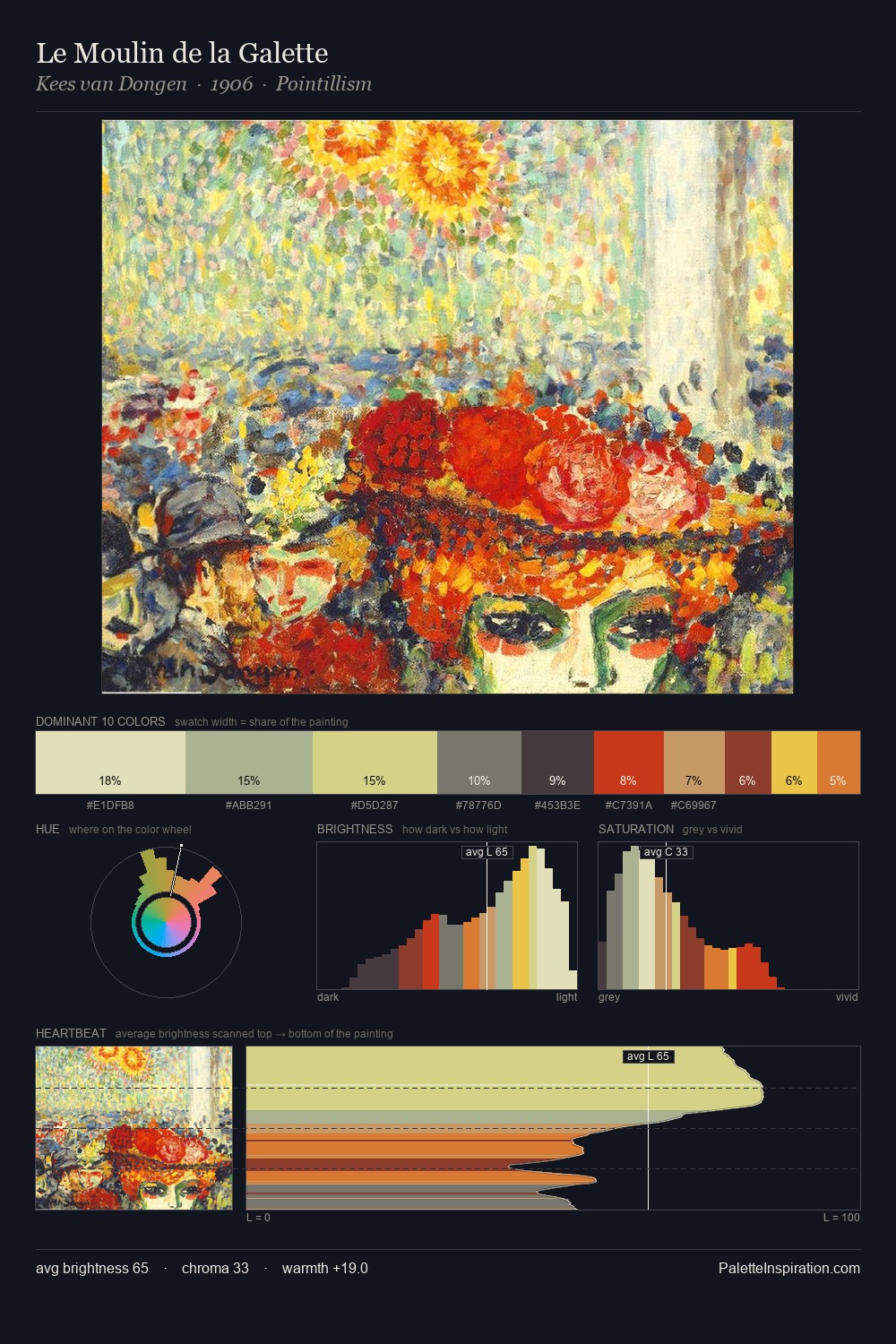
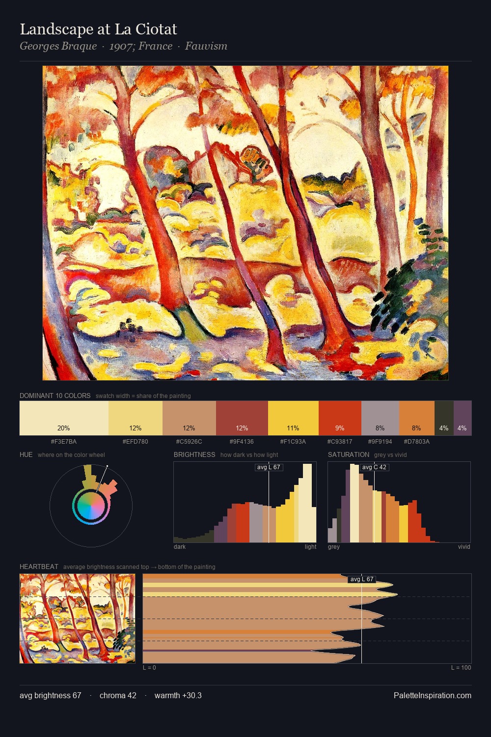
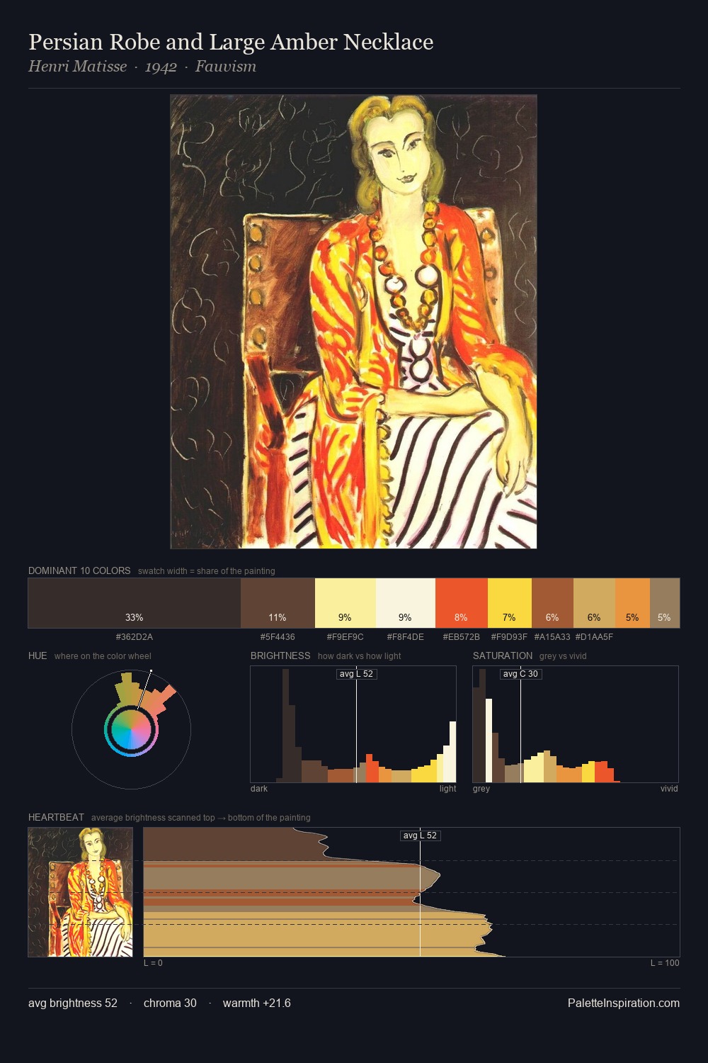
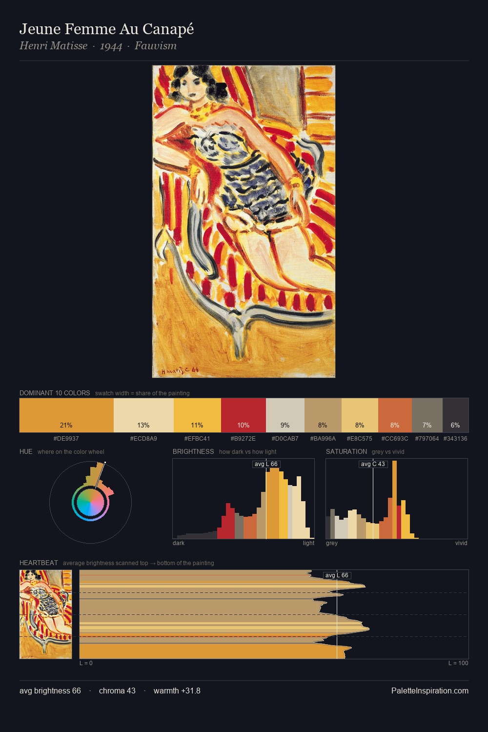
Facundus occupies the comfortable middle of the value scale, avoiding both extremes to hold the eye in a sustained middle grey. Warmth dominates - the palette of Facundus leans heavily on the yellow-orange-red arc of the colour wheel. Mid-range chroma keeps the palette grounded - colourful but not strident. The highest-chroma note - #DC3A35 - appears at just 12.2%, deployed as a precision accent against the quieter ground. The value range of 53 units sits in the comfortable middle: enough depth, enough light, neither extreme. In the context of Facundus's full range of palettes, group 1 represents one movement in an ongoing chromatic dialogue.
Example use cases
- publishing
- corporate identity
- consumer apps
- hospitality
- design agencies
I Love This!
Use This Palette
Copy, export, or download for your project
Copy, export, or download for your project
Copy:
Download:
Share: