Eero Järnefelt Master Palette
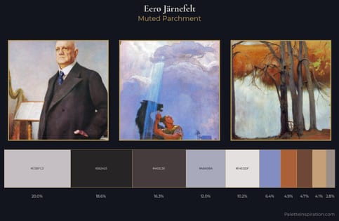
Muted Parchment
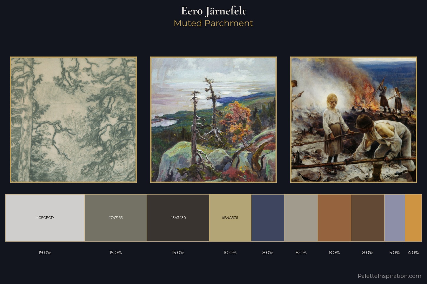
Muted Deliberately desaturated - chroma pulled toward gray, the restraint of tonal painting.
Parchment Aged warm neutral - the color of old manuscript parchment, tan and slightly yellowed.
Palette Analysis
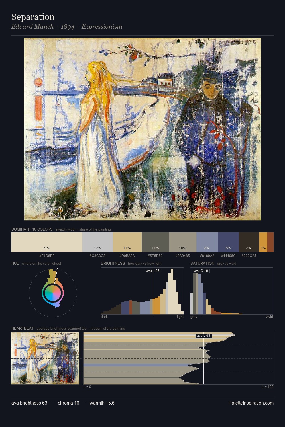
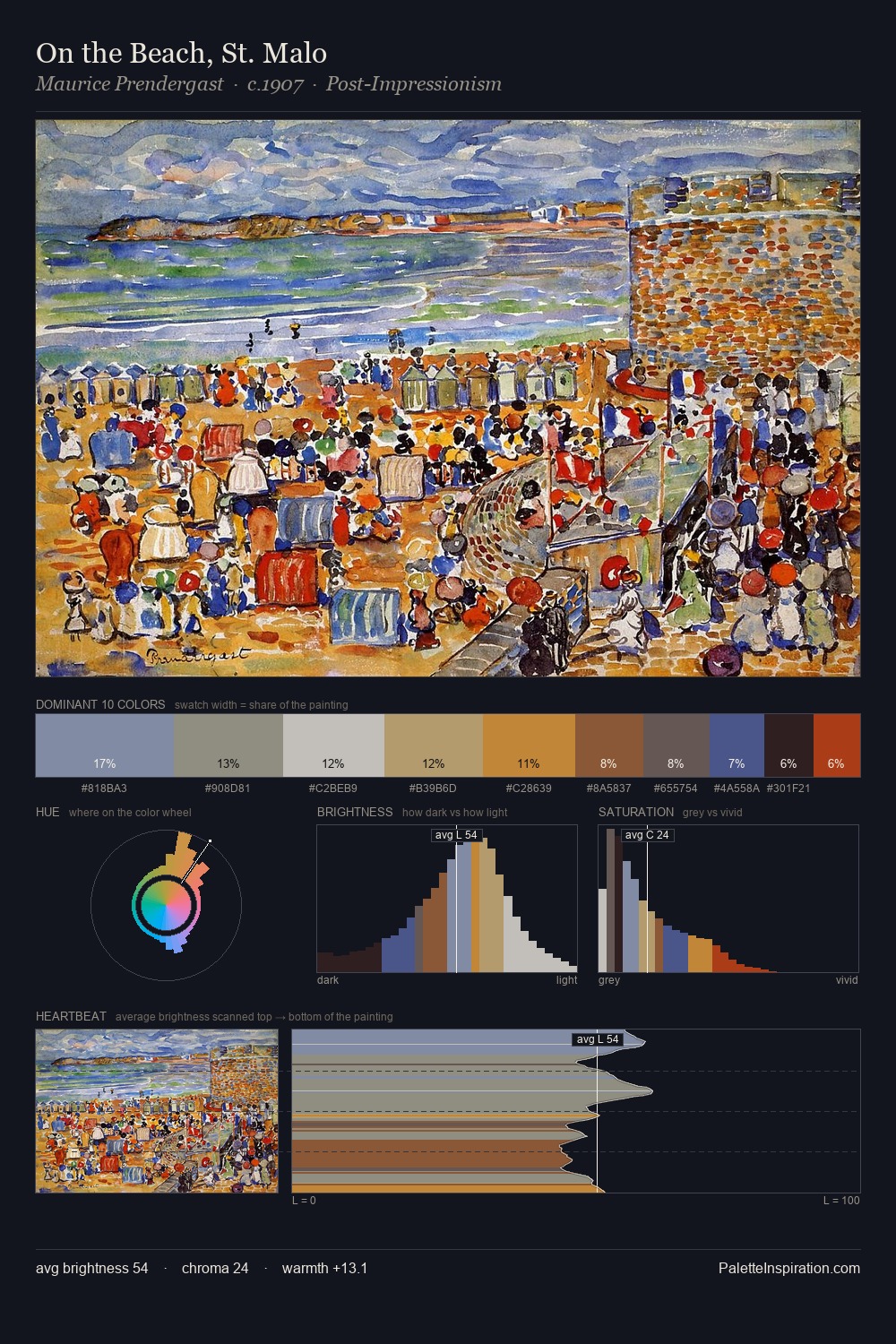
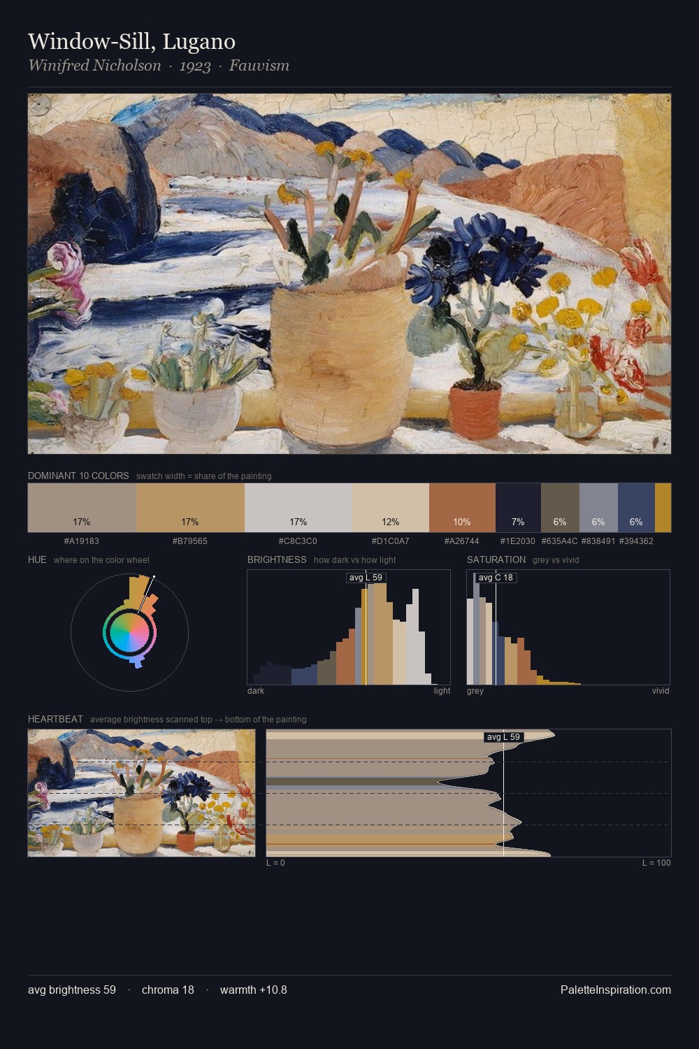
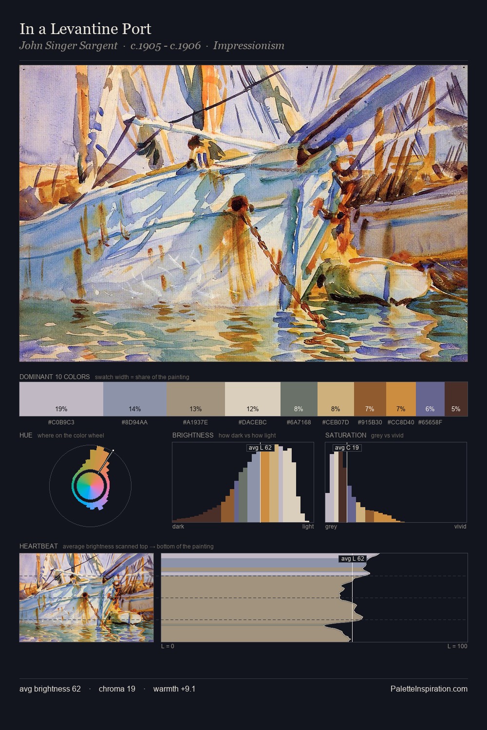
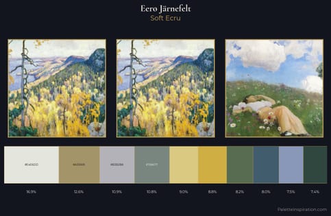
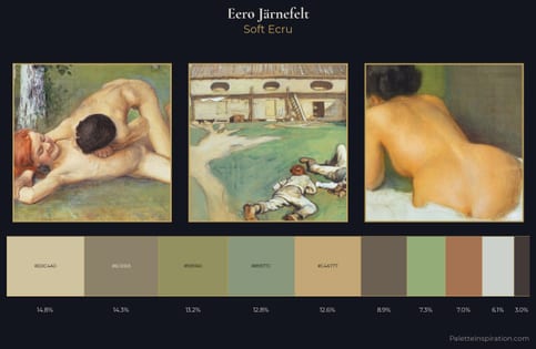
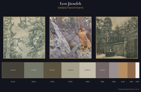
Eero Järnefelt occupies the comfortable middle of the value scale, avoiding both extremes to hold the eye in a sustained middle grey. Temperature is balanced: the palette pits warm earth against cool sky without declaring a winner. All colours lean toward grey, building depth through value rather than colour punch. The saturated accent, #624935, registers at 8.0% - sparse enough to feel like a deliberate surprise. 52 units of value spread create a palette that is varied but unified - contrast in the service of harmony. These proportions encode Eero Järnefelt's instinctive sense of how much of each quality the eye can hold.
Example use cases
- archival print
- university identity
- rare books
- cultural institutions
- nonprofit identity
I Love This!
Use This Palette
Copy, export, or download for your project
Copy, export, or download for your project
Copy:
Download:
Share: