Eero Järnefelt Palette 6
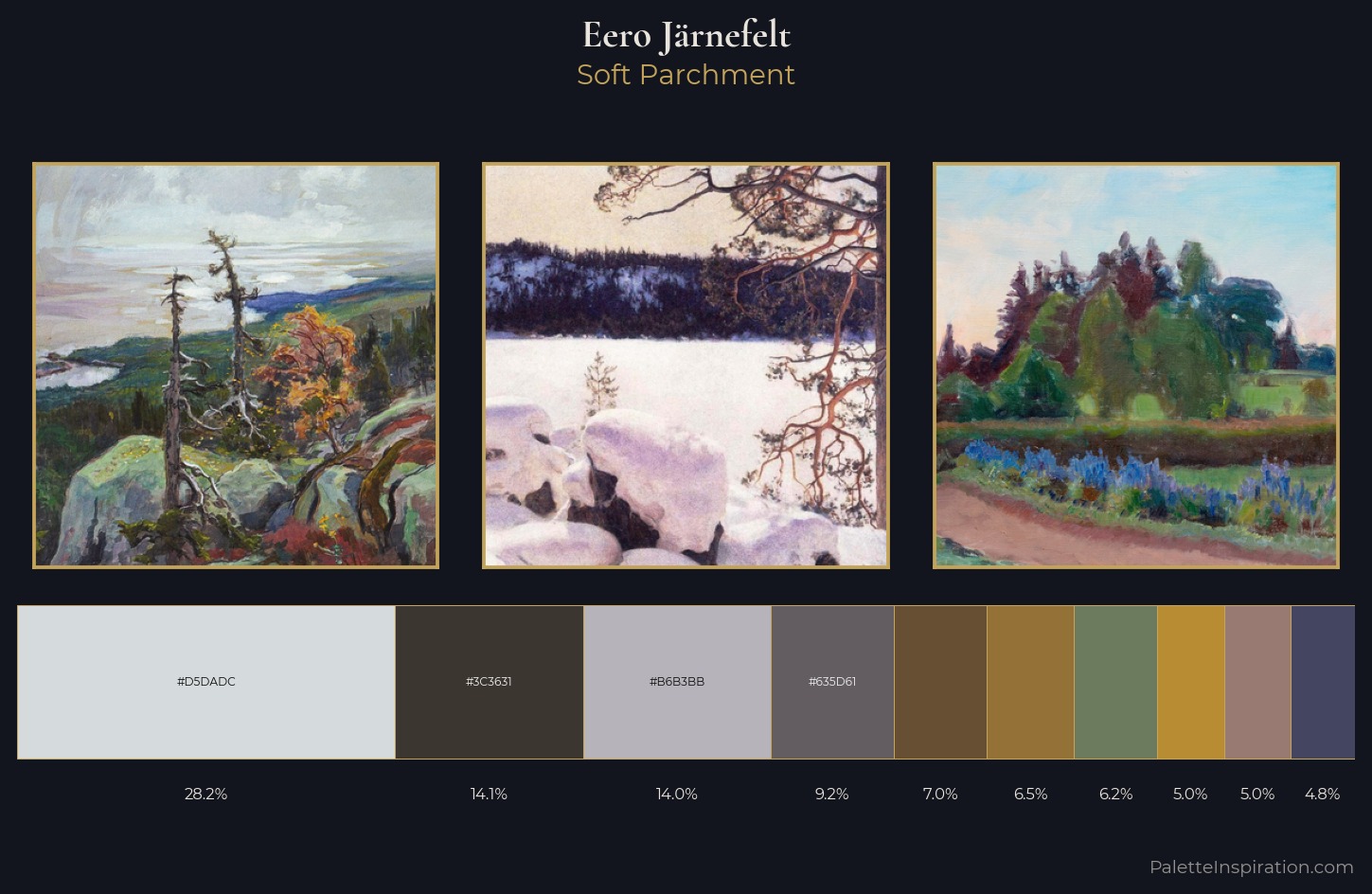
Palette Analysis
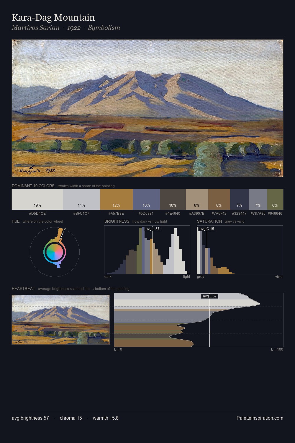
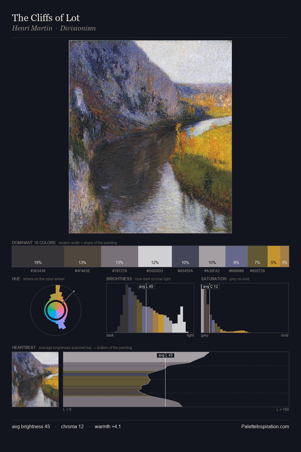
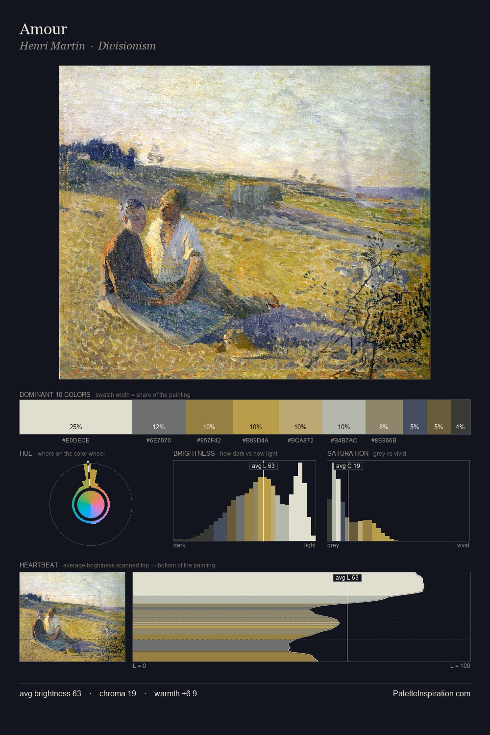
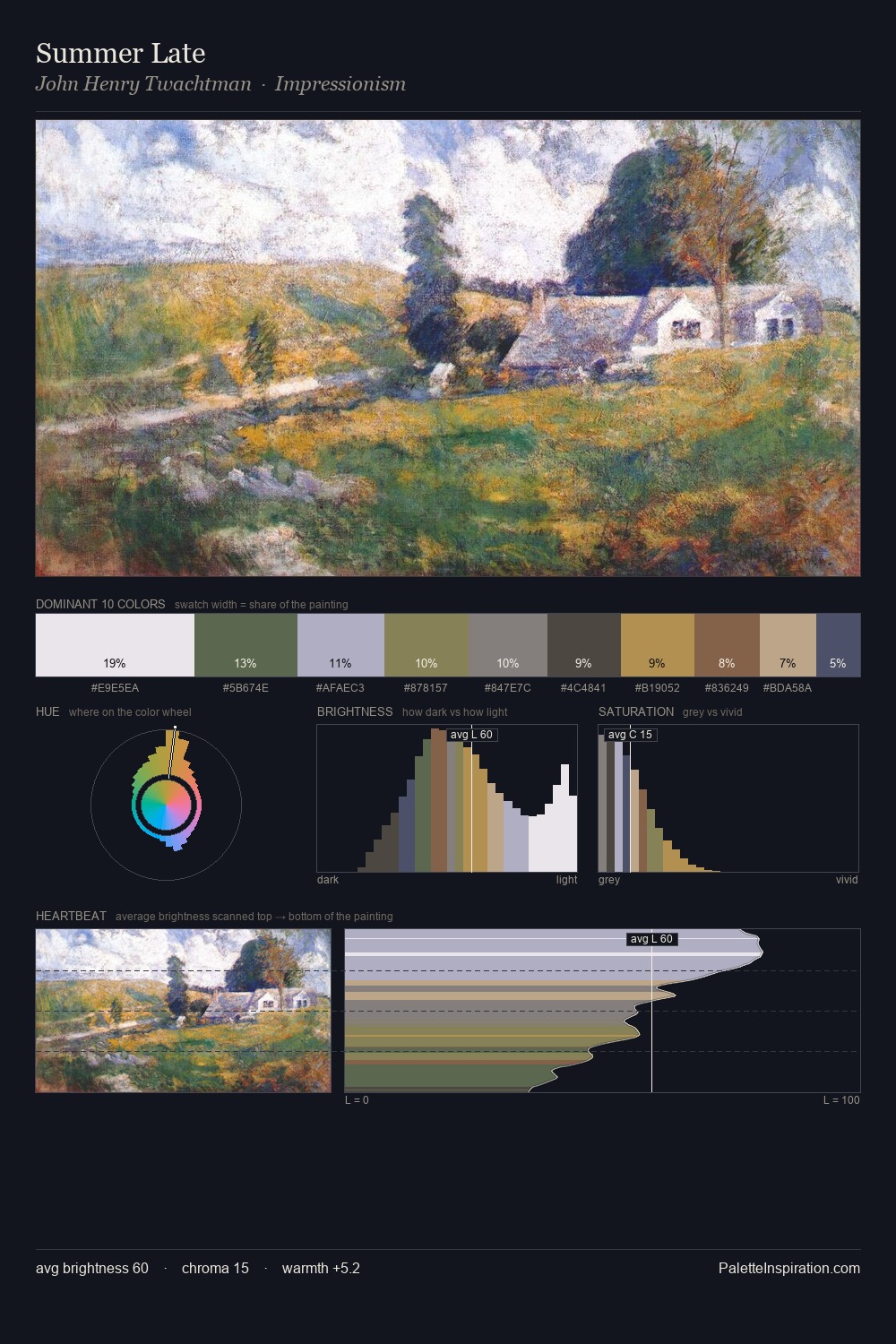
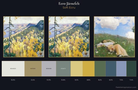
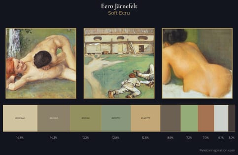
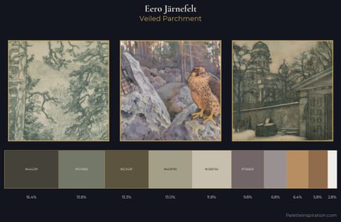
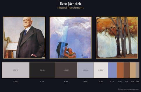
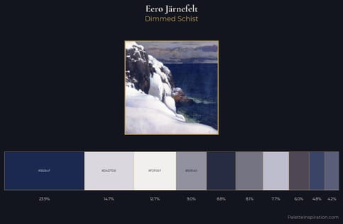
Values in Eero Järnefelt rest in the mid-range - neither dramatically lit nor steeped in shadow. A distinctly cool atmosphere runs through this palette: sky, water, and mist given colour form. Chroma is kept low across all colours, producing the soft, enveloping quality that characterises tonal painting. Eero Järnefelt gives 28.2% of the composition to a single #D5DADC - a decisive chromatic anchor. The saturated accent, #B88C32, registers at 5.0% - sparse enough to feel like a deliberate surprise. 55 units of value range underpin the palette's structural clarity: the eye always knows where light falls. The mid-to-high key, cool bias, and moderate chroma point to outdoor observation - sky and diffused daylight as the dominant light source. In the context of Eero Järnefelt's full range of palettes, group 6 represents one movement in an ongoing chromatic dialogue.
Example use cases
- exhibition design
- foundation branding
- estate management
- art education
- museums & galleries
I Love This!
Copy, export, or download for your project