Edward William Cooke Palette 2

Palette Analysis
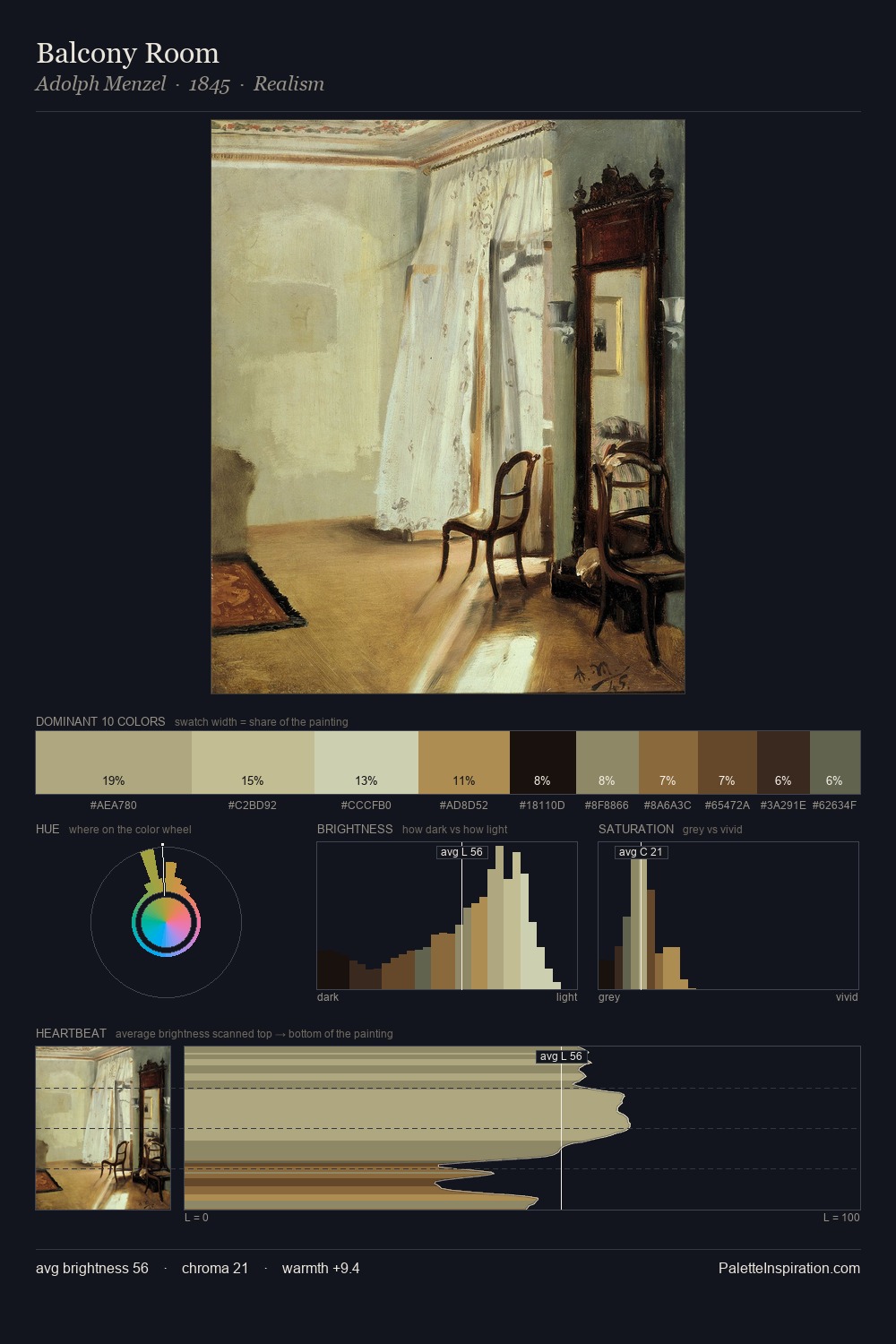
Mid-key values give Edward William Cooke its characteristic quietness - nothing blazes, nothing disappears. Blues and teal-greys govern the palette, lending it an aquatic or atmospheric quality. Saturation is deliberately withheld - the beauty here lies in the near-monochromatic gradations rather than colour difference. At 4.2%, #563E1B carries the palette's sharpest chromatic charge: an accent that earns its place precisely because it is withheld. 59 units of value range underpin the palette's structural clarity: the eye always knows where light falls. The mid-to-high key, cool bias, and moderate chroma point to outdoor observation - sky and diffused daylight as the dominant light source. Palette 2 sits within the larger chromatic argument that Edward William Cooke's complete body of work advances.
Example use cases
- ceramics & pottery
- boutique hospitality
- menswear
- heritage food brands
- craft & artisan brands
I Love This!
Copy, export, or download for your project