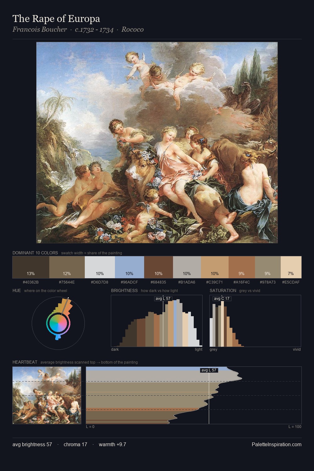
Edward Wadsworth Palette 2

Palette Analysis
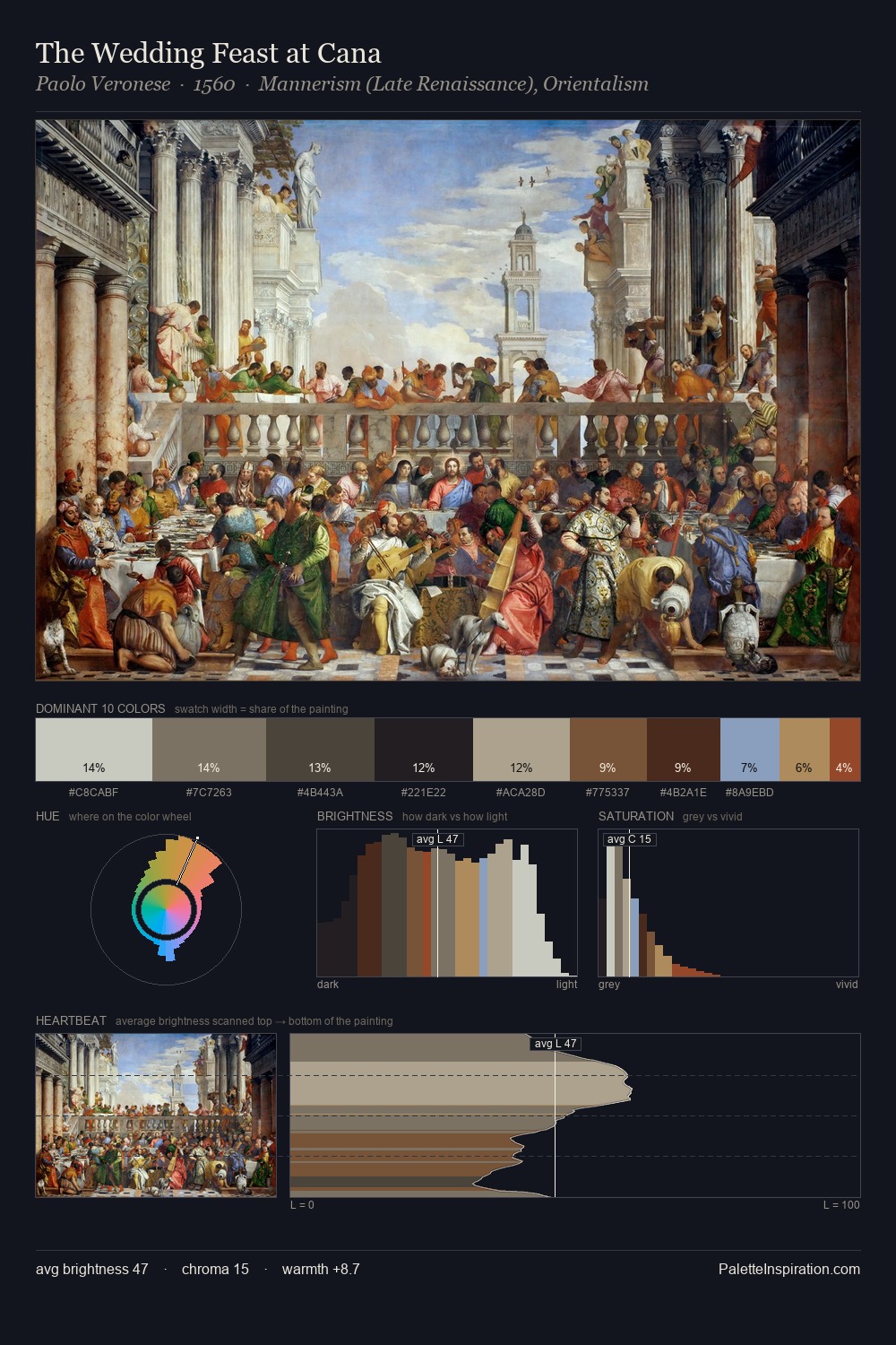
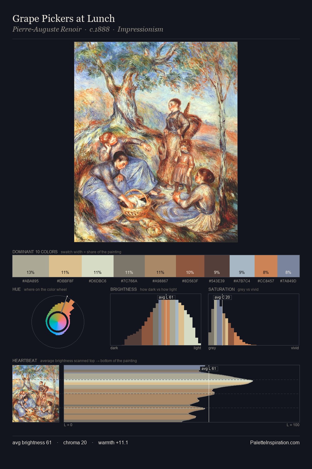
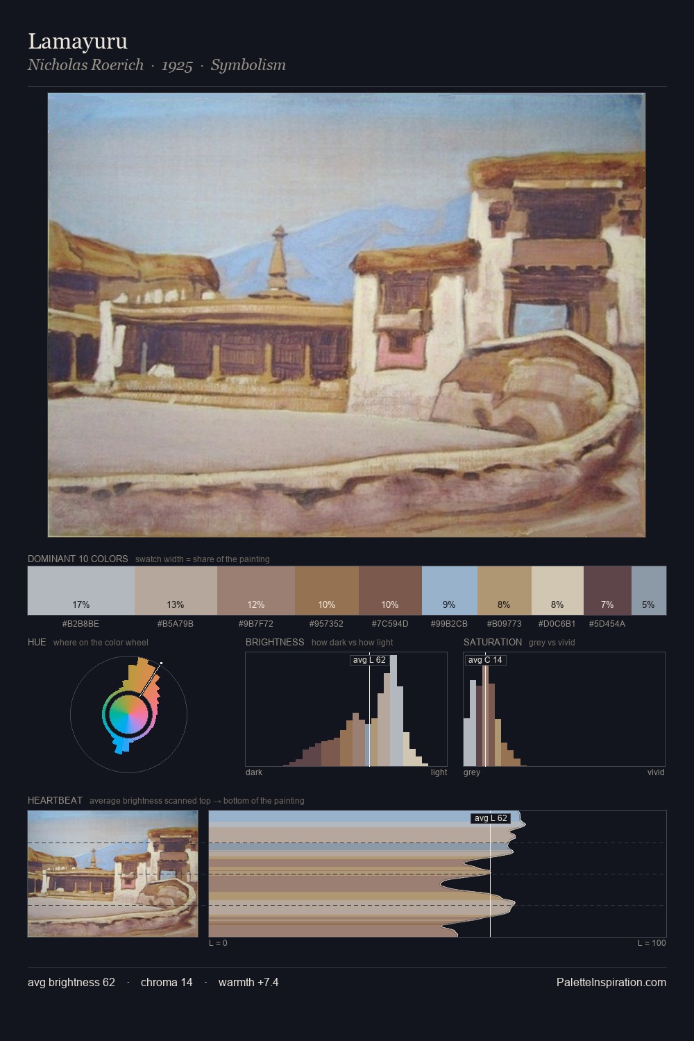
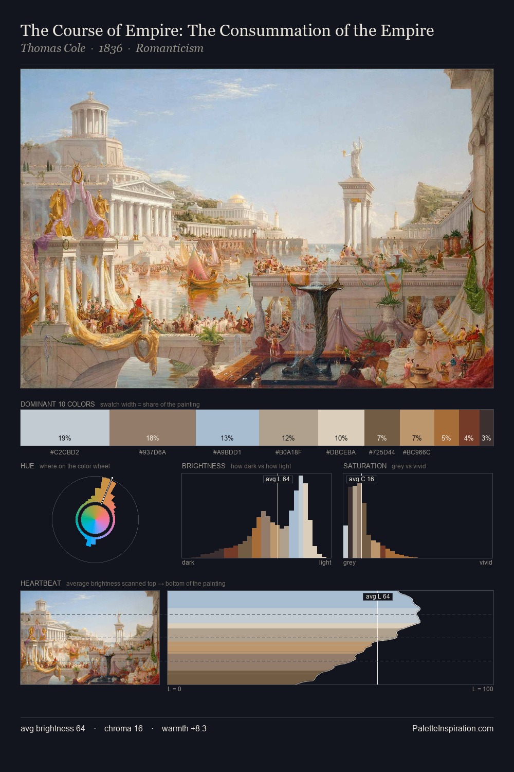
The high-key values of Edward Wadsworth give it an effulgent, almost bleached quality. A distinctly cool atmosphere runs through this palette: sky, water, and mist given colour form. Saturation is deliberately withheld - the beauty here lies in the near-monochromatic gradations rather than colour difference. Only 10.6% is devoted to #B29D71, yet that small allocation delivers the palette's entire chromatic tension. Value range is moderate at 47 units - enough contrast for legibility, not so much as to fragment the tonal unity. The palette has the character of outdoor light: cool, mid-bright, with colour rendered faithfully rather than expressively. This is palette 2 of Edward Wadsworth's sequence - a single chapter in a chromatic story told across many works.
Example use cases
- exhibition design
- foundation branding
- estate management
- art education
- museums & galleries
I Love This!
Copy, export, or download for your project