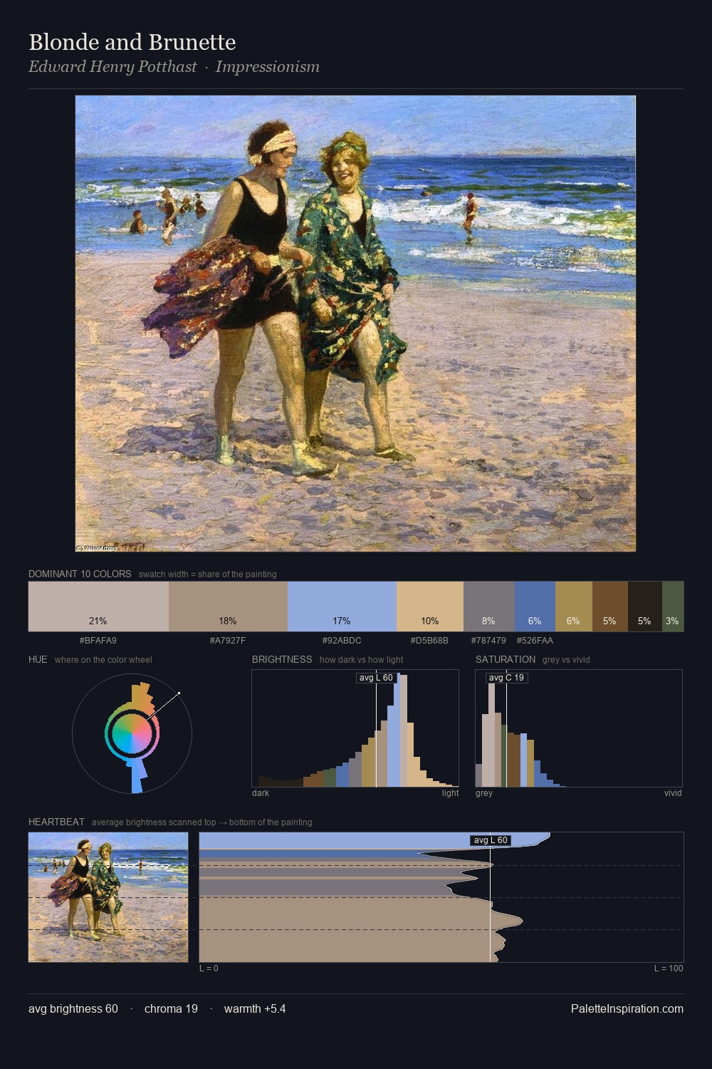
Edward Henry Potthast Master Palette
Soft Parchment
Soft Low-contrast, gentle chroma - mid-key values and low saturation, approachable and calm.
Parchment Aged warm neutral - the color of old manuscript parchment, tan and slightly yellowed.

Palette Analysis
Edward Henry Potthast keeps values measured and balanced, a hallmark of tonal restraint. Edward Henry Potthast tilts toward cool - blues and silver-greys carry the structural weight. Chroma is kept low across all colours, producing the soft, enveloping quality that characterises tonal painting. The saturated accent, #6478A5, registers at 5.3% - sparse enough to feel like a deliberate surprise. At 52 units across the value scale, the palette keeps contrast readable without letting it dominate. High luminosity and cool temperature suggest the plein-air condition: unfiltered daylight and open sky. These proportions encode Edward Henry Potthast's instinctive sense of how much of each quality the eye can hold.
Example use cases
- exhibition design
- foundation branding
- estate management
- art education
- museums & galleries
I Love This!
Use This Palette
Copy, export, or download for your project
Copy, export, or download for your project
Copy:
Download:
Share: