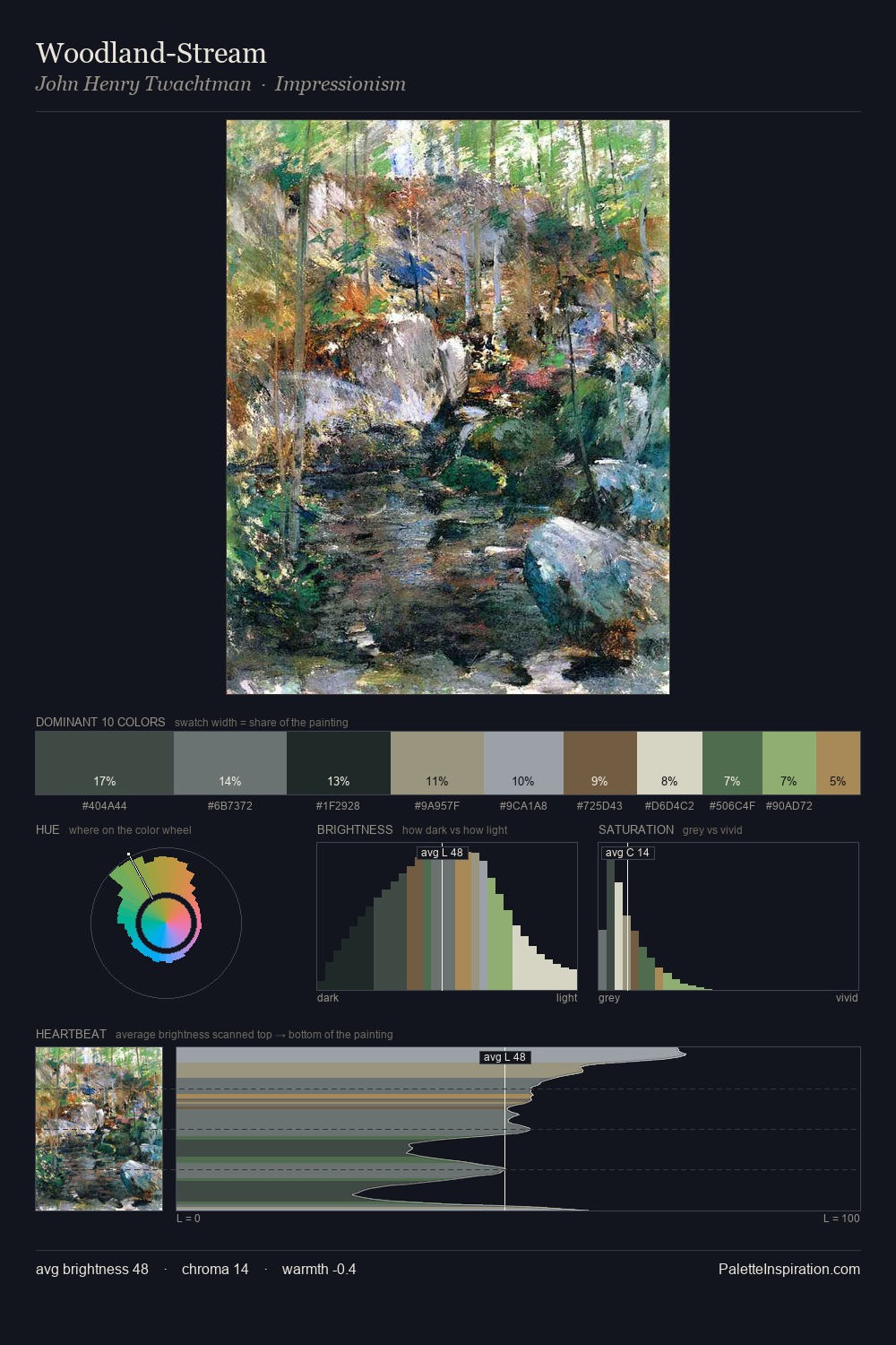
Edward Henry Potthast Palette 5
Veiled Celadon
Veiled Partially obscured light - mid-dark with a hazy, scrim-filtered quality.
Celadon Pale gray-green - the color of Song dynasty celadon glaze, cool and mineral.

Palette Analysis
Values in Edward Henry Potthast rest in the mid-range - neither dramatically lit nor steeped in shadow. Cool tones set the register here - the blues and greens easily outweigh any warm accents. All colours lean toward grey, building depth through value rather than colour punch. Only 5.5% is devoted to #B9BB6E, yet that small allocation delivers the palette's entire chromatic tension. The palette spans 44 value units: a measured range that delivers coherence over drama. High luminosity and cool temperature suggest the plein-air condition: unfiltered daylight and open sky. Palette 5 sits within the larger chromatic argument that Edward Henry Potthast's complete body of work advances.
Example use cases
- exhibition design
- foundation branding
- estate management
- art education
- museums & galleries
I Love This!
Use This Palette
Copy, export, or download for your project
Copy, export, or download for your project
Copy:
Download:
Share: