Domenico Beccafumi Palette 9

Palette Analysis
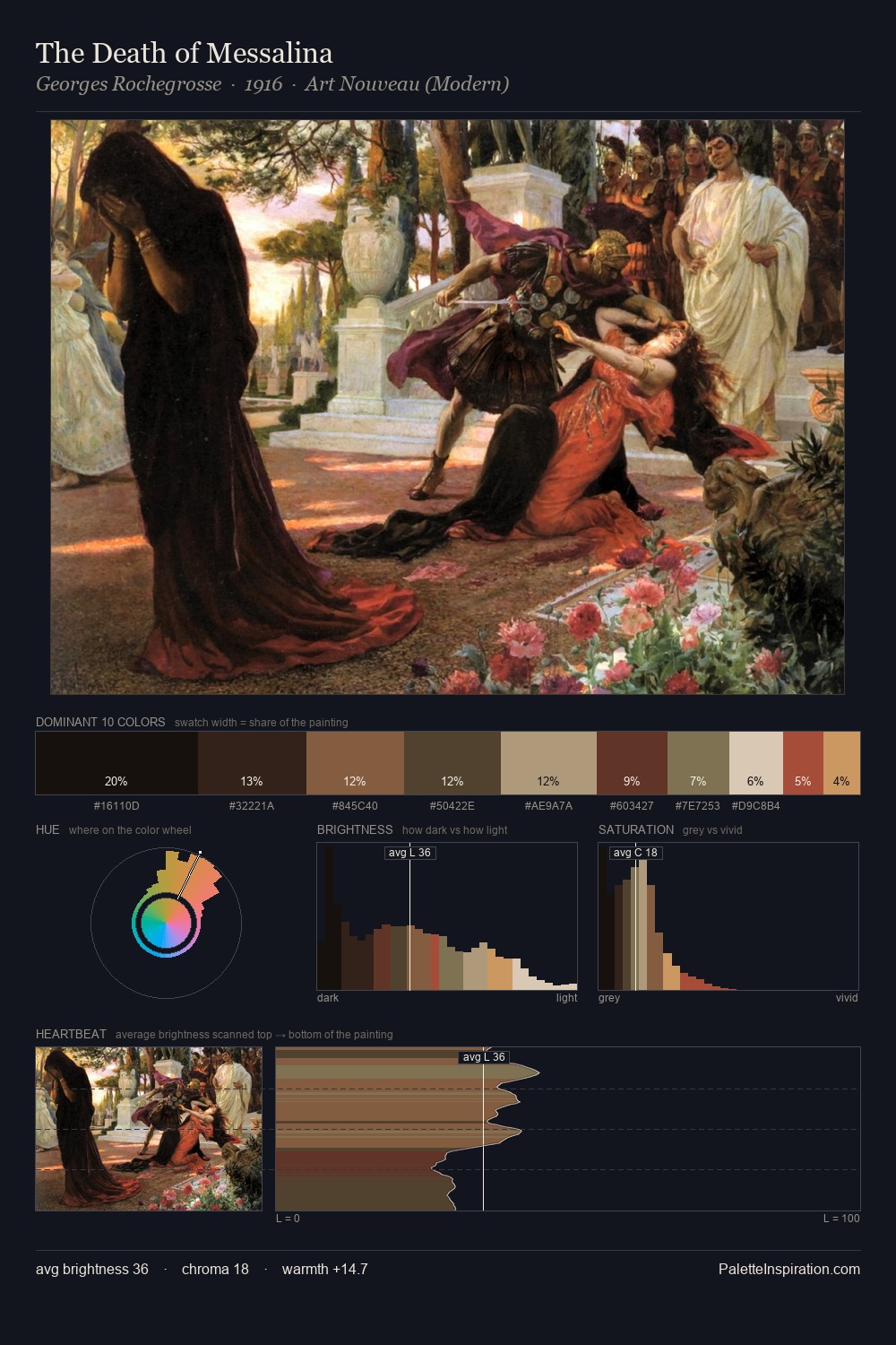
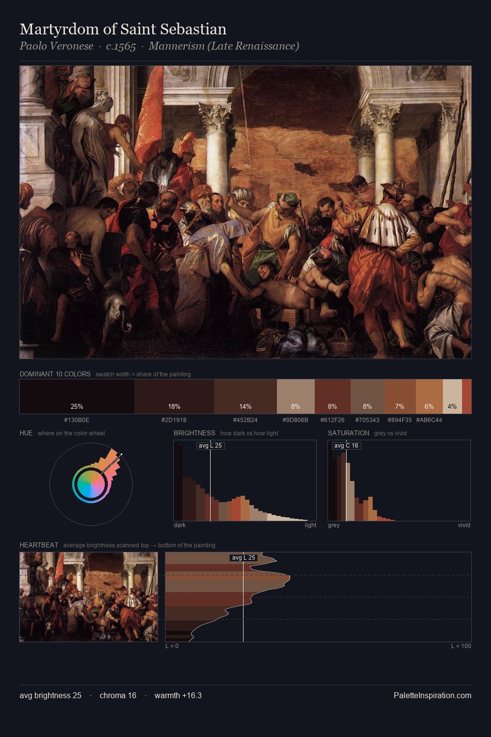
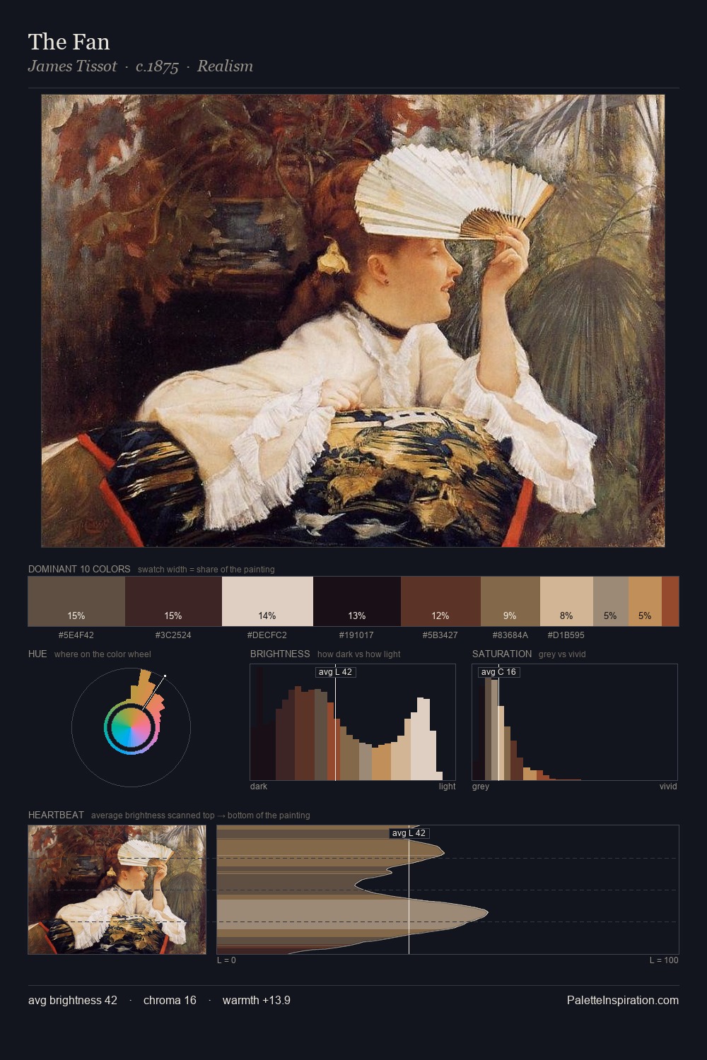
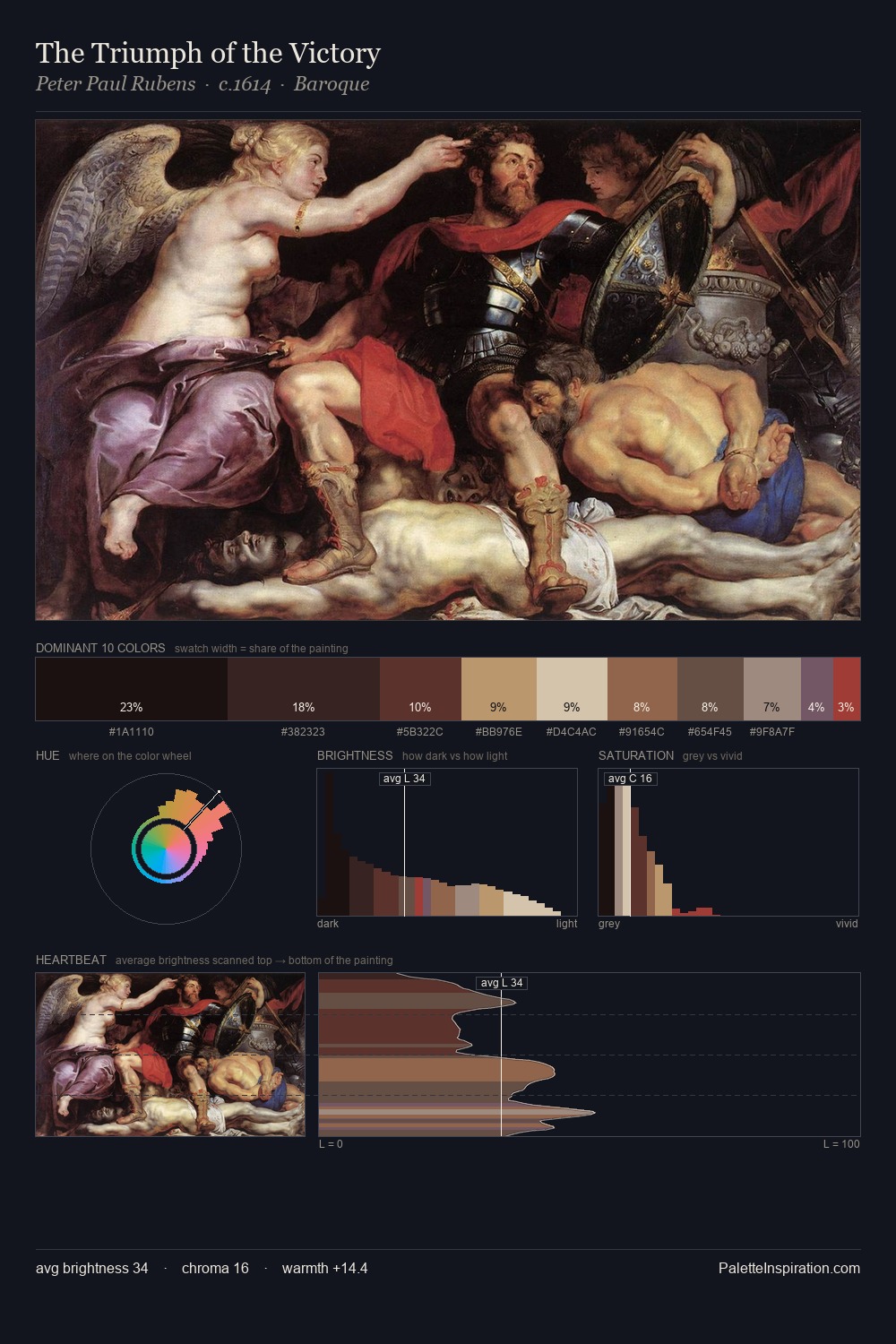
The palette of Domenico Beccafumi sits in the lower register of the value scale - dense, contained, and weighted. Warmth dominates - the palette of Domenico Beccafumi leans heavily on the yellow-orange-red arc of the colour wheel. Chroma hovers near zero; colour declares itself through subtle shifts in hue rather than outright saturation. The dominant colour, #080204, takes 30.6% of the total area, establishing the overall mood before any other hue is introduced. The saturated accent, #603022, registers at 10.1% - sparse enough to feel like a deliberate surprise. From deepest dark to palest light, the palette traverses 75 units of the value scale - a span that creates natural depth. This tonal restraint is characteristic of the Domenico Beccafumi approach: colour serves light, not the reverse. Palette 9 sits within the larger chromatic argument that Domenico Beccafumi's complete body of work advances.
Example use cases
- theater design
- jewelry brands
- tobacco-adjacent retail
- event branding
- film & entertainment
I Love This!
Copy, export, or download for your project