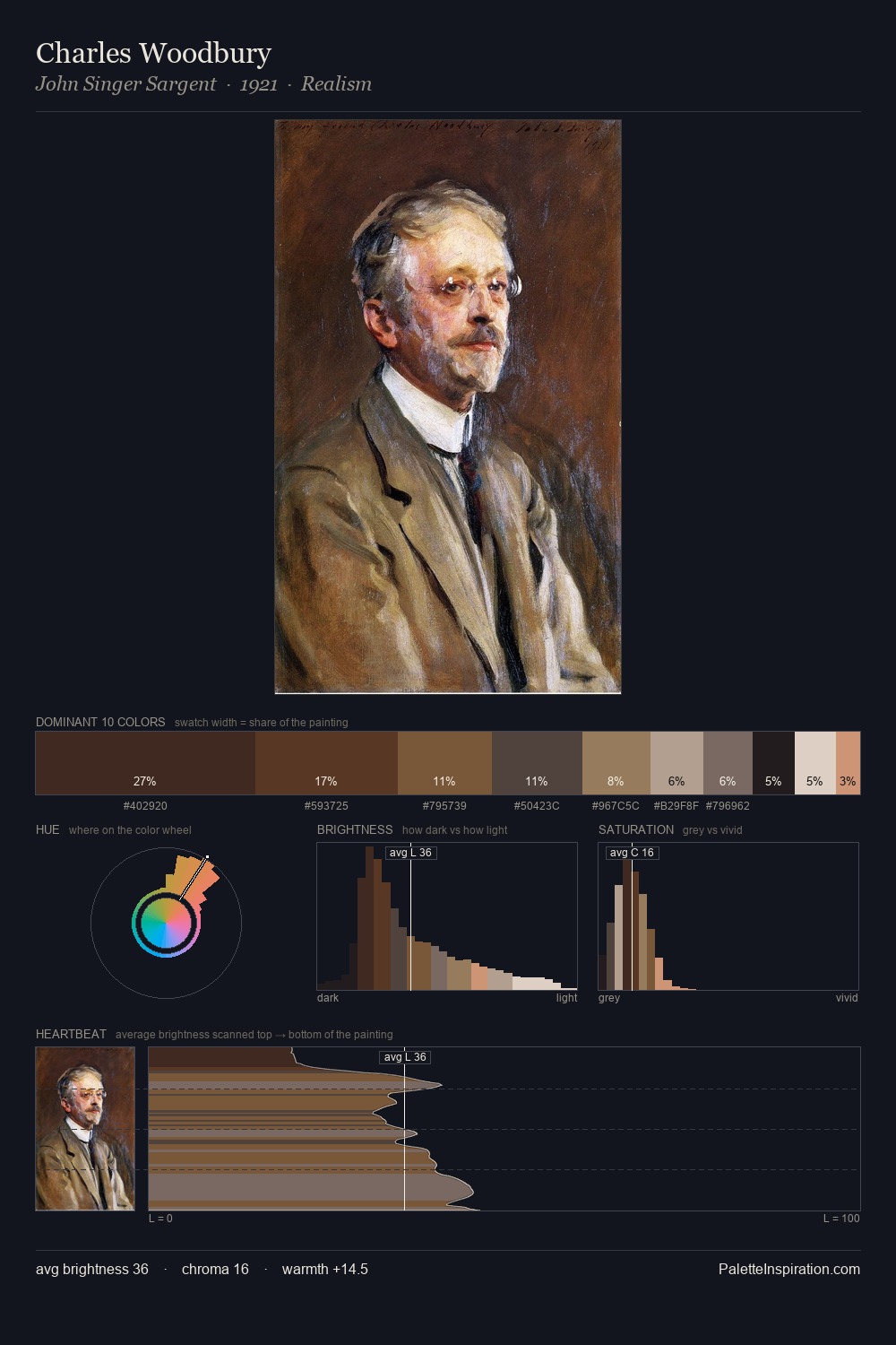
Domenico Beccafumi Palette 2
Shadowed Tawny
Shadowed Low-key - values weighted toward shadow, the palette of dim interiors and overcast skies.
Tawny Warm orange-brown - a traditional term for the color of tanned leather or lion fur.

Palette Analysis
Domenico Beccafumi occupies the comfortable middle of the value scale, avoiding both extremes to hold the eye in a sustained middle grey. Warmth dominates - the palette of Domenico Beccafumi leans heavily on the yellow-orange-red arc of the colour wheel. Saturation is deliberately withheld - the beauty here lies in the near-monochromatic gradations rather than colour difference. The saturated accent, #BD9B61, registers at 2.5% - sparse enough to feel like a deliberate surprise. The value range spans 65 units across the palette, providing the full gamut from deep shadow to near-white and ensuring clear tonal hierarchy. Palette 2 sits within the larger chromatic argument that Domenico Beccafumi's complete body of work advances.
Example use cases
- theater design
- jewelry brands
- tobacco-adjacent retail
- event branding
- film & entertainment
I Love This!
Use This Palette
Copy, export, or download for your project
Copy, export, or download for your project
Copy:
Download:
Share: