Diego Velazquez Palette 6

Palette Analysis
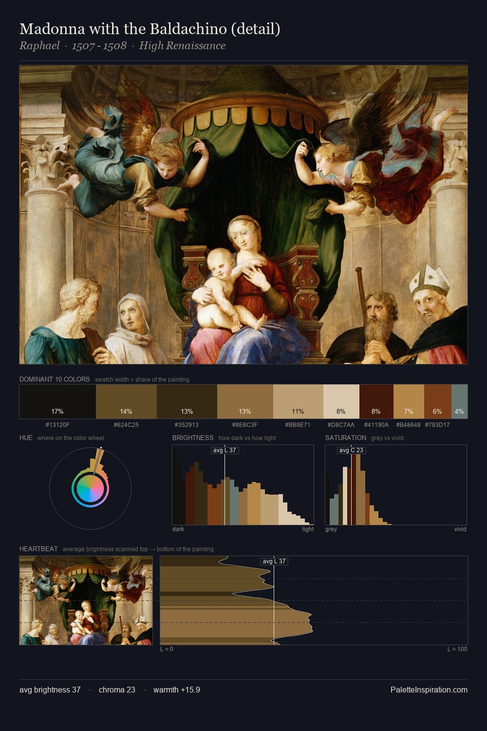
Values in Diego Velazquez rest in the mid-range - neither dramatically lit nor steeped in shadow. Diego Velazquez keeps warm and cool in parity, a balance that lends the work a perceptual shimmer. All colours lean toward grey, building depth through value rather than colour punch. The dominant colour, #110D0C, takes 25.5% of the total area, establishing the overall mood before any other hue is introduced. The saturated accent, #683E1E, registers at 5.4% - sparse enough to feel like a deliberate surprise. From deepest dark to palest light, the palette traverses 71 units of the value scale - a span that creates natural depth. Diego Velazquez's palette 6 carries its own internal logic while remaining in conversation with the artist's broader colour intelligence.
Example use cases
- theater design
- jewelry brands
- tobacco-adjacent retail
- event branding
- film & entertainment
I Love This!
Copy, export, or download for your project