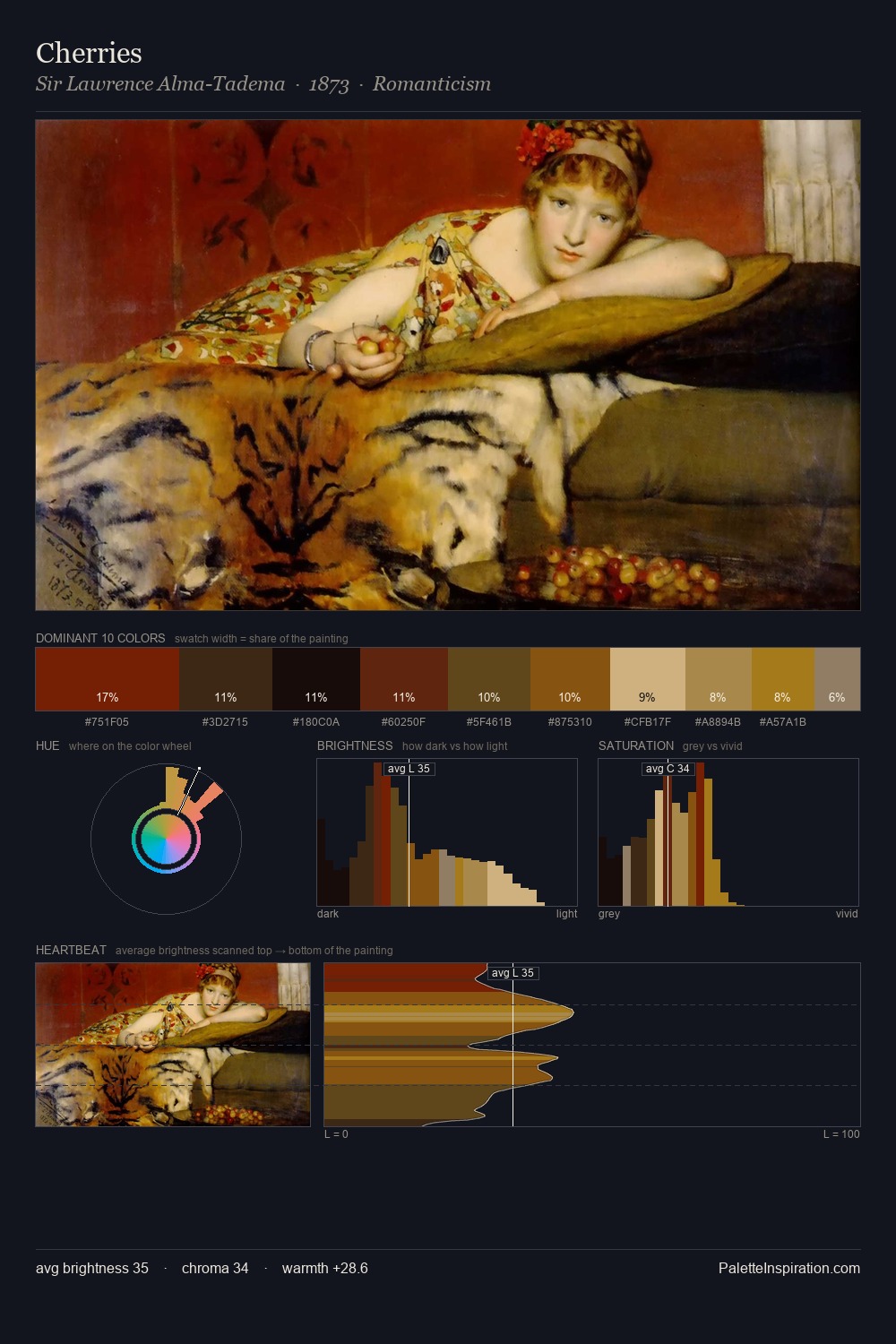
David Rijckaert III Palette 3

Palette Analysis
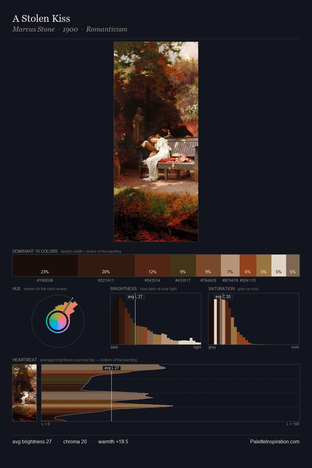
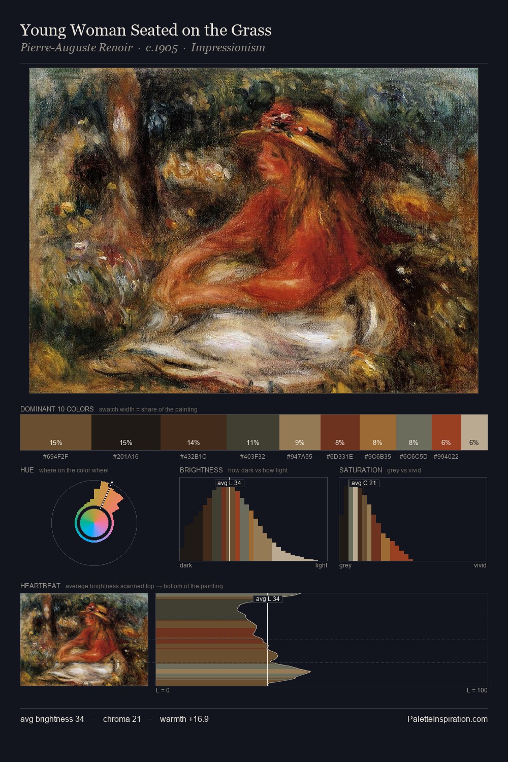
Darkness anchors David Rijckaert III; light is rationed, creating dramatic contrast rather than open air. The dominant temperature is warm, with earth tones and fire-hues setting the emotional key. Saturation is deliberately withheld - the beauty here lies in the near-monochromatic gradations rather than colour difference. #231910 claims 35.9% of the surface, functioning as the work's tonal foundation. #945C21 functions as the palette's exclamation mark: highest chroma, lowest percentage (2.1%). The palette spans 49 value units: a measured range that delivers coherence over drama. Together these qualities place David Rijckaert III firmly in the tonal tradition - concerned with mood and atmosphere rather than chromatic display. David Rijckaert III's palette 3 carries its own internal logic while remaining in conversation with the artist's broader colour intelligence.
Example use cases
- theater design
- jewelry brands
- tobacco-adjacent retail
- event branding
- film & entertainment
I Love This!
Copy, export, or download for your project