David James Palette 2
Pearlescent Gossamer
Pearlescent Iridescent light quality - high-key with subtle hue variation, like mother-of-pearl.
Gossamer Nearly transparent pale - delicate, wispy, like fine spider silk.

Palette Analysis
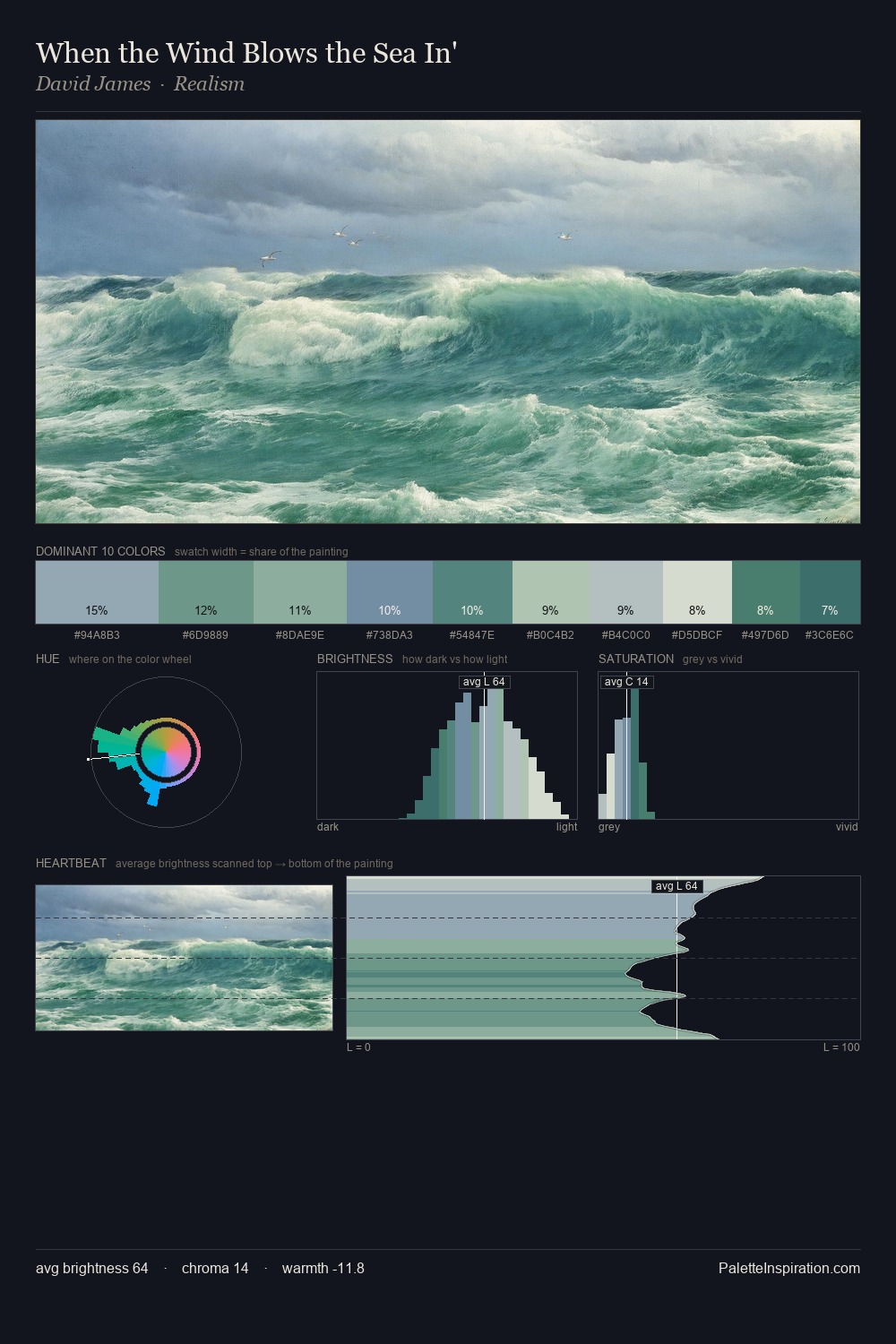
Values in David James tilt decisively toward white, giving the palette its luminous character. Blues and teal-greys govern the palette, lending it an aquatic or atmospheric quality. All colours lean toward grey, building depth through value rather than colour punch. The saturated accent, #ACC0D6, registers at 5.0% - sparse enough to feel like a deliberate surprise. The palette spans 36 value units: a measured range that delivers coherence over drama. High luminosity and cool temperature suggest the plein-air condition: unfiltered daylight and open sky. This is palette 2 of David James's sequence - a single chapter in a chromatic story told across many works.
Example use cases
- exhibition design
- foundation branding
- estate management
- art education
- museums & galleries
I Love This!
Use This Palette
Copy, export, or download for your project
Copy, export, or download for your project
Copy:
Download:
Share: