Cornelis Pietersz. Bega Palette 1

Palette Analysis
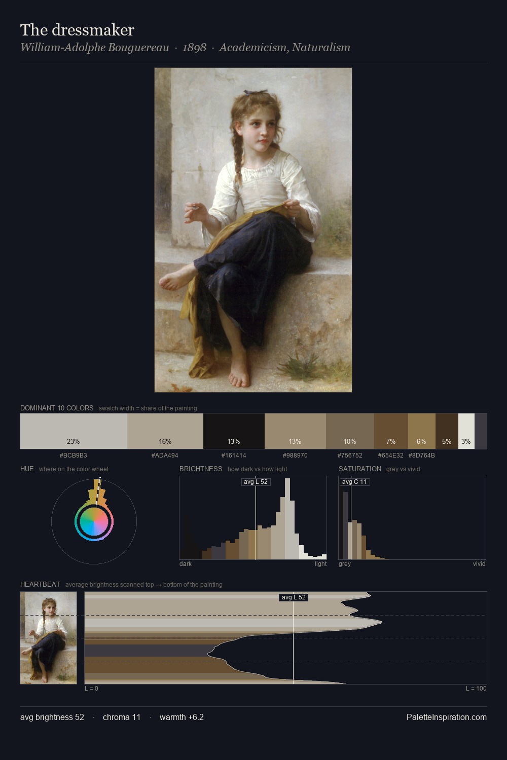
Cornelis Pietersz. Bega is high-key - luminous, open, and weighted toward light. Warm and cool tones are held in careful balance - neither family dominates, creating tension and resolution simultaneously. Saturation is deliberately withheld - the beauty here lies in the near-monochromatic gradations rather than colour difference. Cornelis Pietersz. Bega gives 49.6% of the composition to a single #FFFFFF - a decisive chromatic anchor. The most saturated colour, #9C764E, is reserved to 2.4% of the surface, where it acts as a focal punctuation. A value spread of 80 units gives the palette both depth and air - shadows are genuinely dark, lights genuinely light. Palette 1 sits within the larger chromatic argument that Cornelis Pietersz. Bega's complete body of work advances.
Example use cases
- florist branding
- event design
- real estate
- jewelry retail
- hospitality branding
I Love This!
Copy, export, or download for your project