Christian Stocklin Palette 1

Palette Analysis
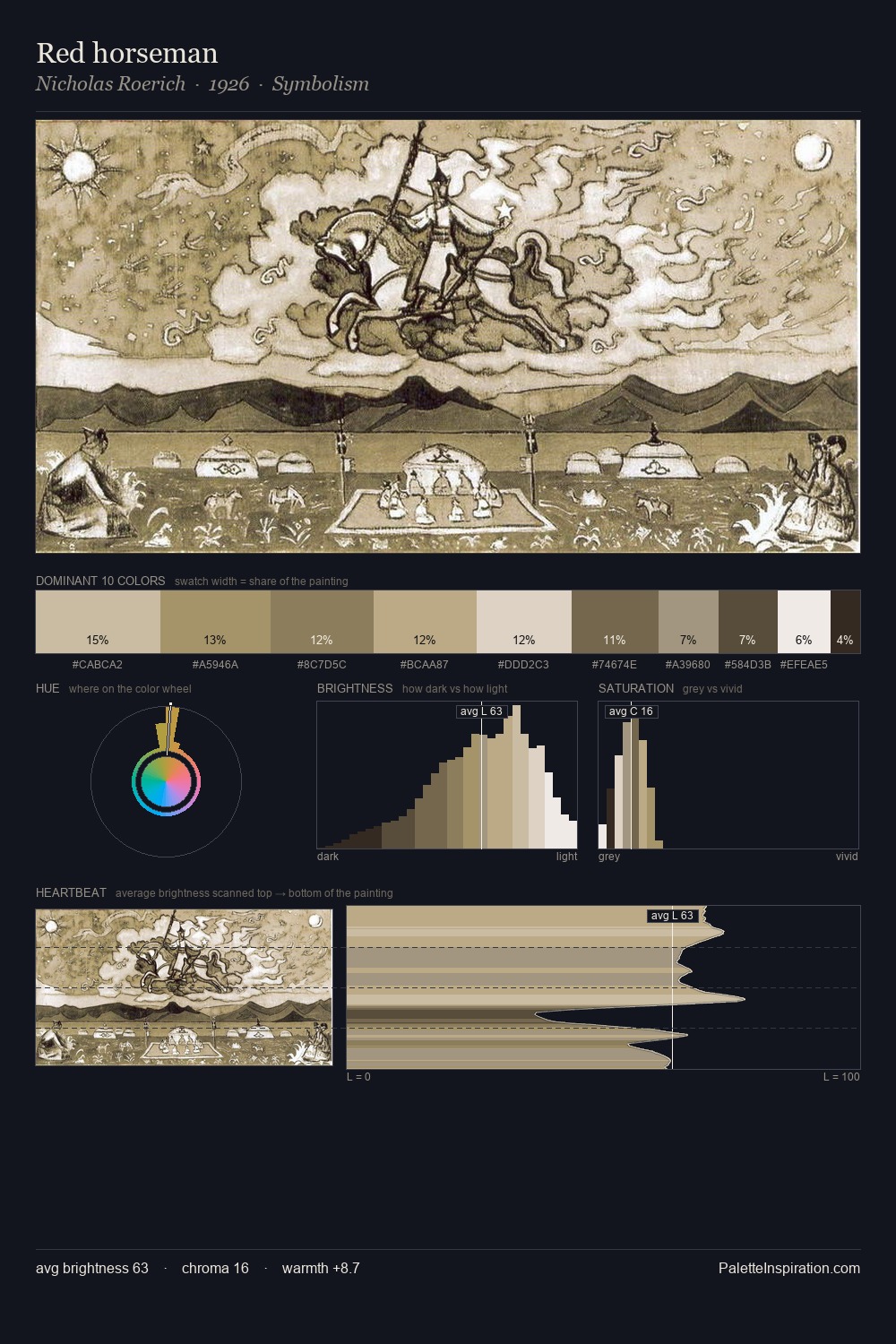
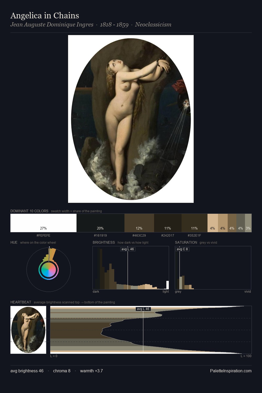
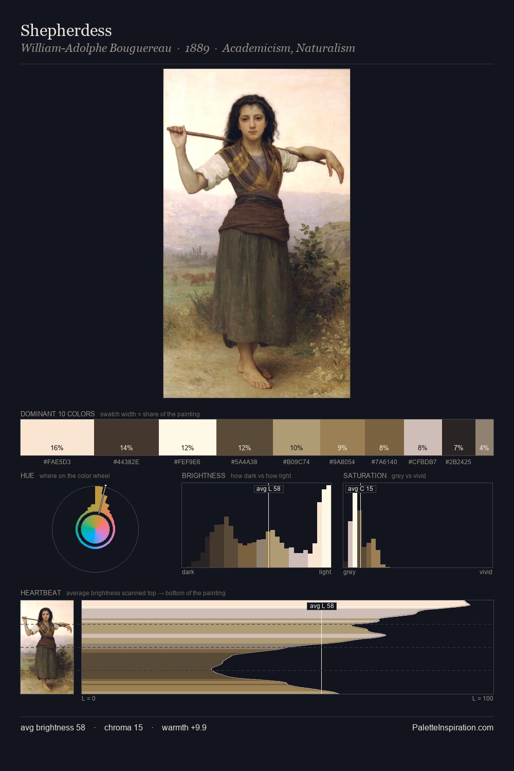
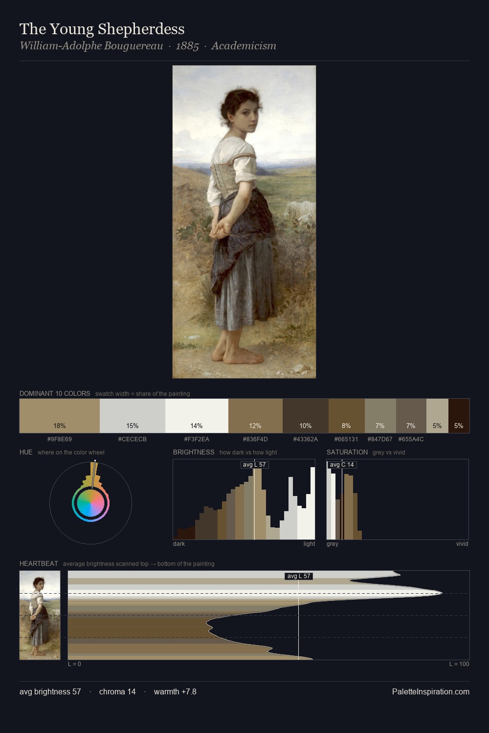
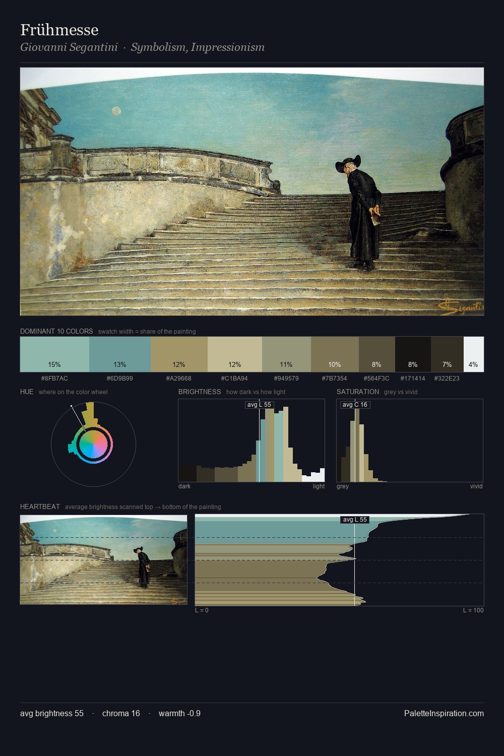
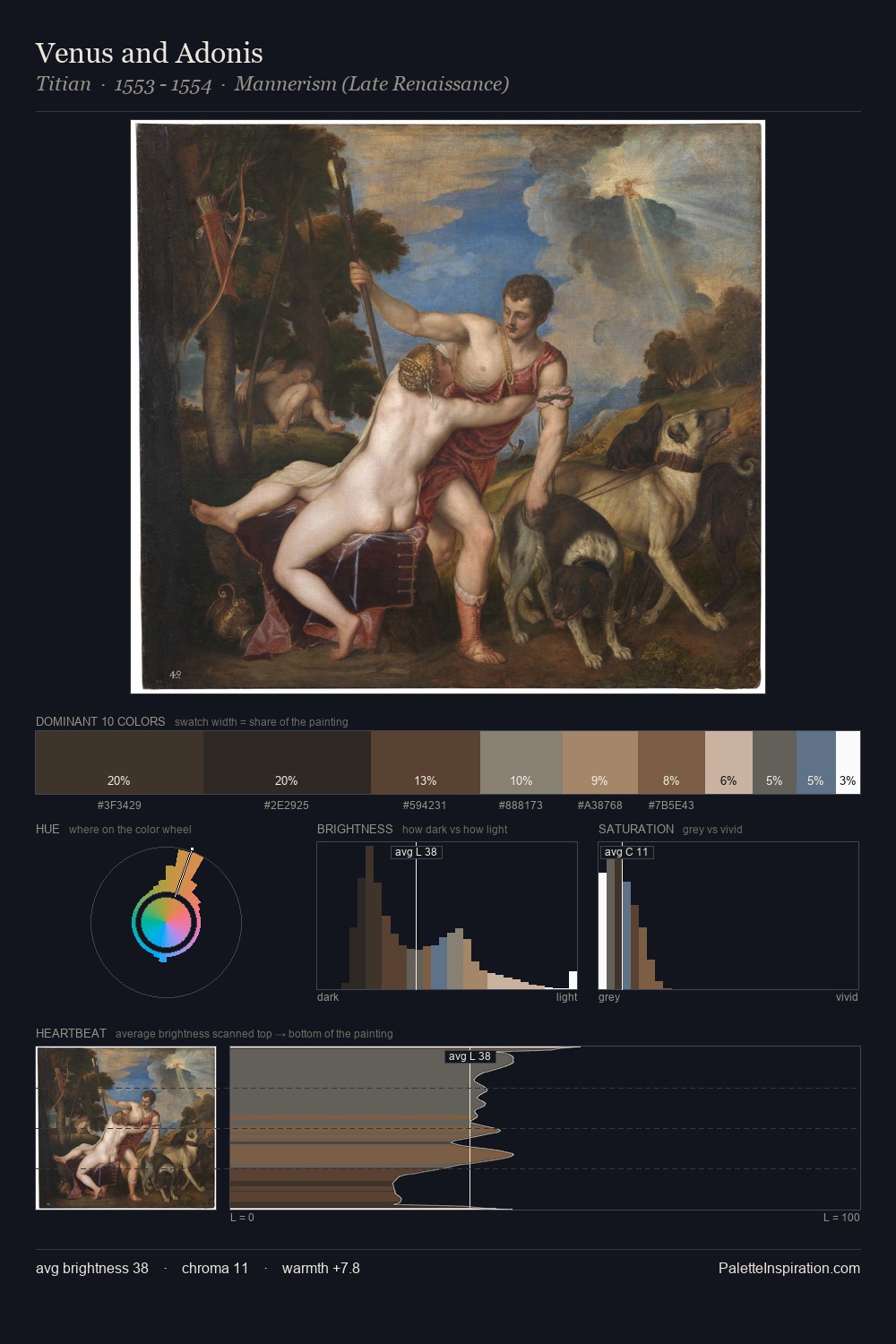
Christian Stocklin works in the upper reaches of the value scale, creating an atmosphere of brightness and expansiveness. Blues and teal-greys govern the palette, lending it an aquatic or atmospheric quality. All colours lean toward grey, building depth through value rather than colour punch. #FFFFFE at 53.0% of the palette: an overwhelming presence that pulls all other colours into its gravitational field. The most saturated colour, #715E42, is reserved to 4.4% of the surface, where it acts as a focal punctuation. 72 units of value range underpin the palette's structural clarity: the eye always knows where light falls. The palette has the character of outdoor light: cool, mid-bright, with colour rendered faithfully rather than expressively. In the context of Christian Stocklin's full range of palettes, group 1 represents one movement in an ongoing chromatic dialogue.
Example use cases
- publishing
- corporate identity
- consumer apps
- hospitality
- design agencies
I Love This!
Copy, export, or download for your project