Cornelis Kimmel Master Palette
Veiled Tawny
Veiled Partially obscured light - mid-dark with a hazy, scrim-filtered quality.
Tawny Warm orange-brown - a traditional term for the color of tanned leather or lion fur.

Palette Analysis
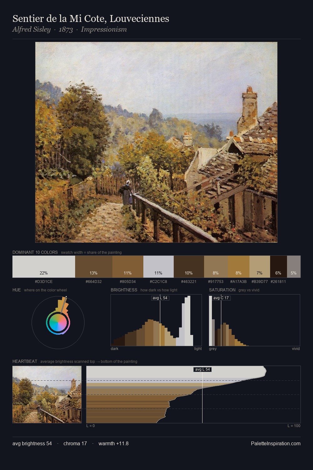
Cornelis Kimmel distributes its values across the middle register, creating harmony without high contrast. Yellow, ochre, sienna: warm hues that Cornelis Kimmel deploys as the palette's primary energy. Chroma is kept low across all colours, producing the soft, enveloping quality that characterises tonal painting. The highest-chroma note - #97843E - appears at just 4.0%, deployed as a precision accent against the quieter ground. A value spread of 64 units gives the palette both depth and air - shadows are genuinely dark, lights genuinely light. These proportions encode Cornelis Kimmel's instinctive sense of how much of each quality the eye can hold.
Example use cases
- ceramics & pottery
- boutique hospitality
- menswear
- heritage food brands
- craft & artisan brands
I Love This!
Use This Palette
Copy, export, or download for your project
Copy, export, or download for your project
Copy:
Download:
Share: