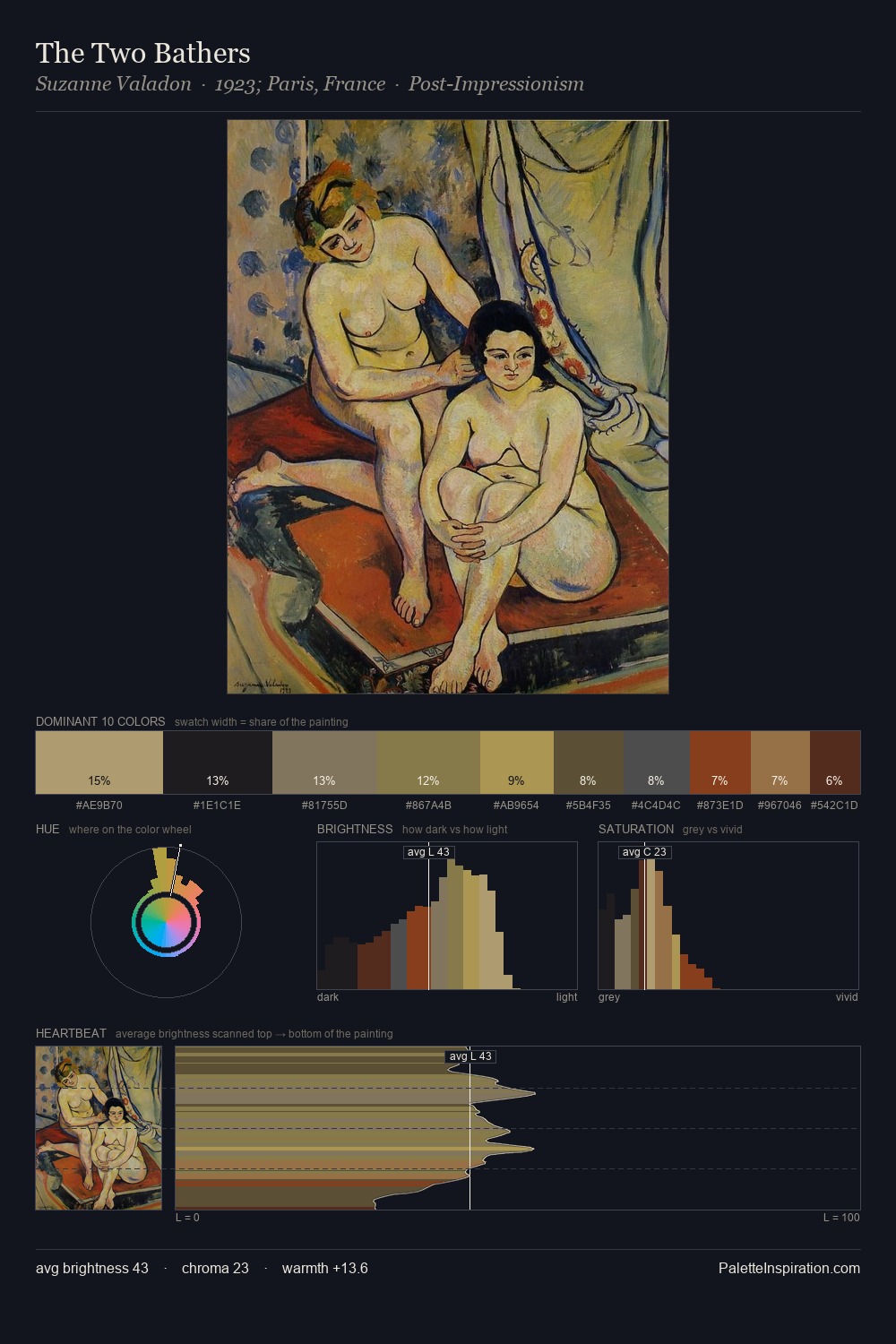
Constantin Artachino Palette 6
Veiled Apricot
Veiled Partially obscured light - mid-dark with a hazy, scrim-filtered quality.
Apricot Soft warm orange - peach-adjacent, the color of ripe stone fruit.

Palette Analysis
Constantin Artachino keeps values measured and balanced, a hallmark of tonal restraint. Warm and cool are kept in productive tension, creating the kind of chromatic harmony that sustains the eye. All colours lean toward grey, building depth through value rather than colour punch. The most saturated colour, #5B3327, is reserved to 3.0% of the surface, where it acts as a focal punctuation. Value range is moderate at 43 units - enough contrast for legibility, not so much as to fragment the tonal unity. Palette 6 sits within the larger chromatic argument that Constantin Artachino's complete body of work advances.
Example use cases
- ceramics & pottery
- boutique hospitality
- menswear
- heritage food brands
- craft & artisan brands
I Love This!
Use This Palette
Copy, export, or download for your project
Copy, export, or download for your project
Copy:
Download:
Share:

, \"Cecchino\" Palette 9 - Muted Gamboge")


