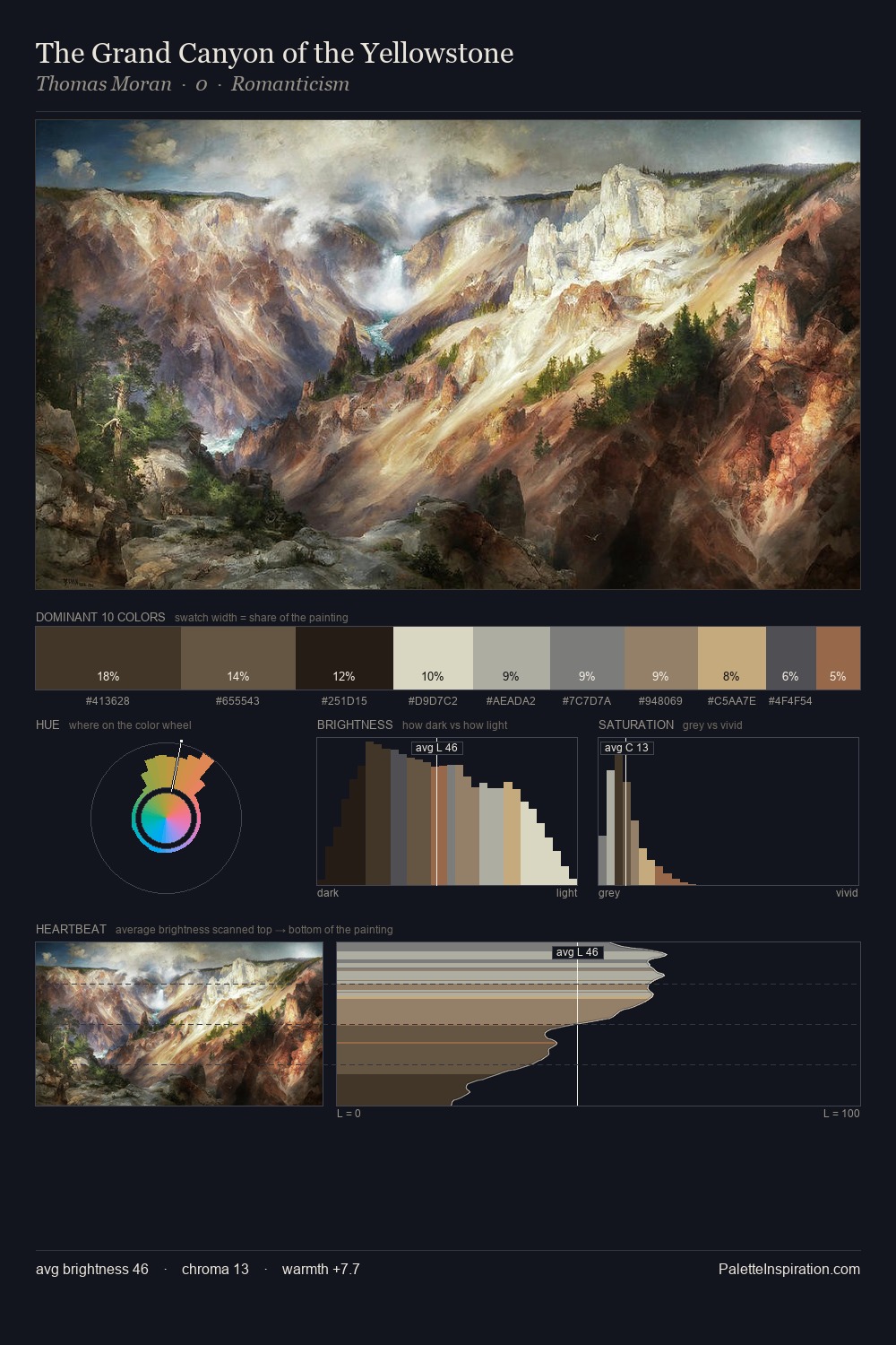
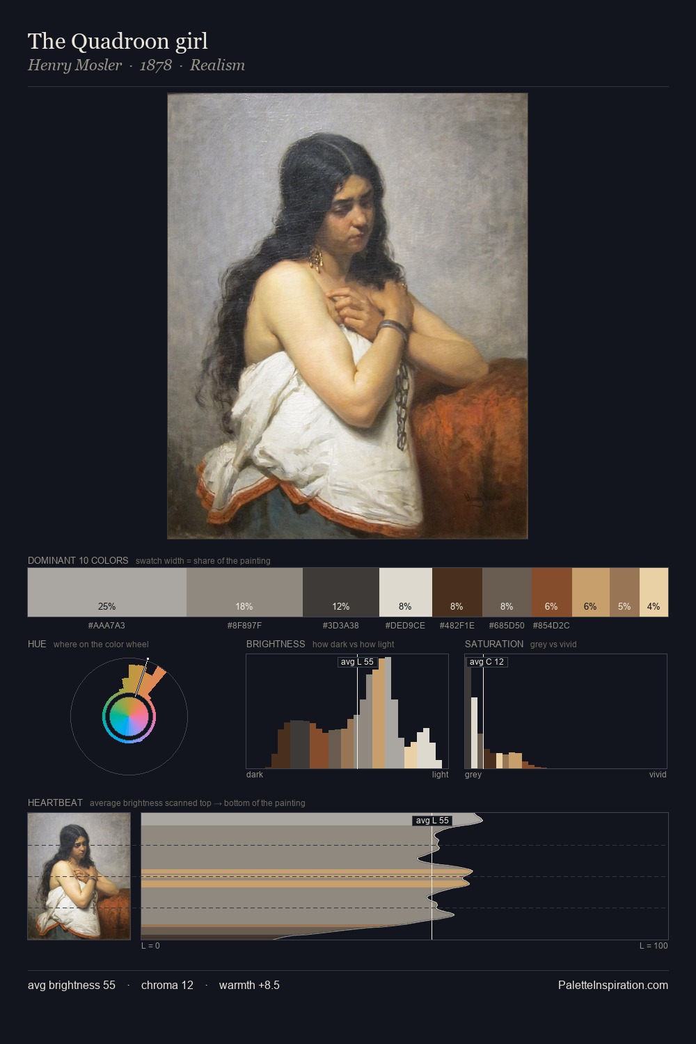
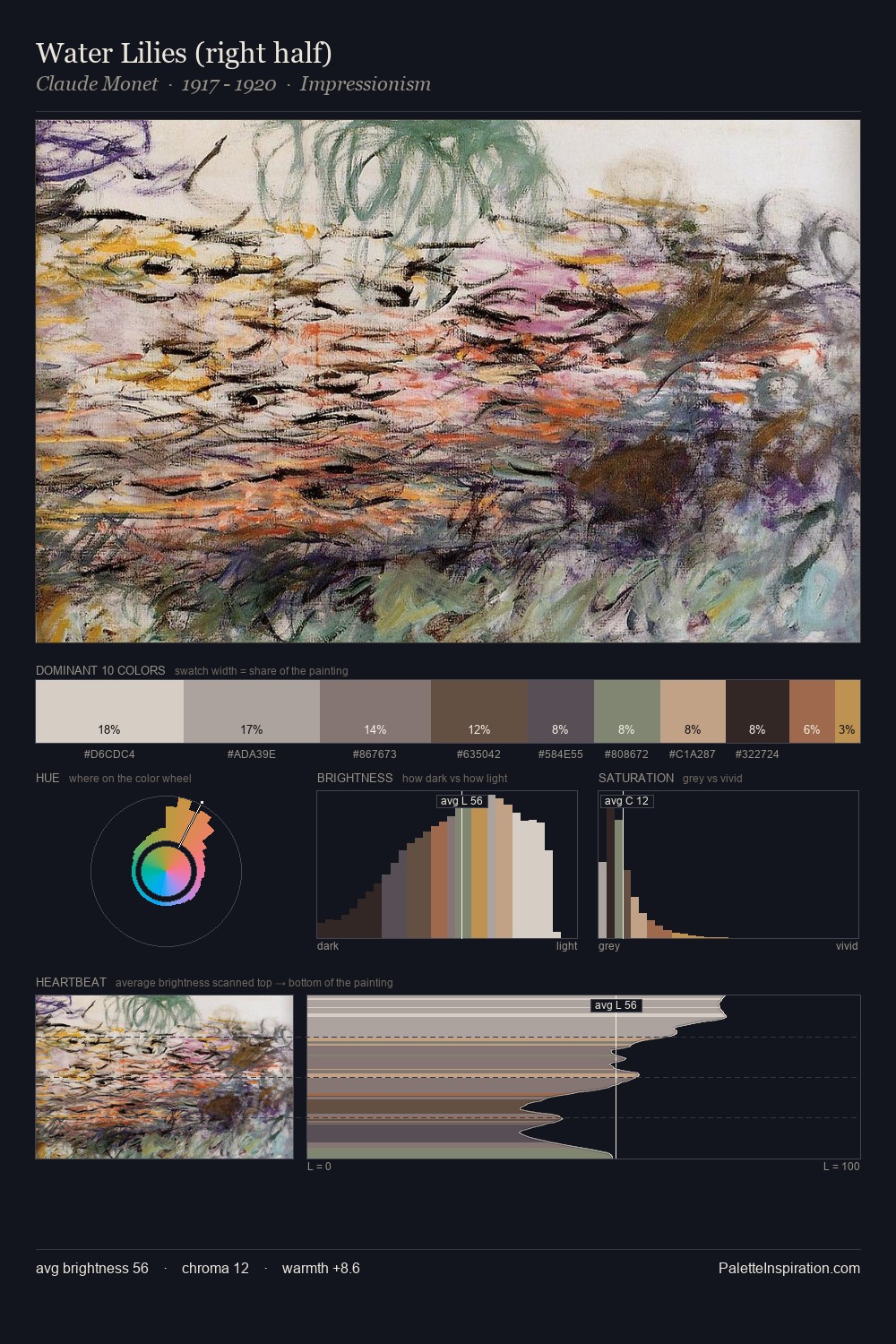
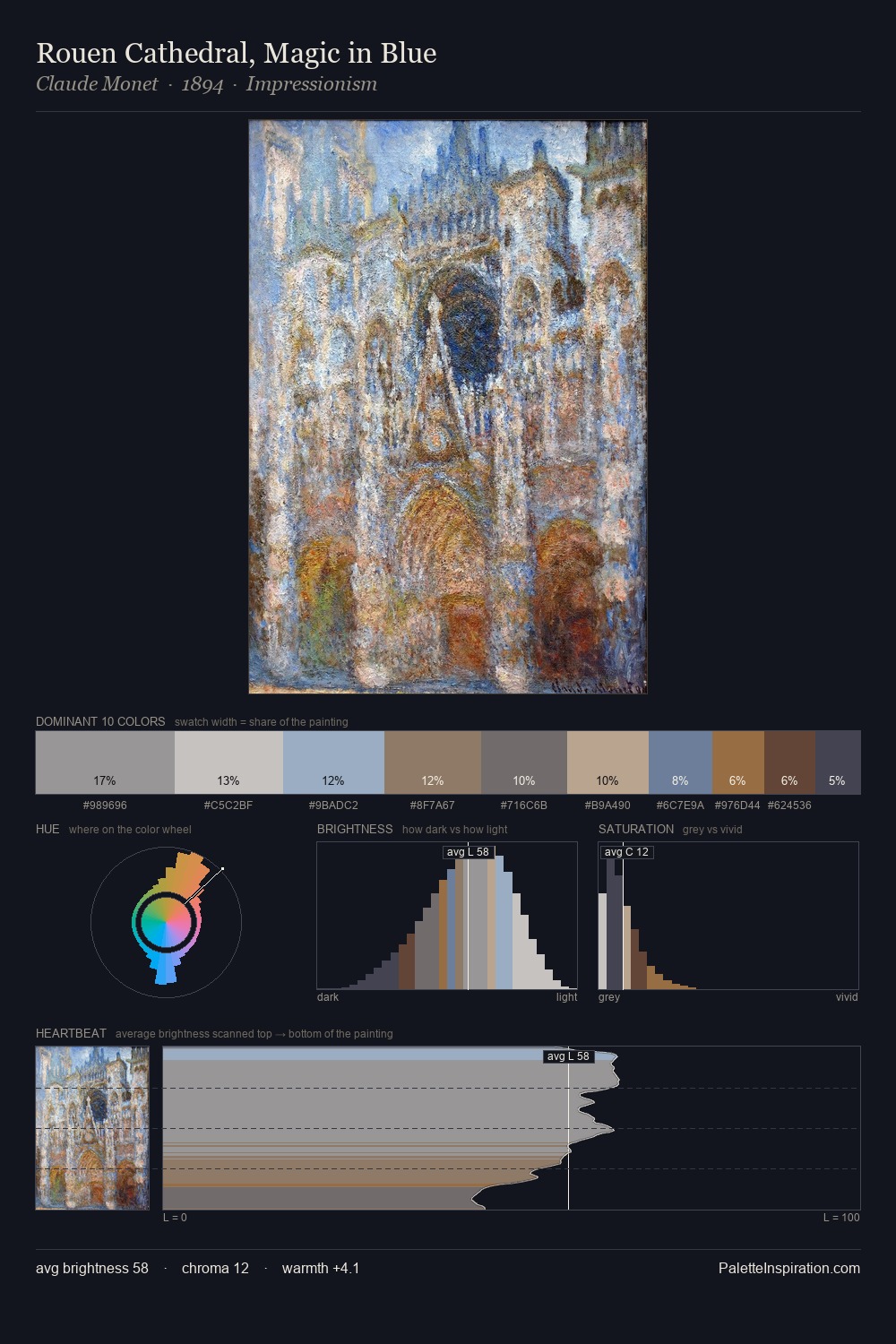
Constantin Artachino Palette 5
Pale Ivory
Pale High-key and low-chroma - delicate, bleached, washed with light.
Ivory Warm creamy white - the color of natural ivory, warmer than pure white.

Palette Analysis
Light floods Constantin Artachino; the palette keeps values pale and airy across its range. Warmth dominates - the palette of Constantin Artachino leans heavily on the yellow-orange-red arc of the colour wheel. Muted throughout, the palette achieves its effects through value and temperature rather than chromatic force. Only 9.0% is devoted to #BB9E7D, yet that small allocation delivers the palette's entire chromatic tension. Spanning 52 units on the value axis, the palette achieves the balance between tonal flatness and fragmentation. In the context of Constantin Artachino's full range of palettes, group 5 represents one movement in an ongoing chromatic dialogue.
Example use cases
- archival print
- university identity
- rare books
- cultural institutions
- nonprofit identity
I Love This!
Use This Palette
Copy, export, or download for your project
Copy, export, or download for your project
Copy:
Download:
Share: