Conrad Wise Chapman Master Palette
Soft Tawny
Soft Low-contrast, gentle chroma - mid-key values and low saturation, approachable and calm.
Tawny Warm orange-brown - a traditional term for the color of tanned leather or lion fur.

Palette Analysis
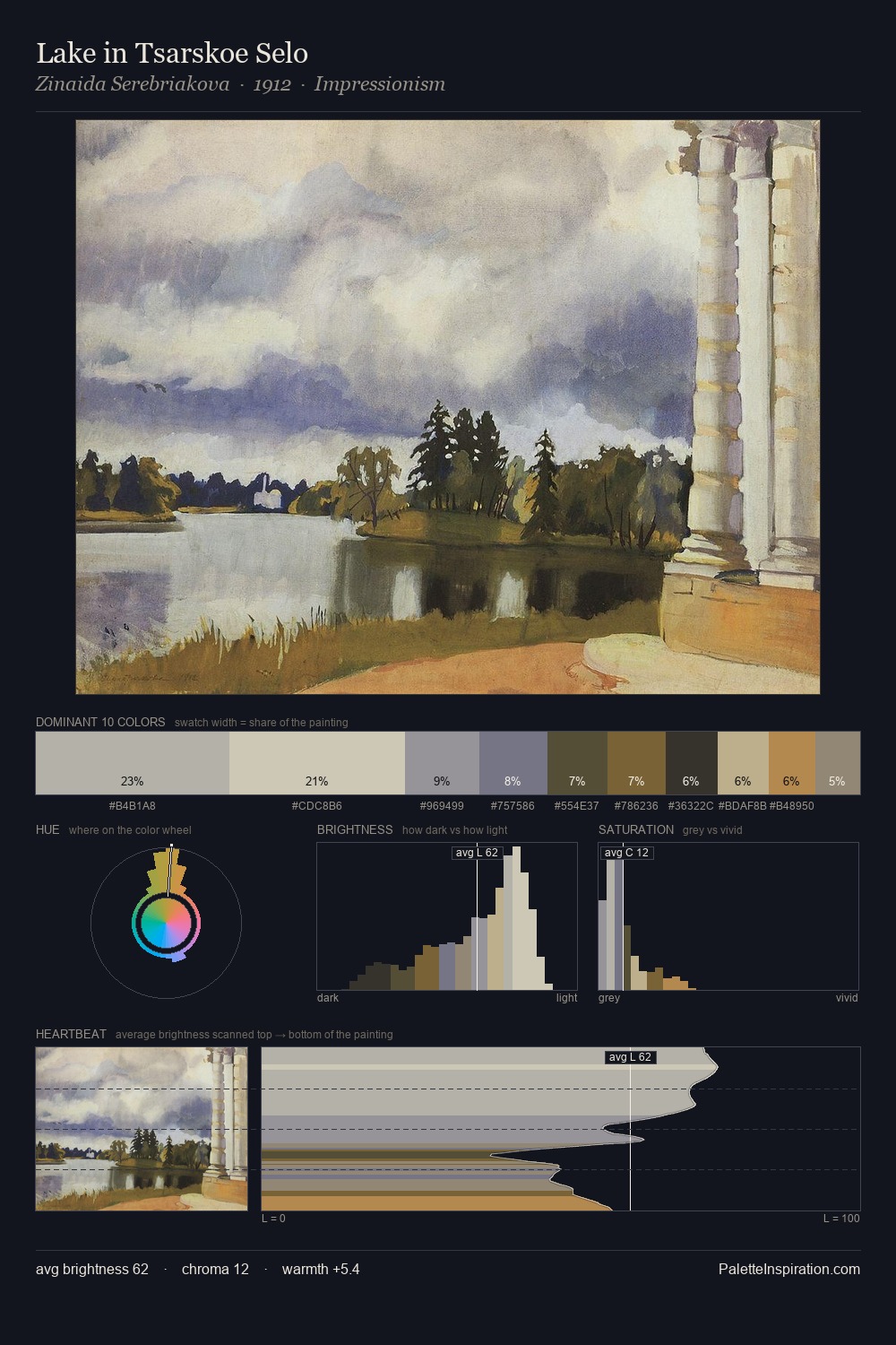
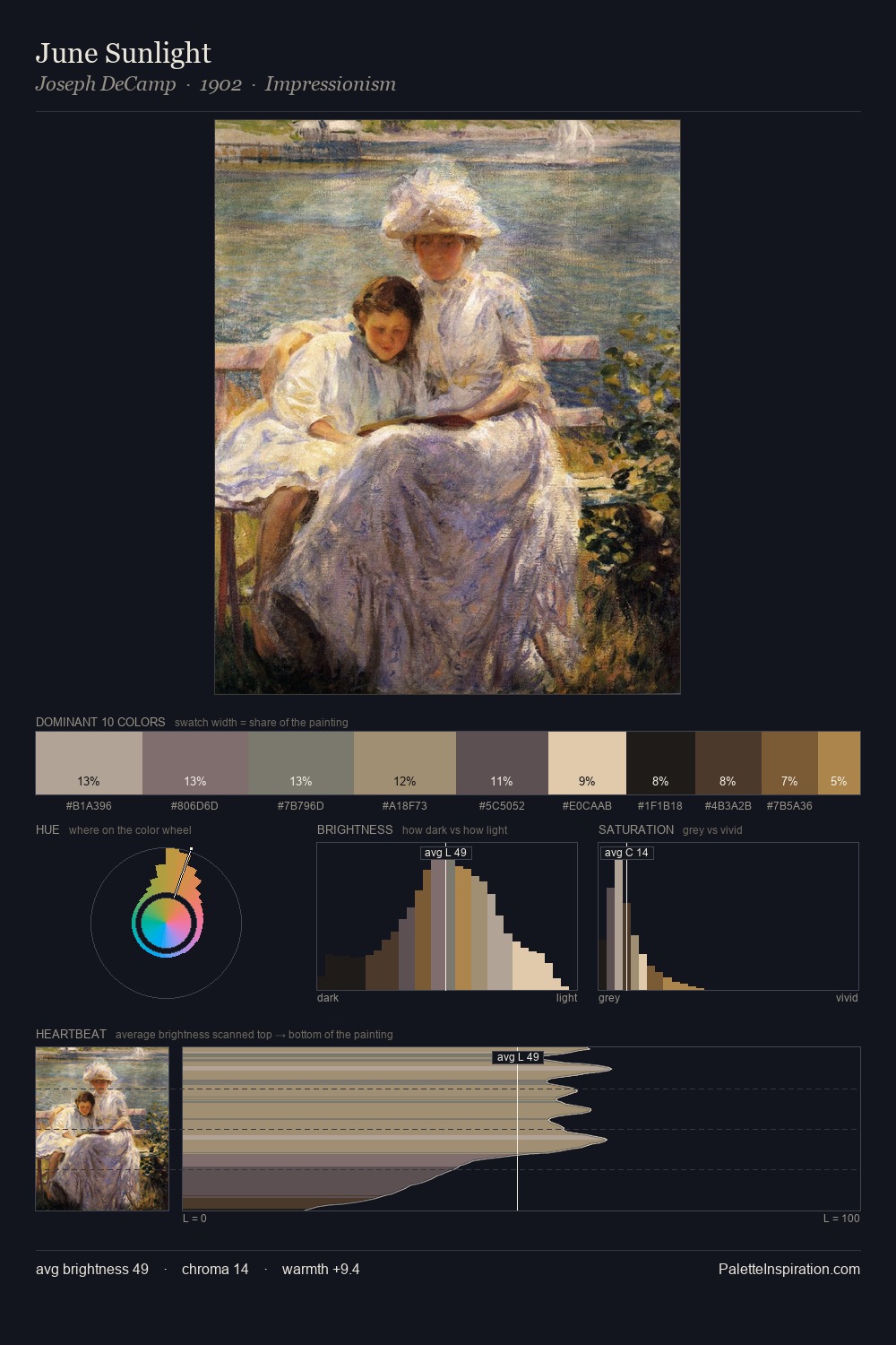
Conrad Wise Chapman sits in the centre of the value range, lending the palette a sense of even, sustained light. Cool hues prevail: blues, greens, and greys anchor the palette's emotional temperature. Every colour is desaturated; the palette proceeds through near-neutrals and gently-coloured greys. The saturated accent, #D7C294, registers at 6.8% - sparse enough to feel like a deliberate surprise. The palette spans 50 value units: a measured range that delivers coherence over drama. The mid-to-high key, cool bias, and moderate chroma point to outdoor observation - sky and diffused daylight as the dominant light source. These proportions encode Conrad Wise Chapman's instinctive sense of how much of each quality the eye can hold.
Example use cases
- ceramics & pottery
- boutique hospitality
- menswear
- heritage food brands
- craft & artisan brands
I Love This!
Use This Palette
Copy, export, or download for your project
Copy, export, or download for your project
Copy:
Download:
Share: