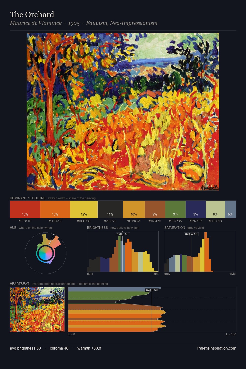
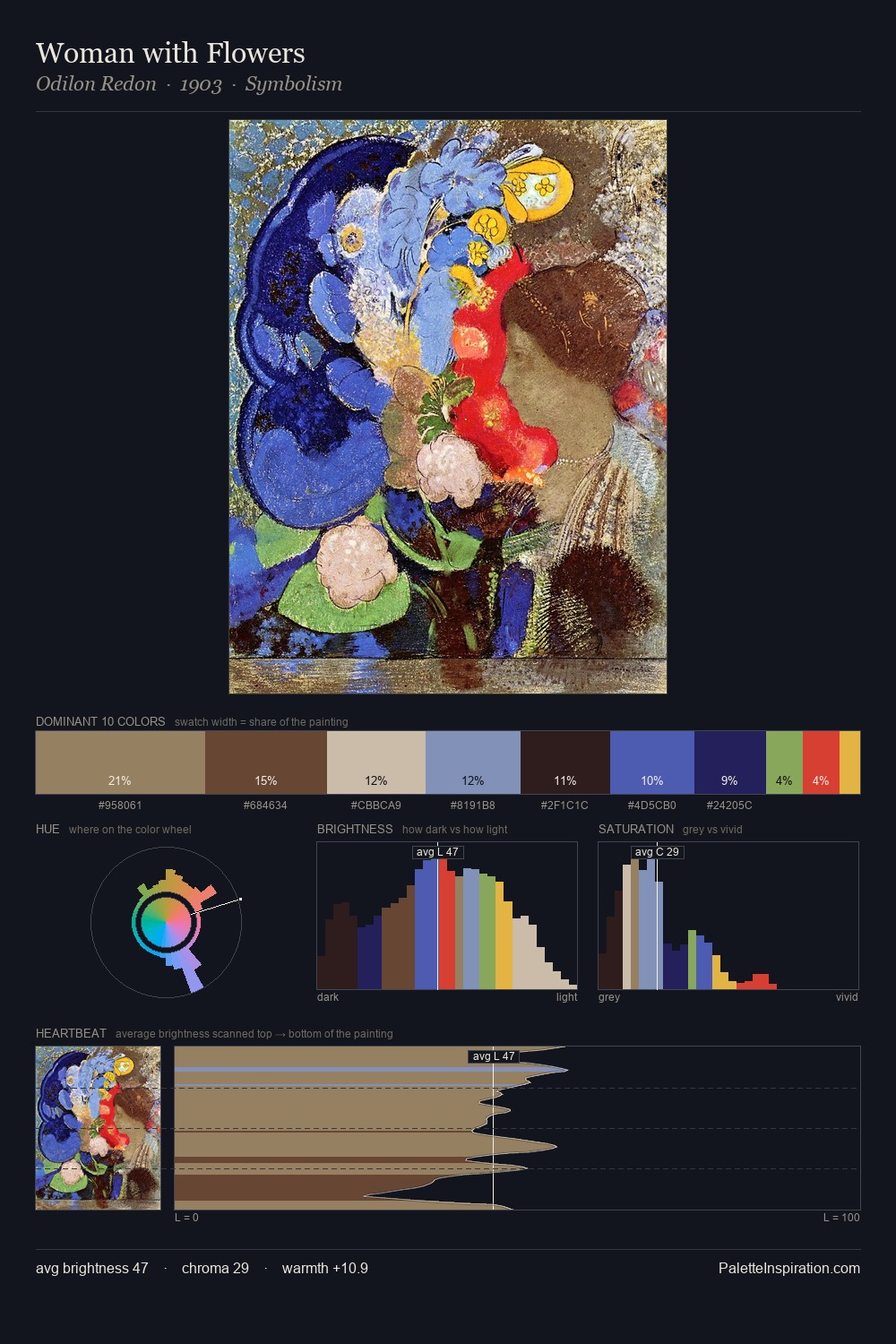
Concretism Master Palette
Palette Analysis
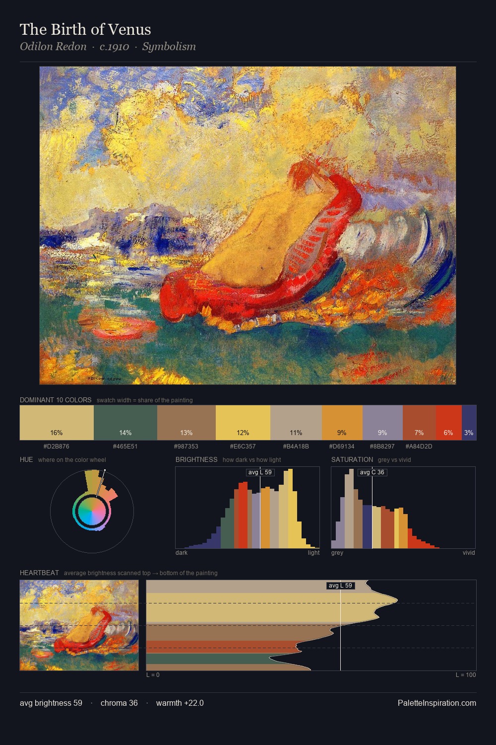
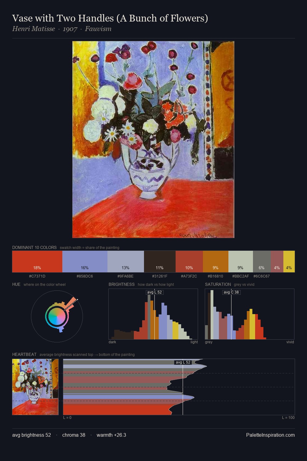
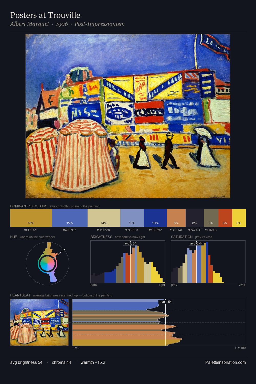
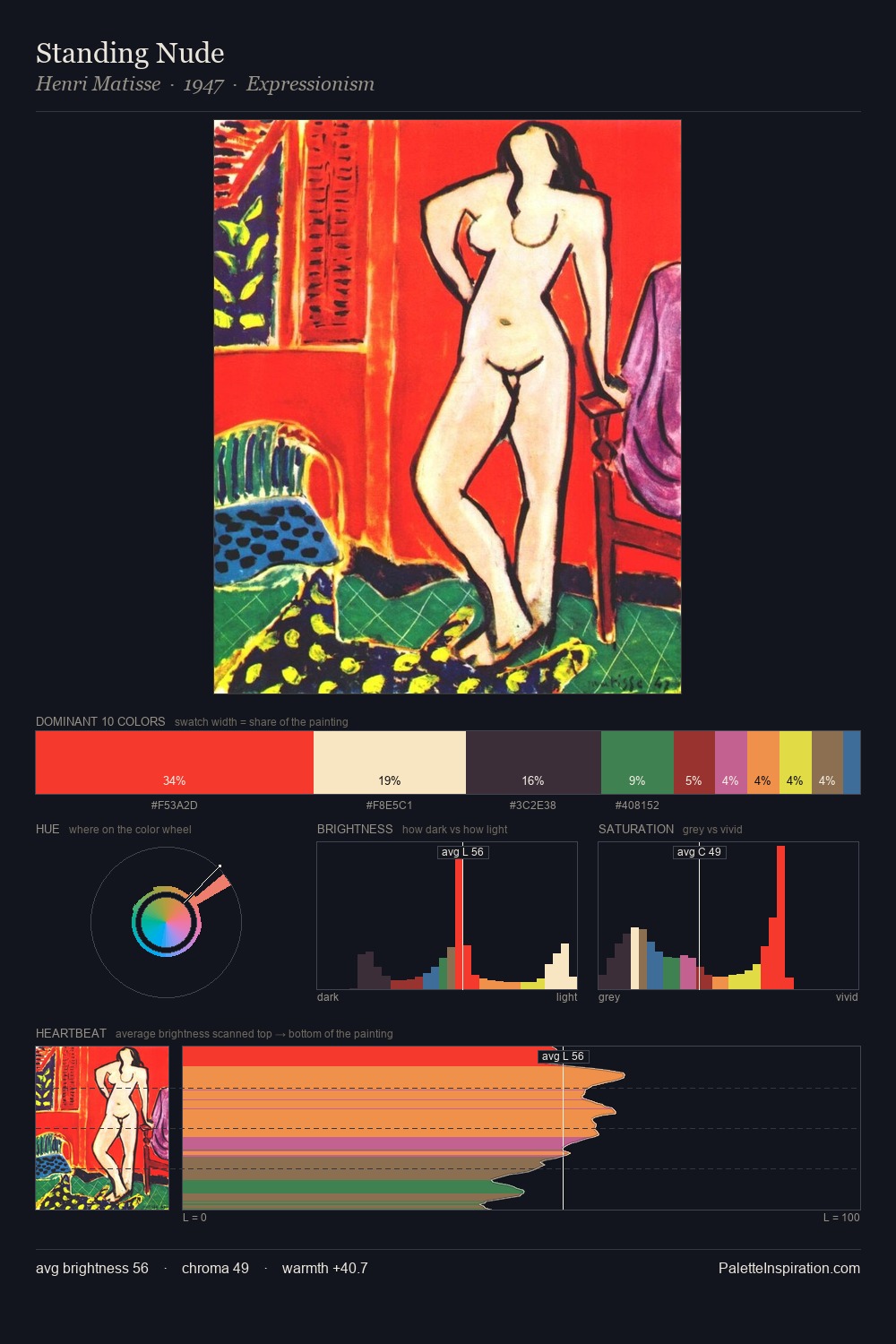
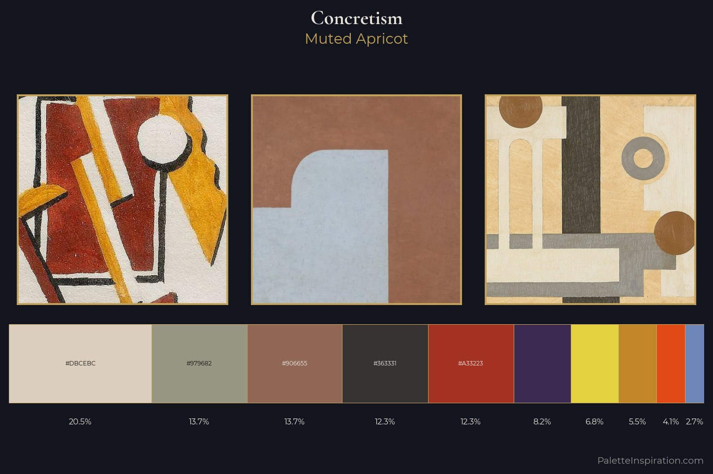
The colour logic of Concretism is concentrated here: its characteristic value range, temperature bias, and chroma level. Concretism sits in the centre of the value range, lending the palette a sense of even, sustained light. Neither warm nor cool has the upper hand here; the equilibrium between the two generates the palette's visual energy. Mid-saturation across the board: the palette has colour character without chromatic excess. #E4D13F functions as the palette's exclamation mark: highest chroma, lowest percentage (6.9%). The value range of 54 units sits in the comfortable middle: enough depth, enough light, neither extreme. Together these qualities point to the open-air Impressionist method: recording light rather than local colour. Applied to contemporary work, these proportions immediately evoke the Concretism register.
Example use cases
- ceramics & pottery
- boutique hospitality
- menswear
- heritage food brands
- craft & artisan brands
I Love This!
Copy, export, or download for your project