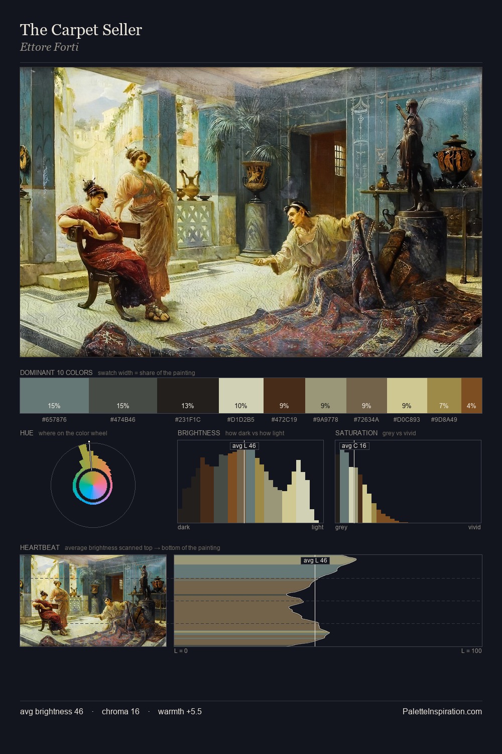
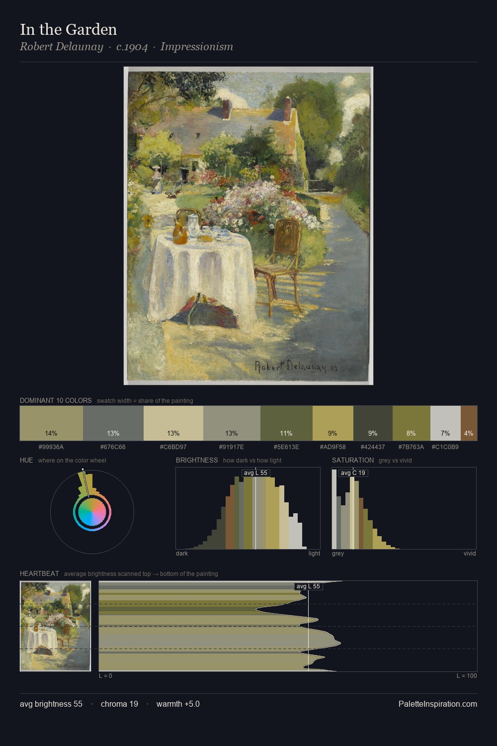
Concretism Palette 2
Soft Ecru
Soft Low-contrast, gentle chroma - mid-key values and low saturation, approachable and calm.
Ecru Unbleached linen - warm mid-neutral, slightly grayed, raw and natural.

Palette Analysis
Concretism is high-key - luminous, open, and weighted toward light. Temperature is cool-dominant, with blue and green families claiming the largest areas. All colours lean toward grey, building depth through value rather than colour punch. #D3CFAA delivers the chromatic peak at only 11.4% - a small shot of colour with outsized visual impact. Spanning 47 units on the value axis, the palette achieves the balance between tonal flatness and fragmentation. High luminosity and cool temperature suggest the plein-air condition: unfiltered daylight and open sky.
Example use cases
- ceramics & pottery
- boutique hospitality
- menswear
- heritage food brands
- craft & artisan brands
I Love This!
Use This Palette
Copy, export, or download for your project
Copy, export, or download for your project
Copy:
Download:
Share: