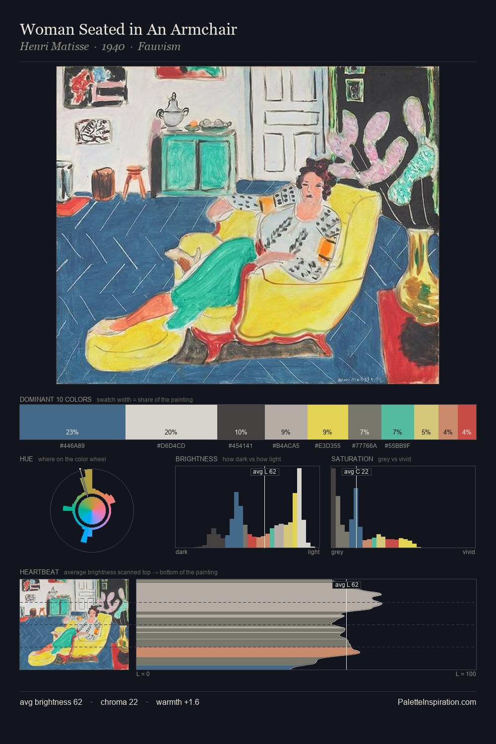
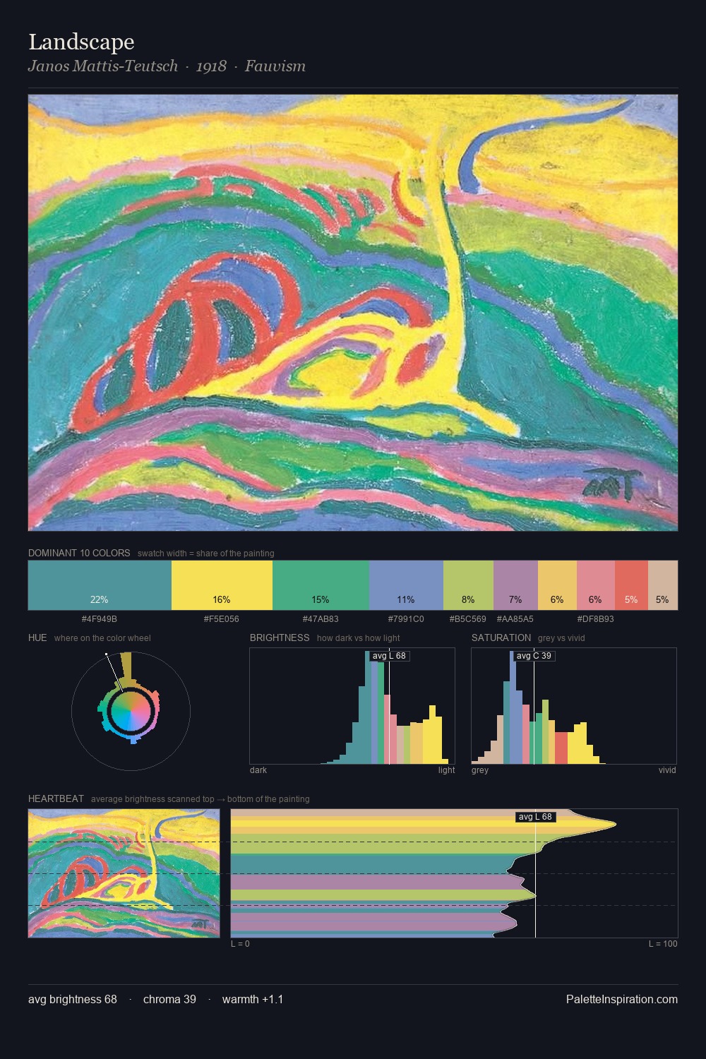
Concretism Palette 1
Luminous Cream
Luminous Self-illuminated feeling - high-key values with an inner glow quality.
Cream Warm white - slightly yellowed, rich, the color of heavy dairy.

Palette Analysis
Light floods Concretism; the palette keeps values pale and airy across its range. Warm and cool tones are held in careful balance - neither family dominates, creating tension and resolution simultaneously. A restrained, mid-chroma palette: every hue is present and legible, but nothing shouts. The palette gives 34.2% of the composition to a single #D9A3BC - a decisive chromatic anchor. The highest-chroma note - #FDE930 - appears at just 2.1%, deployed as a precision accent against the quieter ground. Spanning 47 units on the value axis, the palette achieves the balance between tonal flatness and fragmentation. Together these qualities point to the open-air Impressionist method: recording light rather than local colour.
Example use cases
- publishing
- corporate identity
- consumer apps
- hospitality
- design agencies
I Love This!
Use This Palette
Copy, export, or download for your project
Copy, export, or download for your project
Copy:
Download:
Share: