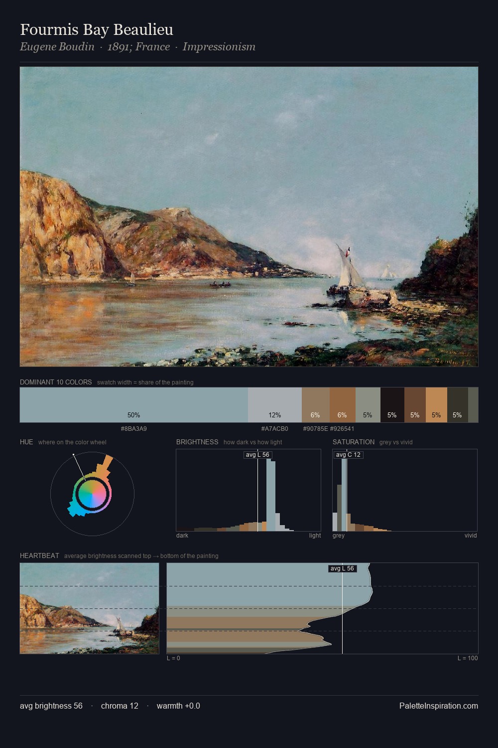
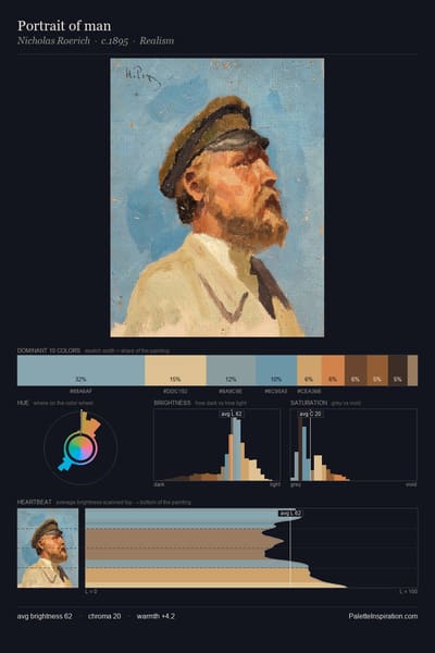
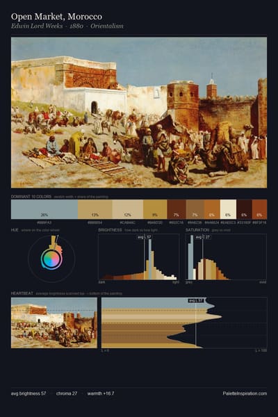
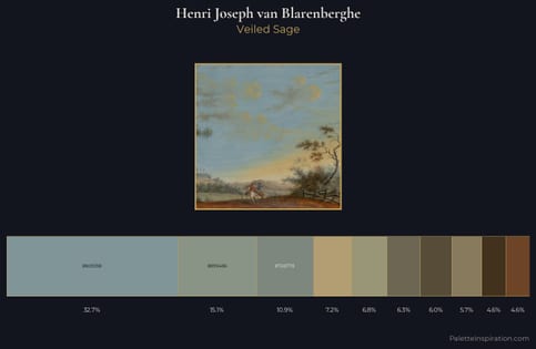
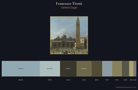
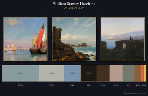
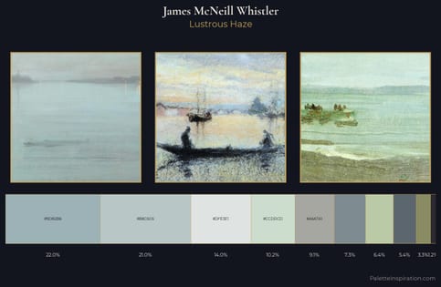
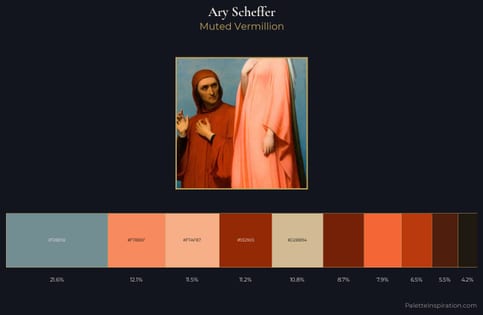
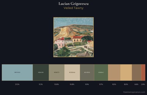
Tourmaline (#86A1A9) is a mid-tone cool shade that appears across 19 master palettes in our corpus, most prominently in the work of Martín Rico y Ortega, Henri Joseph van Blarenberghe, and Francesco Tironi and the Impressionism tradition. Master painters paired it most often with Khaki (#C3B091), Bone (#E3DAC9), and Bistre (#3D2B1F). The combination forms a steady, atmospheric chord, built on a complementary hue split, leans on warm companions to lift a cool source color, with the pair colors held at a similar value to the source.