Francesco Tironi Palette 2
Palette Analysis
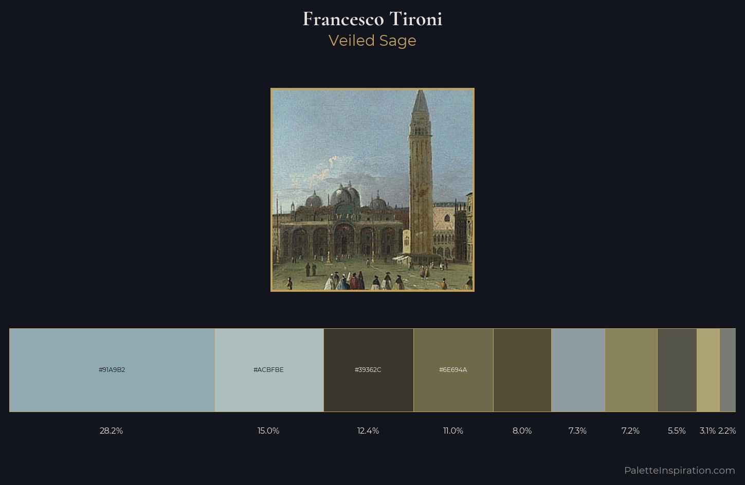
Francesco Tironi distributes its values across the middle register, creating harmony without high contrast. Francesco Tironi tilts toward cool - blues and silver-greys carry the structural weight. The absence of saturated colour is itself an expressive choice: this is a palette of restraint and atmosphere. 28.2% of the palette belongs to #91A9B2, a concentration that makes it the unmistakable visual centre. The most saturated colour, #ACA274, is reserved to 3.1% of the surface, where it acts as a focal punctuation. Spanning 46 units on the value axis, the palette achieves the balance between tonal flatness and fragmentation. The mid-to-high key, cool bias, and moderate chroma point to outdoor observation - sky and diffused daylight as the dominant light source. Palette 2 sits within the larger chromatic argument that Francesco Tironi's complete body of work advances.
Example use cases
- nonprofit identity
- public libraries
- historical sites
- literary journals
- archival print
I Love This!
Copy, export, or download for your project