Colors that go with

Powder blue

#B0E0E6

Or pick a different color

Open on color wheel →

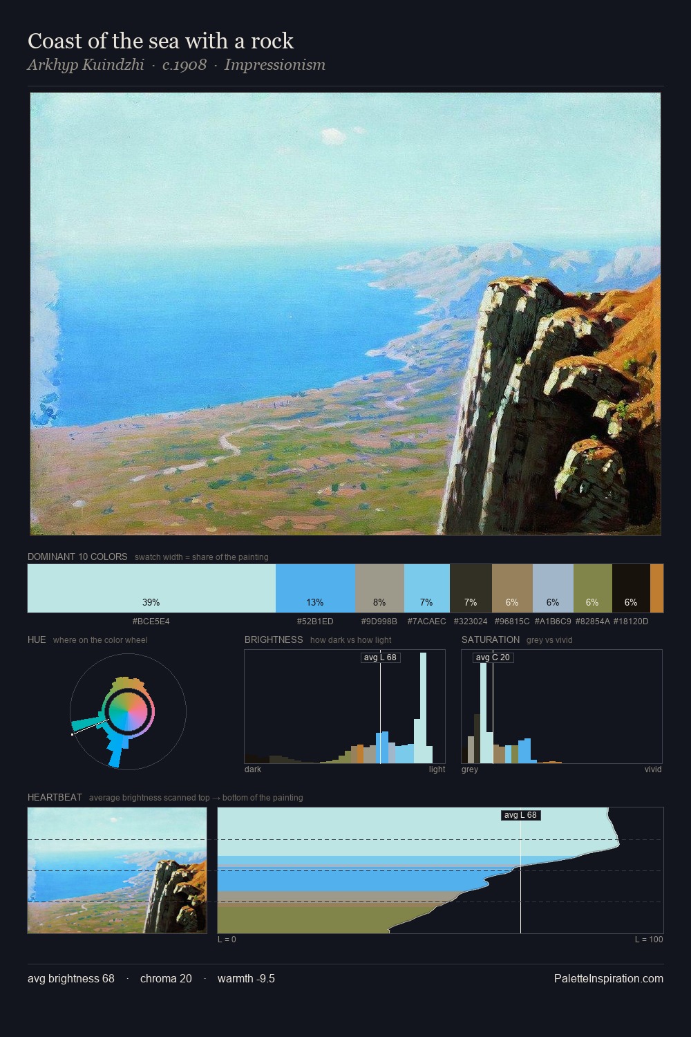
Powder blue (#B0E0E6) is a light cool shade that appears across 8 master palettes in our corpus, most prominently in the work of Franz Richard Unterberger, Maerten van Heemskerck, and James Ward and the Realism tradition. Master painters paired it most often with Khaki (#C3B091), Bone (#E3DAC9), and Drab dark brown (#4A412A). The combination forms an airy, hazy chord, built on a split-complementary spread, leans on warm companions to lift a cool source color, with a moderate step down in value that keeps the source forward.
Artworks Featuring This Color

The Cabbage Patch palette card
The Cabbage Patch
John Henry Twachtman · 1890
Sea coast. Crimean coast near Ai-Petri palette card
Sea coast. Crimean coast near Ai-Petri
Ivan Aivazovsky · 1890
A Terrace in Morocco palette card
A Terrace in Morocco
Benjamin Constant · 1880
Spring, Navesink Highlands palette card
Spring, Navesink Highlands
Childe Hassam · 1908
Farmhouses in a Wheat Field Near Arles palette card
Farmhouses in a Wheat Field Near Arles
Vincent van Gogh · 1888
Mountains Soshing palette card
Mountains Soshing
Nicholas Roerich · 1924

Master palettes

Palettes Featuring Powder blue

6 palettes where Powder blue appears prominently — one per artist.

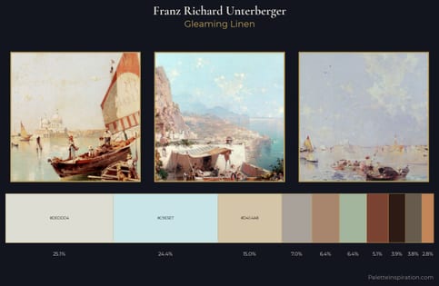
Franz Richard Unterberger Palette 1 - Gleaming Linen

Franz Richard Unterberger

24.4% Powder blue

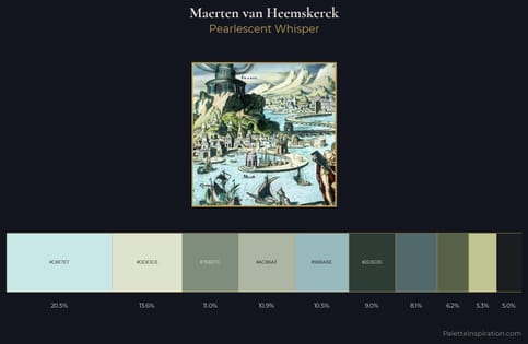
Maerten van Heemskerck Palette 2 - Pearlescent Whisper

Maerten van Heemskerck

20.5% Powder blue

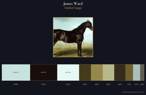
James Ward Palette 4 - Veiled Sage

James Ward

19.8% Powder blue

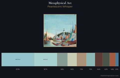
Metaphysical art Palette 2 - Pearlescent Whisper

Metaphysical art

19.7% Powder blue

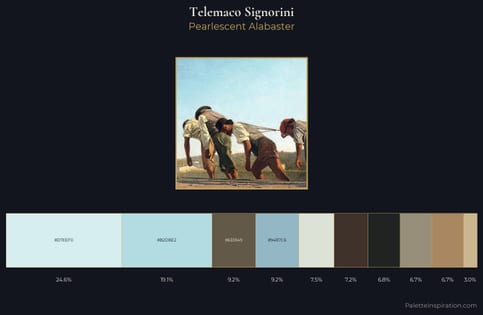
Telemaco Signorini Palette 1 - Pearlescent Alabaster

Telemaco Signorini

19.1% Powder blue

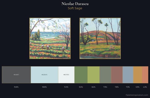
Nicolae Darascu Palette 3 - Soft Sage

Nicolae Darascu

18.8% Powder blue

Choose another color