Maerten van Heemskerck Palette 2

Palette Analysis
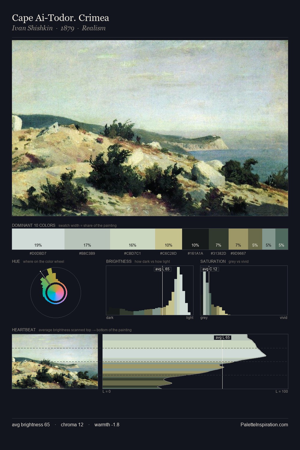
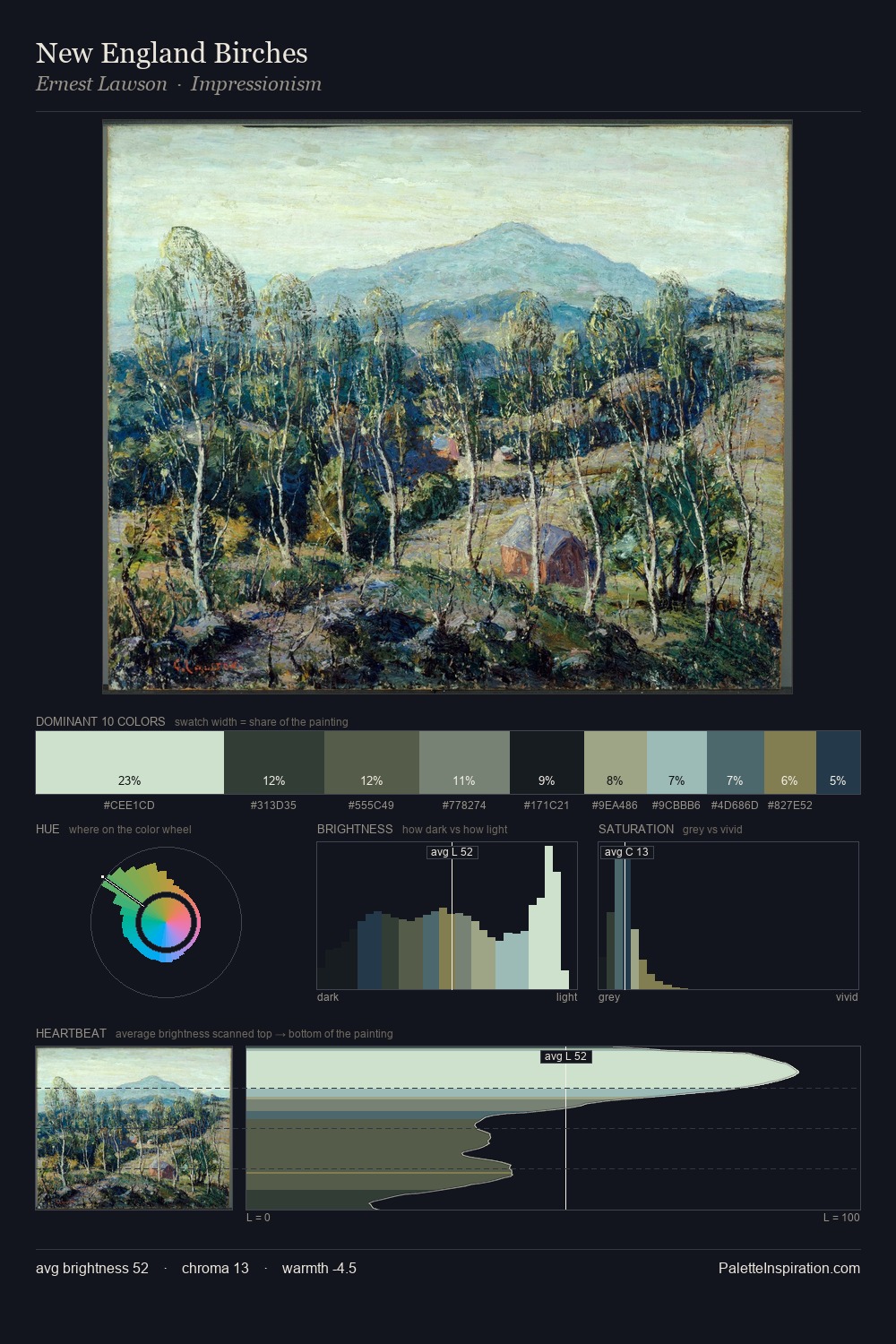
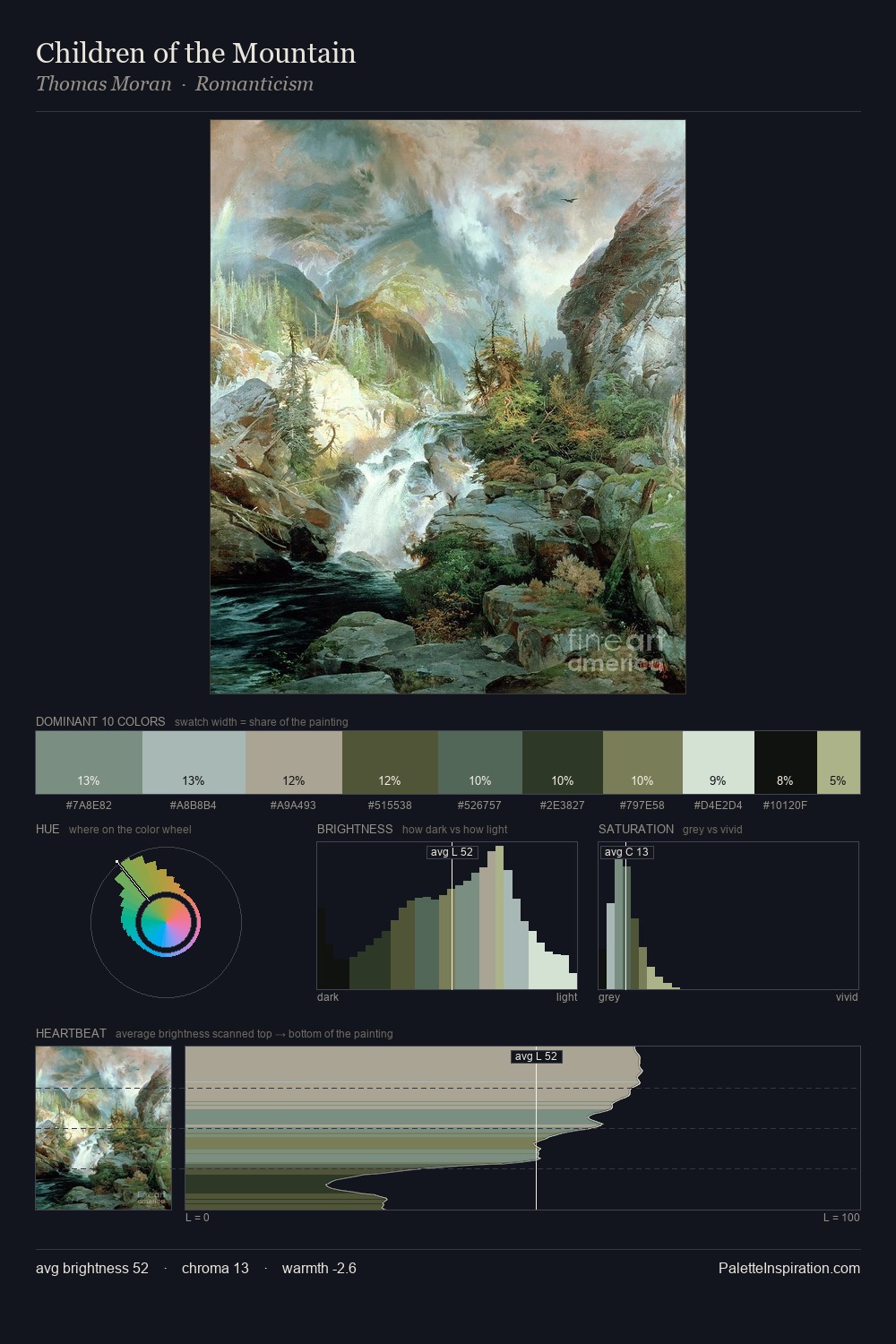
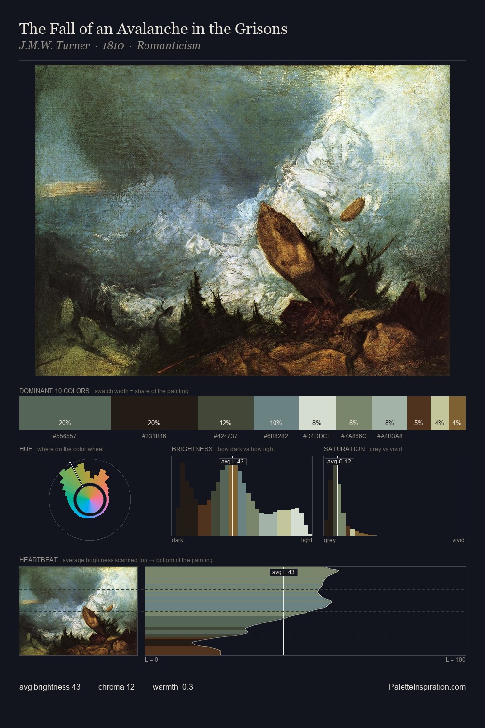
Light floods Maerten van Heemskerck; the palette keeps values pale and airy across its range. Maerten van Heemskerck builds on cool foundations: the palette favours the blue-cyan-green arc. All colours lean toward grey, building depth through value rather than colour punch. At 10.5%, #98BABE carries the palette's sharpest chromatic charge: an accent that earns its place precisely because it is withheld. A value spread of 68 units gives the palette both depth and air - shadows are genuinely dark, lights genuinely light. The mid-to-high key, cool bias, and moderate chroma point to outdoor observation - sky and diffused daylight as the dominant light source. Maerten van Heemskerck's palette 2 carries its own internal logic while remaining in conversation with the artist's broader colour intelligence.
Example use cases
- exhibition design
- foundation branding
- estate management
- art education
- museums & galleries
I Love This!
Copy, export, or download for your project