Colors that go with

Pale cerulean

#9BC4E2

Or pick a different color

Open on color wheel →

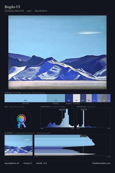
Pale cerulean (#9BC4E2) is a light cool shade that appears across 8 master palettes in our corpus, most prominently in the work of Charles Conder, Jury Annenkov, and William James Glackens and the Impressionism tradition. Master painters paired it most often with Drab dark brown (#4A412A), Camel (#C19A6B), and Platinum (#E5E4E2). The combination forms an airy, hazy chord, built on a complementary hue split, leans on warm companions to lift a cool source color, with the pair colors held at a similar value to the source.
Artworks Featuring This Color

Hudson River palette card
Hudson River
Leon Dabo · 1918
Holy Creek near Yelabuga palette card
Holy Creek near Yelabuga
Ivan Shishkin · 1886
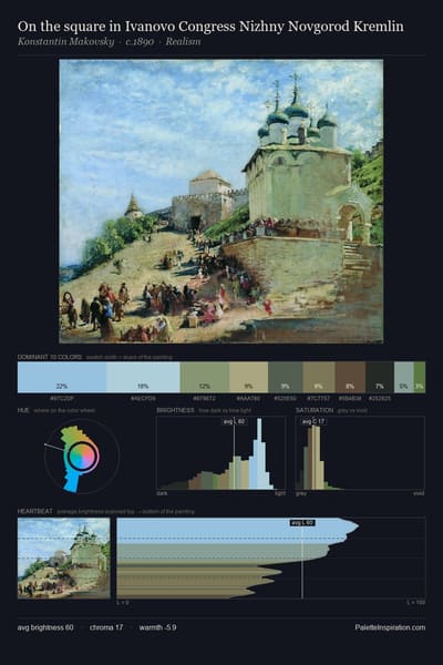
On the square in Ivanovo Congress Nizhny Novgorod Kremlin palette card
On the square in Ivanovo Congress Nizhny Novgorod Kremlin
Konstantin Makovsky · 1890
Wide Lands of the Navajo palette card
Wide Lands of the Navajo
Maynard Dixon · 1945
The glory of Himalayas palette card
The glory of Himalayas
Nicholas Roerich
Telegraph Hill - San Fraicisco palette card
Telegraph Hill - San Fraicisco
Childe Hassam · 1914

Master palettes

Palettes Featuring Pale cerulean

6 palettes where Pale cerulean appears prominently — one per artist.

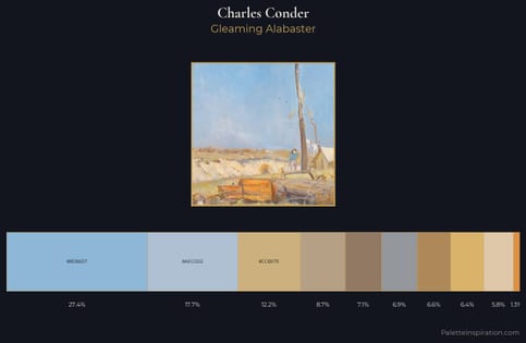
Charles Conder Palette 1 - Gleaming Alabaster

Charles Conder

27.4% Pale cerulean

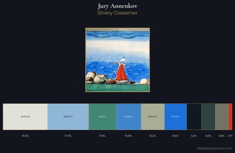
Jury Annenkov Palette 3 - Silvery Gossamer

Jury Annenkov

17.9% Pale cerulean

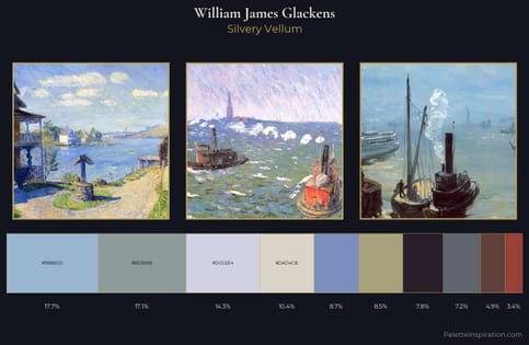
William James Glackens Palette 3 - Silvery Vellum

William James Glackens

17.7% Pale cerulean

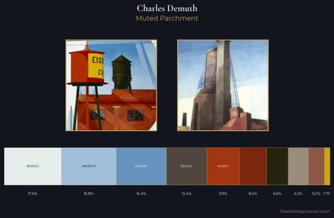
Charles Demuth Palette 6 - Muted Parchment

Charles Demuth

16.8% Pale cerulean

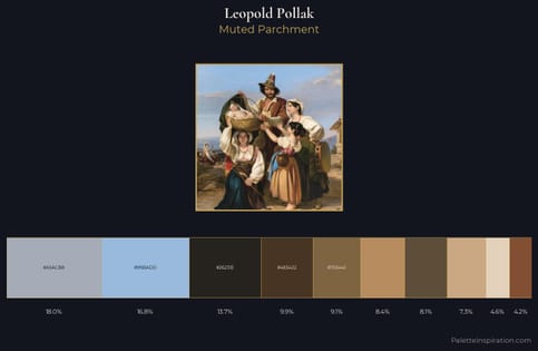
Leopold Pollak Palette 3 - Muted Parchment

Leopold Pollak

16.8% Pale cerulean

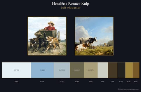
Henriëtte Ronner-Knip Palette 1 - Soft Alabaster

Henriëtte Ronner-Knip

16.7% Pale cerulean

Choose another color