Charles Conder Palette 1

Palette Analysis
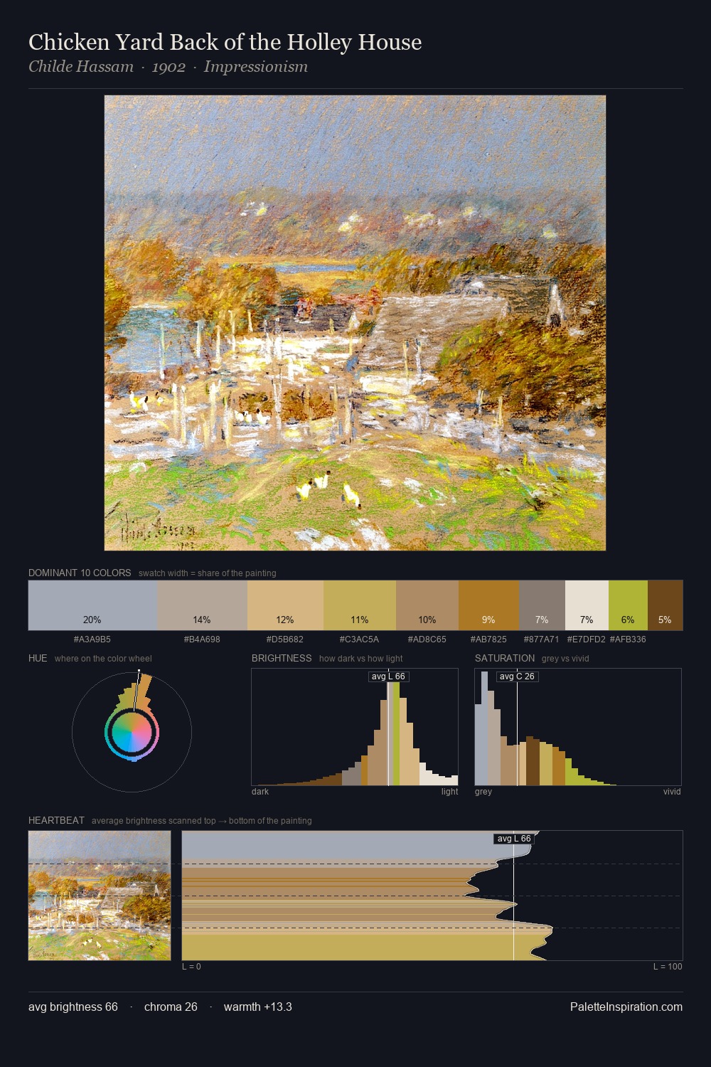
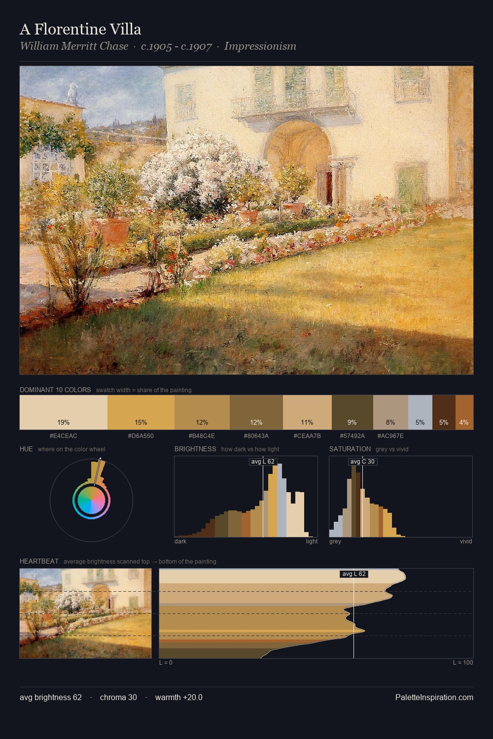
Light floods Charles Conder; the palette keeps values pale and airy across its range. Charles Conder tilts toward cool - blues and silver-greys carry the structural weight. The absence of saturated colour is itself an expressive choice: this is a palette of restraint and atmosphere. #8EB6D7 claims 27.4% of the surface, functioning as the work's tonal foundation. #DAB36B functions as the palette's exclamation mark: highest chroma, lowest percentage (6.4%). 25 units of value spread create a palette that is varied but unified - contrast in the service of harmony. High luminosity and cool temperature suggest the plein-air condition: unfiltered daylight and open sky. In the context of Charles Conder's full range of palettes, group 1 represents one movement in an ongoing chromatic dialogue.
Example use cases
- publishing
- corporate identity
- consumer apps
- hospitality
- design agencies
I Love This!
Copy, export, or download for your project