Colors that go with

Medium carmine

#AF4035

Or pick a different color

Open on color wheel →

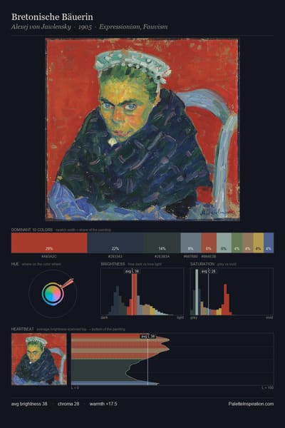
Medium carmine (#AF4035) is a mid-tone warm shade that appears across 11 master palettes in our corpus, most prominently in the work of Hilma af Klint, Henri Matisse, and Albert Herter and the Impressionism tradition. Master painters paired it most often with Khaki (#C3B091), Bone (#E3DAC9), and Raisin black (#242124). The combination forms a sun-bleached, daylight chord, reads as a unified warm palette, with the pair colors held at a similar value to the source.
Artworks Featuring This Color

The Mystic Wood palette card
The Mystic Wood
John William Waterhouse · 1914
Venus, Wounded by Diomedes, is Saved by Iris palette card
Venus, Wounded by Diomedes, is Saved by Iris
Joseph-Marie Vien · 1775
Unknown palette card
Unknown
Raphael Kirchner · 1916
Mosquito Nets palette card
Mosquito Nets
John Singer Sargent · 1908
Full moon on the water palette card
Full moon on the water
Jan Sluyters · 1912
Descent from the Cross (right wing) palette card
Descent from the Cross (right wing)
Peter Paul Rubens · 1612

Master palettes

Palettes Featuring Medium carmine

6 palettes where Medium carmine appears prominently — one per artist.

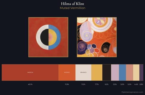
Hilma af Klint Palette 3 - Muted Vermillion

Hilma af Klint

40.1% Medium carmine

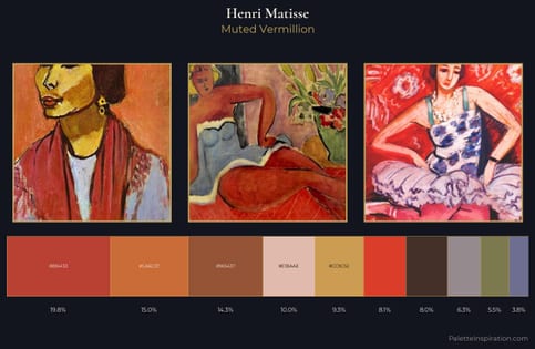
Henri Matisse Palette 20 - Muted Vermillion

Henri Matisse

19.8% Medium carmine

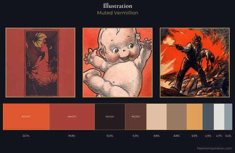
illustration Palette 5 - Muted Vermillion

illustration

19.8% Medium carmine

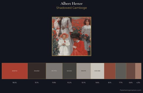
Albert Herter Palette 3 - Shadowed Gamboge

Albert Herter

18.5% Medium carmine

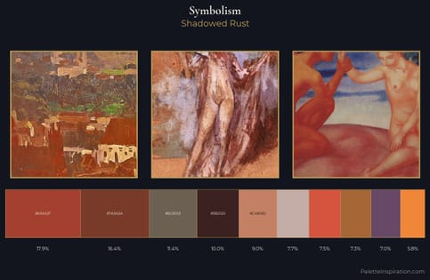
Symbolism Palette 35 - Shadowed Rust

Symbolism

17.9% Medium carmine

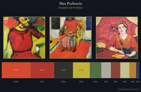
Max Pechstein Palette 6 - Muted Vermillion

Max Pechstein

17.1% Medium carmine

Choose another color