Max Pechstein Palette 6

Palette Analysis
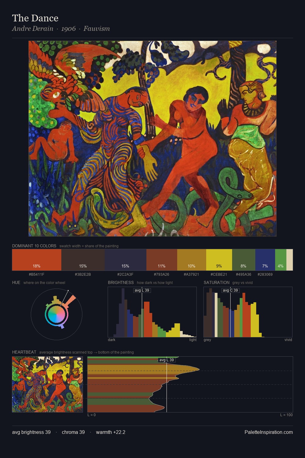
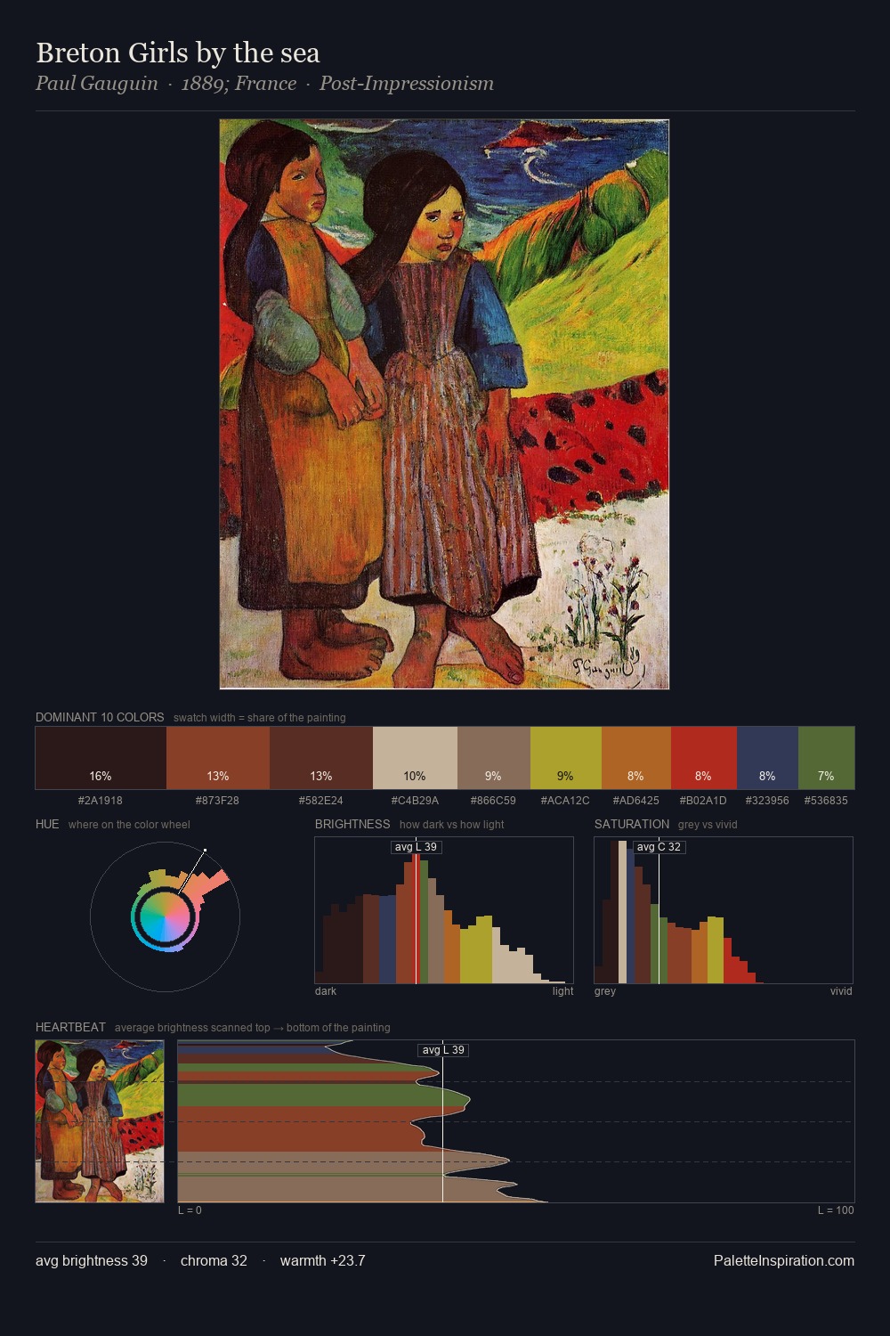
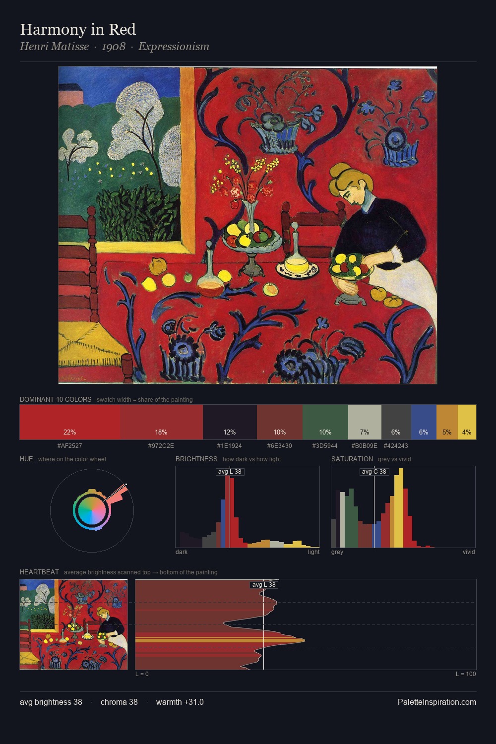
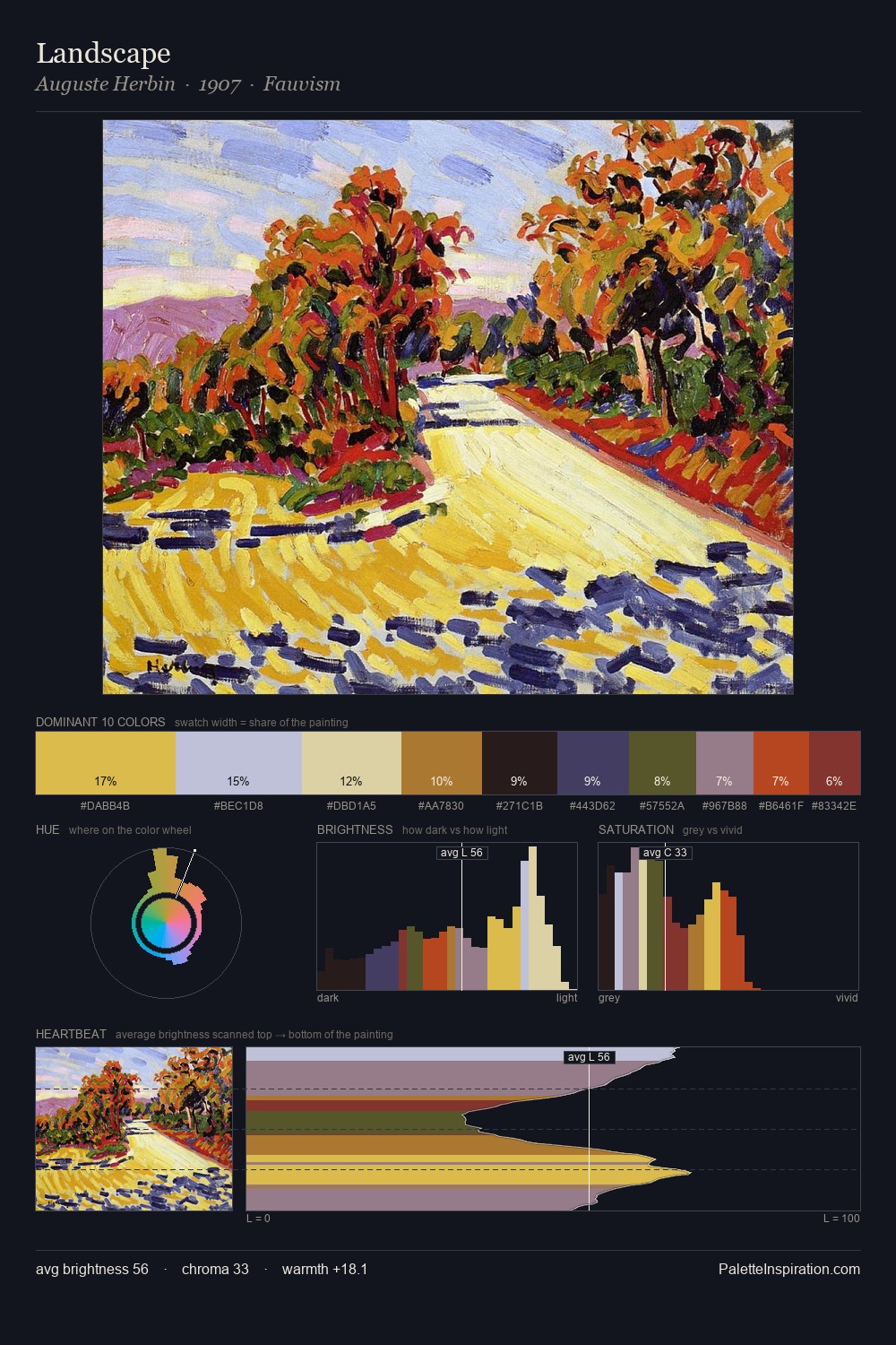
Max Pechstein sits in the centre of the value range, lending the palette a sense of even, sustained light. Warm and cool tones are held in careful balance - neither family dominates, creating tension and resolution simultaneously. Mid-saturation across the board: the palette has colour character without chromatic excess. The chromatic peak belongs to #D34A2D, and at 20.8% it dominates, not decorates. Value range is moderate at 49 units - enough contrast for legibility, not so much as to fragment the tonal unity. The palette reads as an Impressionist one - light-biased, chromatically direct, and built on temperature contrast rather than value opposition. Palette 6 sits within the larger chromatic argument that Max Pechstein's complete body of work advances.
Example use cases
- publishing
- corporate identity
- consumer apps
- hospitality
- design agencies
I Love This!
Copy, export, or download for your project