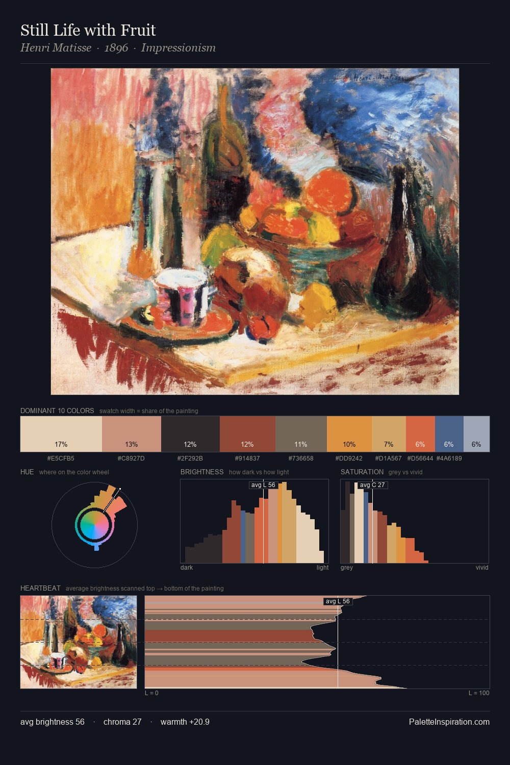
Hilma af Klint Palette 3

Palette Analysis
The value structure of Hilma af Klint is mid-key: quiet, controlled, and cohesive. Warmth dominates - the palette of Hilma af Klint leans heavily on the yellow-orange-red arc of the colour wheel. Colours are neither washed out nor blazing; they occupy the productive middle ground of the chroma scale. 40.1% of the palette belongs to #AB3E2A, a concentration that makes it the unmistakable visual centre. At 4.4%, #E8CE9F carries the palette's sharpest chromatic charge: an accent that earns its place precisely because it is withheld. A value spread of 64 units gives the palette both depth and air - shadows are genuinely dark, lights genuinely light. This is palette 3 of Hilma af Klint's sequence - a single chapter in a chromatic story told across many works.
Example use cases
- publishing
- corporate identity
- consumer apps
- hospitality
- design agencies
I Love This!
Copy, export, or download for your project