Color one

Khaki

#C3B091

Color two

Opal

#A8C3BC

Khaki (#C3B091) and Opal (#A8C3BC) appear together across 6 master palettes in our corpus, most prominently in the work of Georgina de Albuquerque, Henri-Pierre Picou, and Kimon Loghi and the Impressionism tradition. Painters typically deployed khaki at an average of 30% of the canvas, with opal at 16%. Third colors most often completing the combination include Bone (#E3DAC9), Shadow (#8A795D), and Timberwolf (#DBD7D2).
Artworks Featuring Khaki & Opal

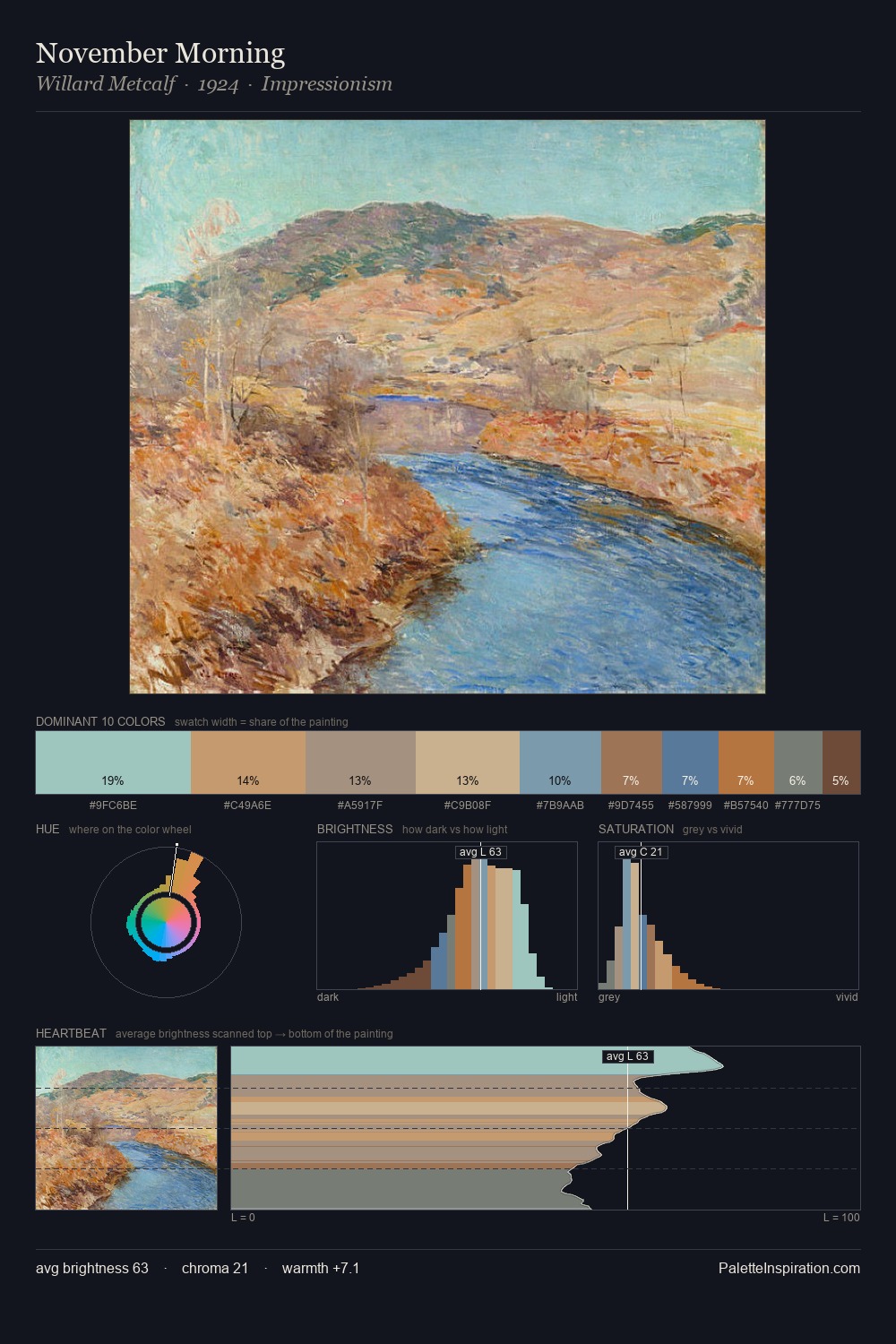
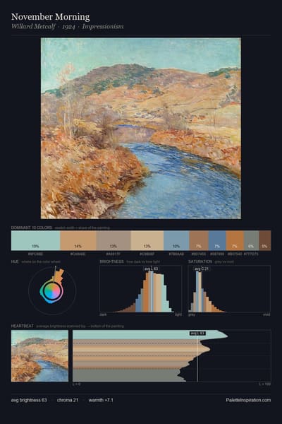
November Morning palette card
November Morning
Willard Metcalf · 1924
A Field of California Poppies palette card
A Field of California Poppies
Granville Redmond
The Spiritual Crown of Annie Mary Howitt Watts palette card
The Spiritual Crown of Annie Mary Howitt Watts
Georgiana Houghton
Searching for Survivors palette card
Searching for Survivors
Ivan Aivazovsky
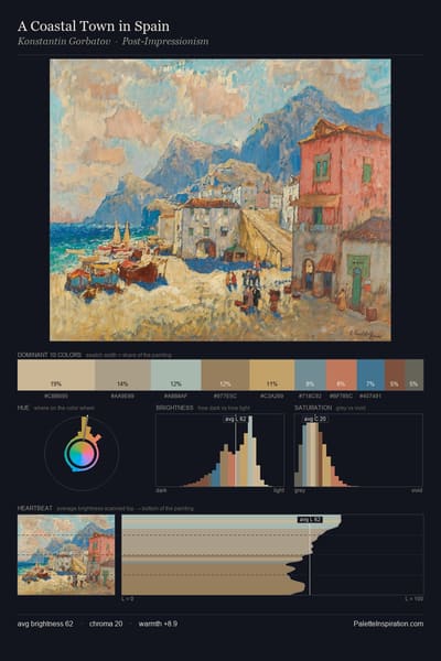
A Coastal Town in Spain palette card
A Coastal Town in Spain
Konstantin Gorbatov
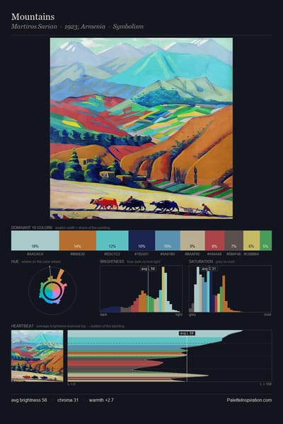
Mountains palette card
Mountains
Martiros Sarian · 1923

Master palettes

Palettes Featuring Khaki & Opal

6 master palettes where Khaki and Opal appear together most prominently.

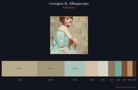
Georgina de Albuquerque Palette 1 - Soft Ecru

Georgina de Albuquerque

46.5% Khaki · 15.6% Opal

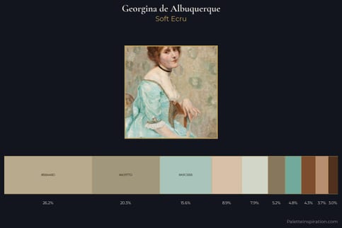
Georgina de Albuquerque Master Palette - Soft Ecru

Georgina de Albuquerque

46.5% Khaki · 15.6% Opal

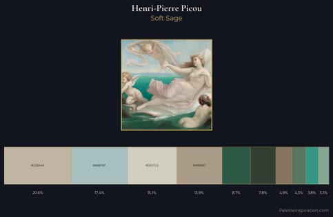
Henri-Pierre Picou Palette 1 - Soft Sage

Henri-Pierre Picou

34.5% Khaki · 17.3% Opal

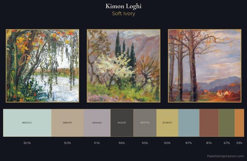
Kimon Loghi Palette 3 - Soft Ivory

Kimon Loghi

20.1% Khaki · 13.3% Opal

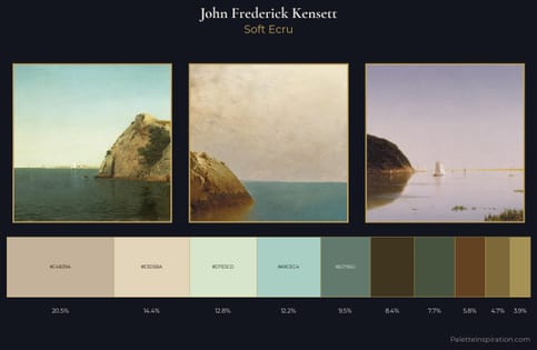
John Frederick Kensett Palette 2 - Soft Ecru

John Frederick Kensett

20.5% Khaki · 12.2% Opal

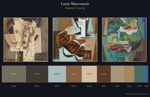
Louis Marcoussis Palette 6 - Veiled Tawny

Louis Marcoussis

12.2% Khaki · 19.4% Opal

Choose another color