Colors that go with

Khaki

#C3B091

Or pick a different color

Open on color wheel →

Khaki (#C3B091) is a mid-tone warm shade that appears across 19 master palettes in our corpus, most prominently in the work of Charles Rennie Mackintosh, Beatrix Potter, and Ludwig Knaus and the Arts and Crafts tradition. Master painters paired it most often with Raisin black (#242124), Bole (#79443B), and Silver sand (#BFC1C2). The combination forms a sun-bleached, daylight chord, built on closely related hues, pairs with restrained, near-neutral companions that let the source carry the chord, with a moderate step down in value that keeps the source forward.
Artworks Featuring This Color

Bather palette card
Bather
Herbert James Draper · 1896
STILL LIFE: APPLES IN A PORCEAIN DISH, A BLUE AND WHITE VASE, AND A SILVER SUGAR BOWL palette card
STILL LIFE: APPLES IN A PORCEAIN DISH, A BLUE AND WHITE VASE, AND A SILVER SUGAR BOWL
Joseph Bail
Riders on a Beach palette card
Riders on a Beach
J.M.W. Turner · 1835
The Cliffs of Dover palette card
The Cliffs of Dover
Theo van Rysselberghe · 1881
The Port of Sauzon palette card
The Port of Sauzon
Maxime Maufra · 1905
Martigues palette card
Martigues
Gustave Loiseau

Master palettes

Palettes Featuring Khaki

6 palettes where Khaki appears prominently — one per artist.

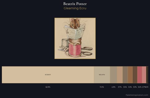
Beatrix Potter Palette 3 - Gleaming Ecru

Beatrix Potter

62.9% Khaki

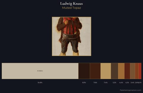
Ludwig Knaus Palette 7 - Muted Topaz

Ludwig Knaus

54.9% Khaki

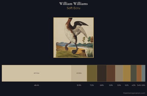
William Williams Palette 3 - Soft Ecru

William Williams

48.4% Khaki

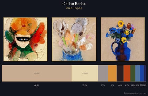
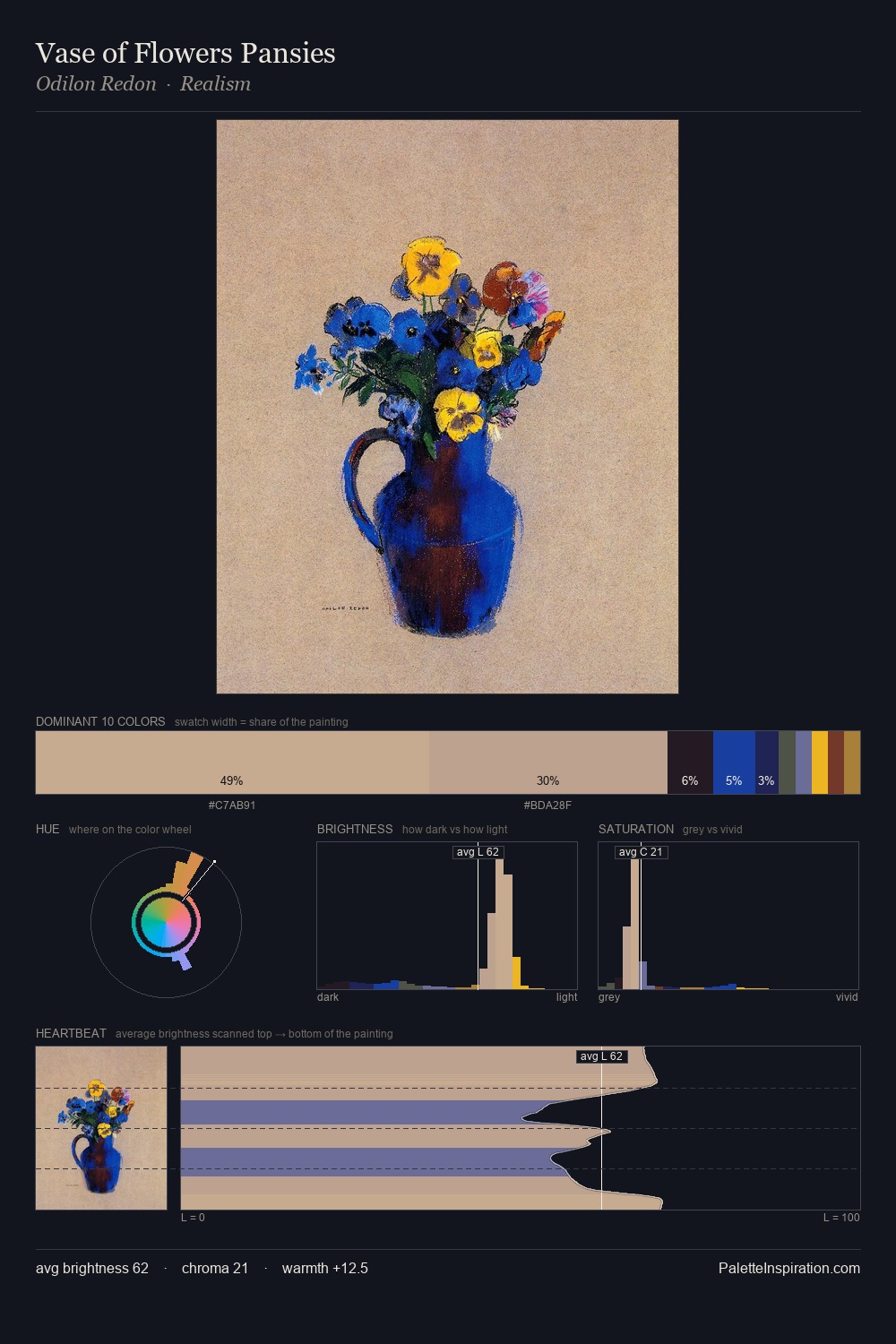
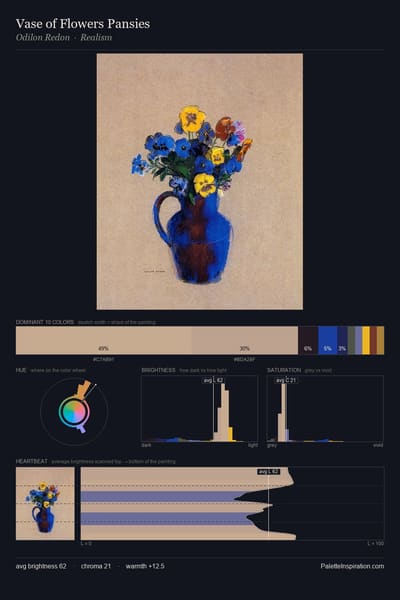
Odilon Redon Palette 11 - Pale Topaz

Odilon Redon

48.3% Khaki

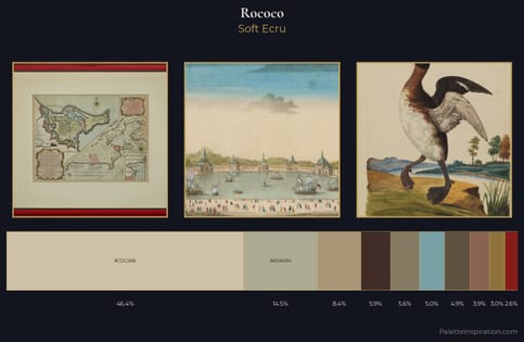
Rococo Palette 13 - Soft Ecru

Rococo

46.4% Khaki

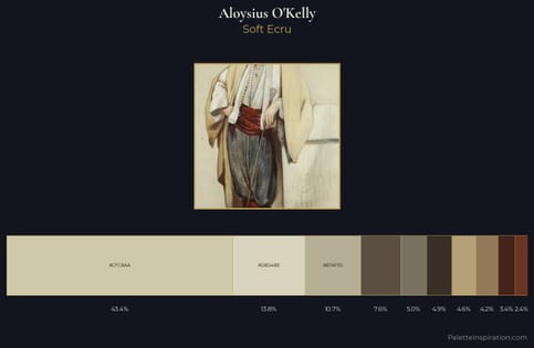
Aloysius O'Kelly Palette 1 - Soft Ecru

Aloysius O'Kelly

43.4% Khaki

Choose another color