Colors that go with

Deep chestnut

#B94E48

Or pick a different color

Open on color wheel →

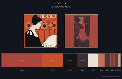
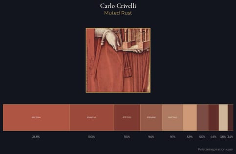
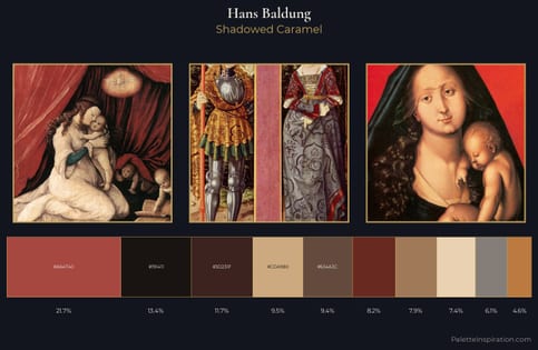
Deep chestnut (#B94E48) is a mid-tone warm shade that appears across 7 master palettes in our corpus, most prominently in the work of Carlo Crivelli, Ethel Reed, and Hans Baldung and the Early Renaissance tradition. Master painters paired it most often with Raisin black (#242124), Khaki (#C3B091), and Bone (#E3DAC9). The combination forms a sun-bleached, daylight chord, reads as a unified warm palette, with the pair colors held at a similar value to the source.
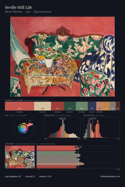
Artworks Featuring This Color

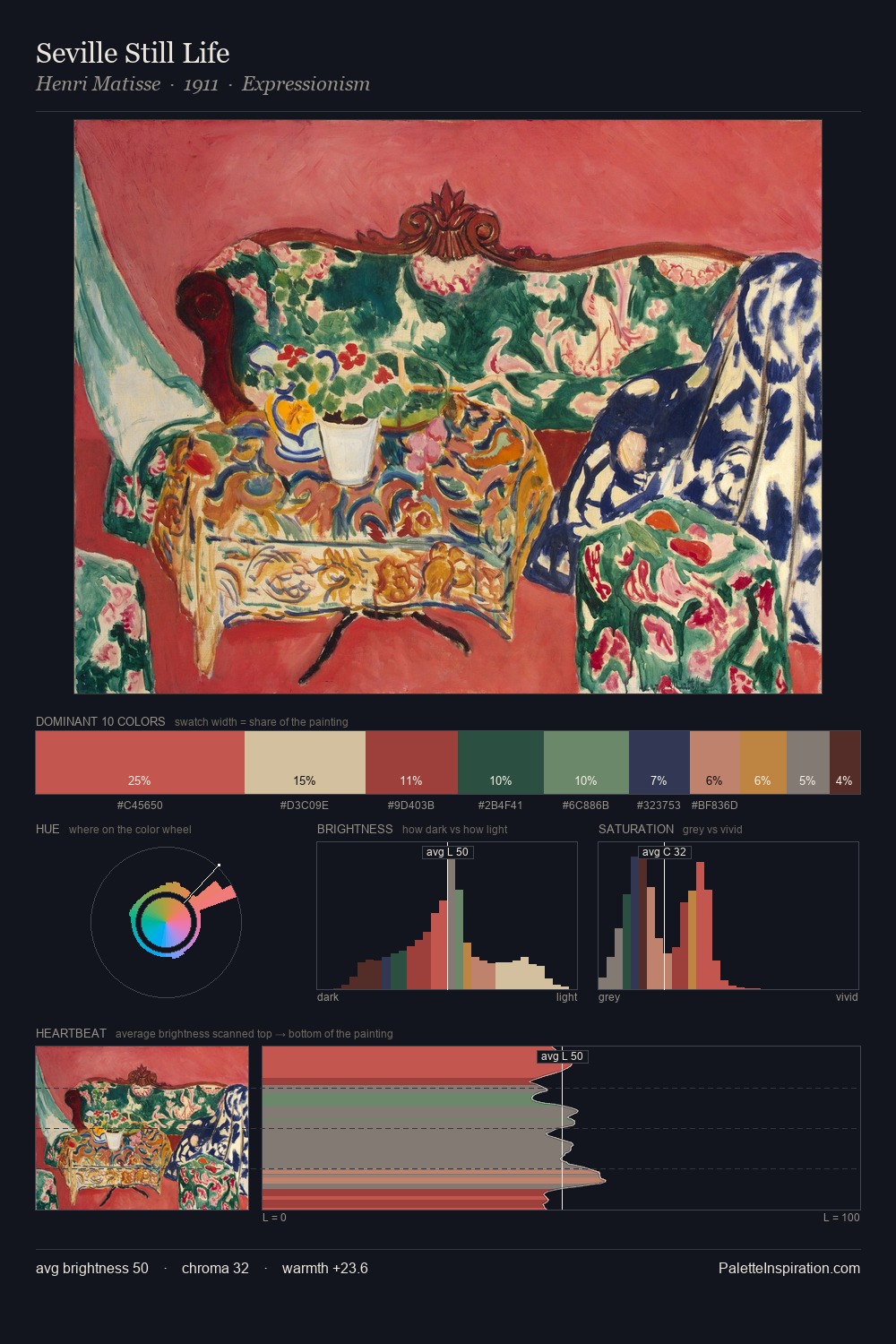
Yellow odalisque palette card
Yellow odalisque
Henri Matisse · 1926
Death on the Ridge Road palette card
Death on the Ridge Road
Grant Wood · 1935
Ashram palette card
Ashram
Nicholas Roerich · 1933
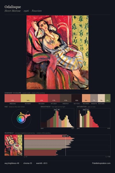
Odalisque palette card
Odalisque
Henri Matisse · 1926
Study for The Clearing palette card
Study for The Clearing
Henri-Edmond Cross · 1906
Interior with Indian Woman palette card
Interior with Indian Woman
Raoul Dufy · 1930

Master palettes

Palettes Featuring Deep chestnut

6 palettes where Deep chestnut appears prominently — one per artist.

Ethel Reed Palette 6 - Shadowed Rust

Ethel Reed

34.2% Deep chestnut

Carlo Crivelli Palette 10 - Muted Rust

Carlo Crivelli

28.8% Deep chestnut

Hans Baldung Palette 6 - Shadowed Caramel

Hans Baldung

21.7% Deep chestnut

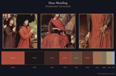
Hans Memling Palette 14 - Shadowed Terracotta

Hans Memling

20.3% Deep chestnut

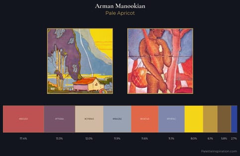
Arman Manookian Palette 2 - Pale Apricot

Arman Manookian

17.4% Deep chestnut

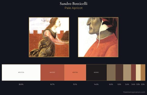
Sandro Botticelli Palette 6 - Pale Apricot

Sandro Botticelli

16.7% Deep chestnut

Choose another color