Colors that go with

Cultured Pearl

#F5F5F5

Or pick a different color

Open on color wheel →

Cultured Pearl (#F5F5F5) is a very pale neutral shade that appears across 19 master palettes in our corpus, most prominently in the work of Clarence Gagnon, Giotto, and Hans Holbein the Younger and the Impressionism tradition. Master painters paired it most often with Smoky black (#100C08), Khaki (#C3B091), and Persian blue (#1C39BB). The combination forms a chalk-and-linen chord, pulls a neutral anchor into a warm composition, with a sharp light/dark contrast that lets the darker companions read as depth.
Artworks Featuring This Color

Landscape palette card
Landscape
Ivan Shishkin · 1896
Variation: Field of Tulips palette card
Variation: Field of Tulips
Alexej von Jawlensky · 1916
Blond Nude with Orange, Blue Couch palette card
Blond Nude with Orange, Blue Couch
John French Sloan · 1925
The Pleasures of Peace: Dance (The Journey to the Islands) palette card
The Pleasures of Peace: Dance (The Journey to the Islands)
Raoul Dufy · 1910
Threshing Wheat in New Mexico palette card
Threshing Wheat in New Mexico
Thomas Moran
Portrait of an Infant palette card
Portrait of an Infant
Pierre-Auguste Renoir · 1881

Master palettes

Palettes Featuring Cultured Pearl

6 palettes where Cultured Pearl appears prominently — one per artist.

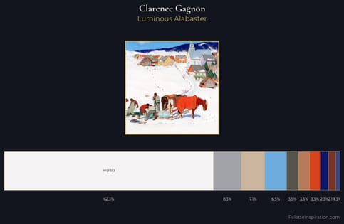
Clarence Gagnon Palette 10 - Luminous Alabaster

Clarence Gagnon

62.3% Cultured Pearl

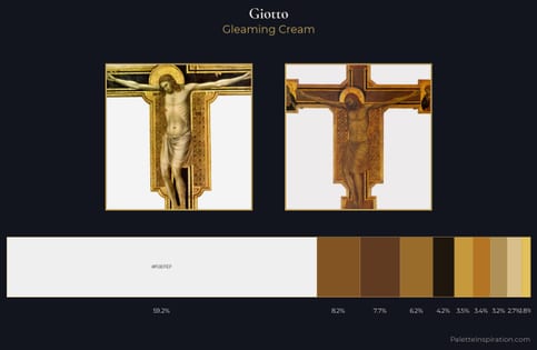
Giotto Palette 1 - Gleaming Cream

Giotto

59.2% Cultured Pearl

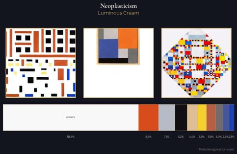
Neoplasticism Palette 7 - Luminous Cream

Neoplasticism

58.6% Cultured Pearl

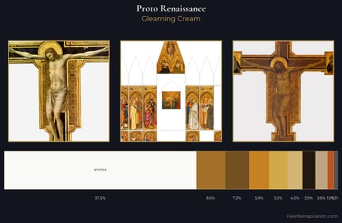
Proto Renaissance Palette 2 - Gleaming Cream

Proto Renaissance

57.5% Cultured Pearl

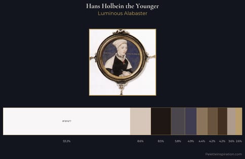
Hans Holbein the Younger Palette 4 - Luminous Alabaster

Hans Holbein the Younger

53.2% Cultured Pearl

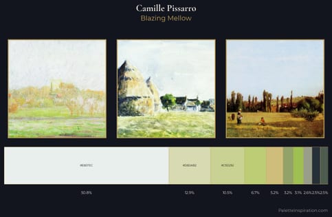
Camille Pissarro Palette 1 - Blazing Mellow

Camille Pissarro

50.8% Cultured Pearl

Choose another color