Colors that go with

Bistre

#3D2B1F

Or pick a different color

Open on color wheel →

Bistre (#3D2B1F) is a deep warm shade that appears across 20+ master palettes in our corpus, most prominently in the work of Willem de Poorter, Albert Herter, and Adam van Noort and the Baroque tradition. Master painters paired it most often with Eerie black (#1B1B1B), White (#FFFFFF), and Drab dark brown (#4A412A). The combination forms an earthy, lived-in chord, built on closely related hues, pairs with restrained, near-neutral companions that let the source carry the chord, with a moderate step up in value that keeps the source recessed.
Artworks Featuring This Color

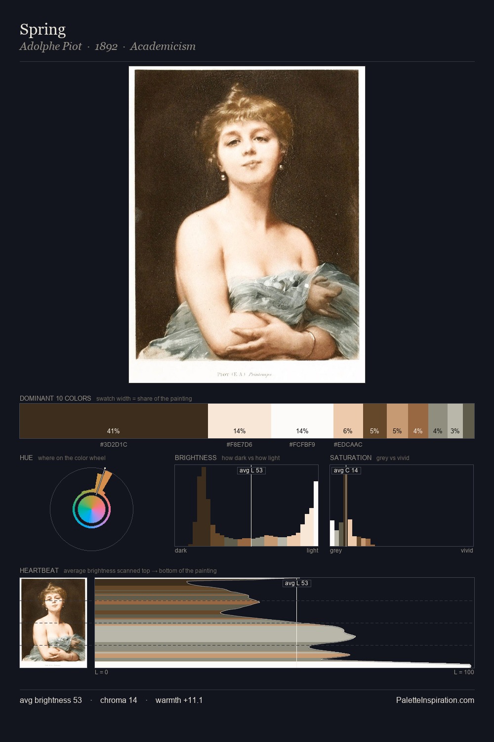
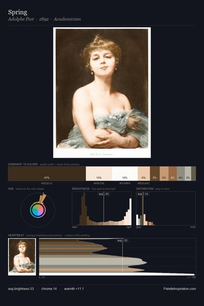
Spring palette card
Spring
Adolphe Piot · 1892
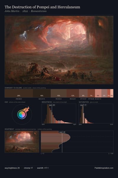
The Destruction of Pompei and Herculaneum palette card
The Destruction of Pompei and Herculaneum
John Martin · 1822
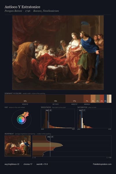
Antíoco Y Estratonice palette card
Antíoco Y Estratonice
Pompeo Batoni · 1746
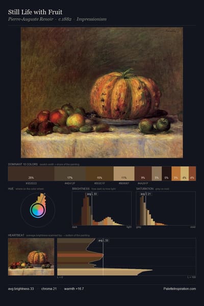
Still Life with Fruit palette card
Still Life with Fruit
Pierre-Auguste Renoir · 1882
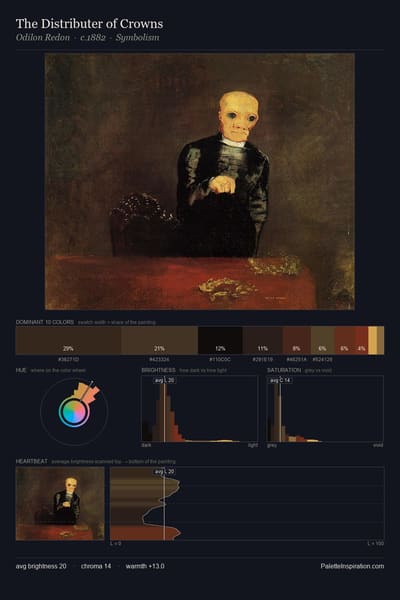
The Distributer of Crowns palette card
The Distributer of Crowns
Odilon Redon · 1882
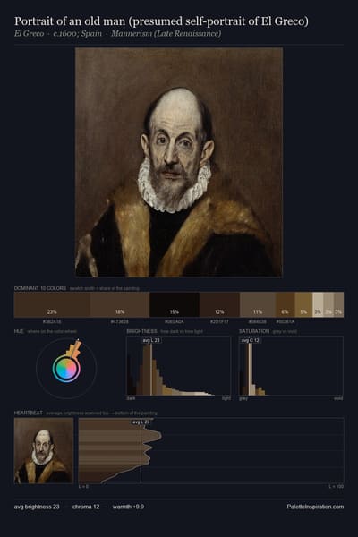
Portrait of an old man (presumed self-portrait of El Greco) palette card
Portrait of an old man (presumed self-portrait of El Greco)
El Greco · 1600

Master palettes

Palettes Featuring Bistre

6 palettes where Bistre appears prominently — one per artist.

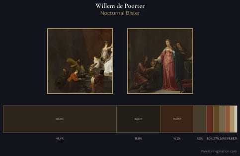
Willem de Poorter Palette 2 - Nocturnal Bister

Willem de Poorter

48.4% Bistre

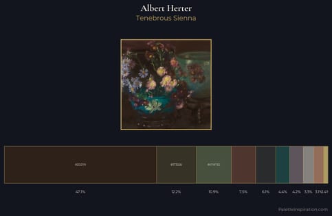
Albert Herter Palette 5 - Tenebrous Sienna

Albert Herter

47.1% Bistre

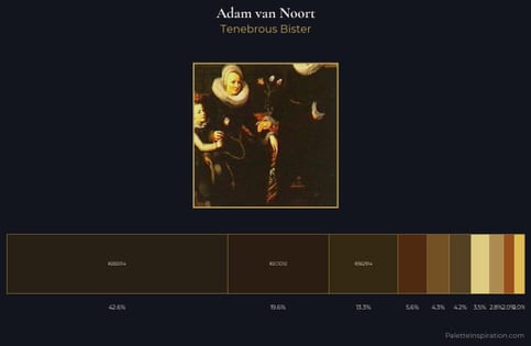
Adam van Noort Palette 3 - Tenebrous Bister

Adam van Noort

42.6% Bistre

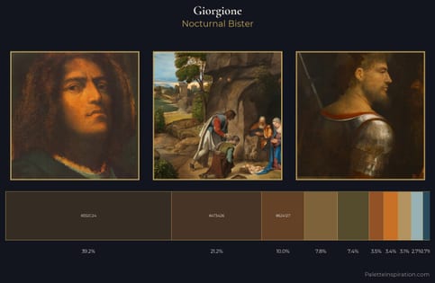
Giorgione Palette 7 - Nocturnal Bister

Giorgione

39.2% Bistre

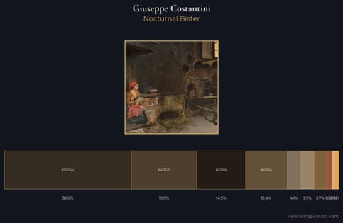
Giuseppe Costantini Palette 2 - Nocturnal Bister

Giuseppe Costantini

38.0% Bistre

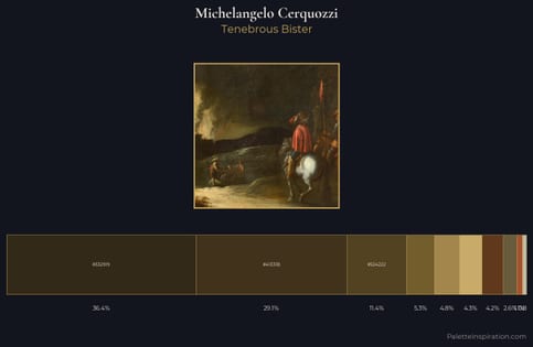
Michelangelo Cerquozzi Palette 3 - Tenebrous Bister

Michelangelo Cerquozzi

36.4% Bistre

Choose another color