Colors that go with

Beau blue

#BCD4E6

Or pick a different color

Open on color wheel →

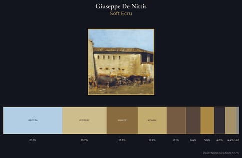
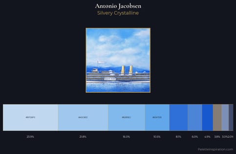
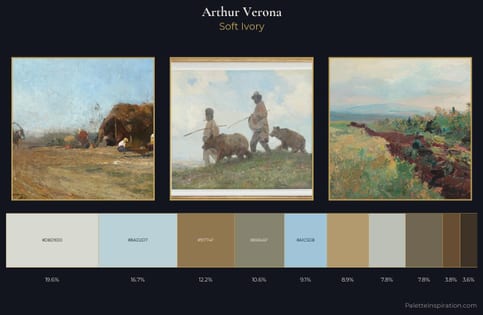
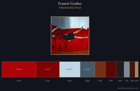
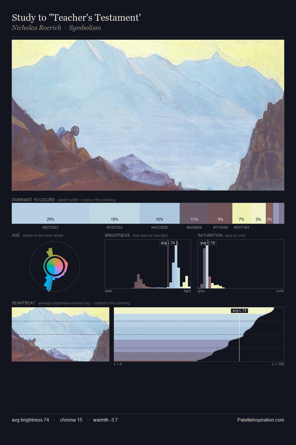
Beau blue (#BCD4E6) is a light cool shade that appears across 4 master palettes in our corpus, most prominently in the work of Giuseppe De Nittis, Antonio Jacobsen, and Arthur Verona and the Impressionism tradition. Master painters paired it most often with Khaki (#C3B091), Metallic Sunburst (#9C7C38), and Rojo Spanish red (#A91101). The combination forms an airy, hazy chord, built on a complementary hue split, leans on warm companions to lift a cool source color, with a moderate step down in value that keeps the source forward.
Artworks Featuring This Color

Against the Sky palette card
Against the Sky
Robert Lewis Reid · 1911
Daughter of viking palette card
Daughter of viking
Nicholas Roerich · 1918
Cultivation of the Vines palette card
Cultivation of the Vines
Henri Martin
Himalayas palette card
Himalayas
Nicholas Roerich · 1937
Water Lilies palette card
Water Lilies
Claude Monet · 1907
Panoramic Landscape palette card
Panoramic Landscape
Robert Julian Onderdonk

Master palettes

Palettes Featuring Beau blue

4 palettes where Beau blue appears prominently — one per artist.

Giuseppe De Nittis Palette 4 - Soft Ecru

Giuseppe De Nittis

25.1% Beau blue

Antonio Jacobsen Palette 6 - Silvery Crystalline

Antonio Jacobsen

23.9% Beau blue

Arthur Verona Palette 1 - Soft Ivory

Arthur Verona

16.7% Beau blue

Francis Gruber Palette 6 - Shadowed Rust

Francis Gruber

15.2% Beau blue

Choose another color