Cloisonnism Palette 3
Soft Vermillion
Soft Low-contrast, gentle chroma - mid-key values and low saturation, approachable and calm.
Vermillion Brilliant red-orange - the classic mercury sulfide pigment, vivid and warm.

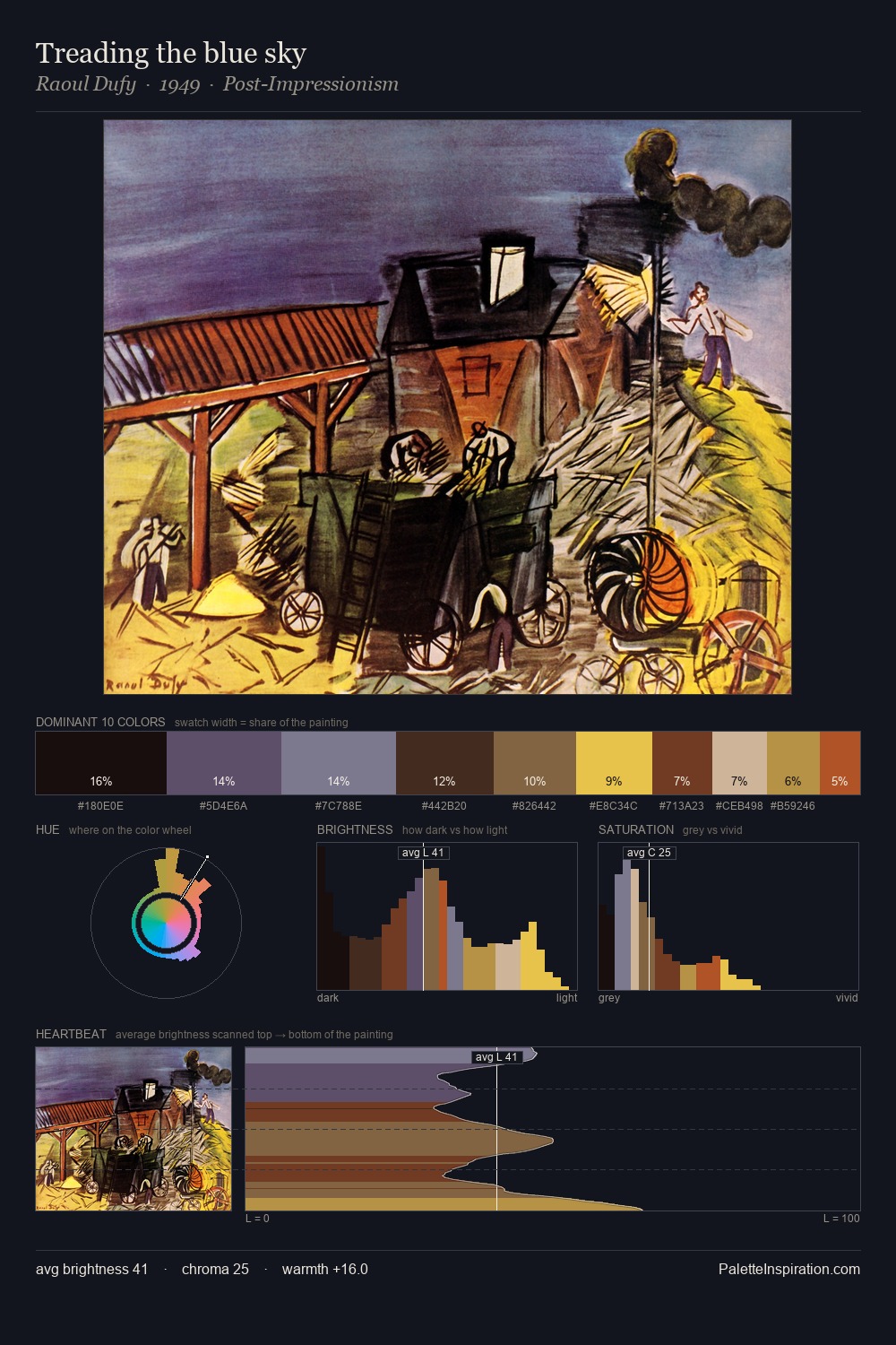
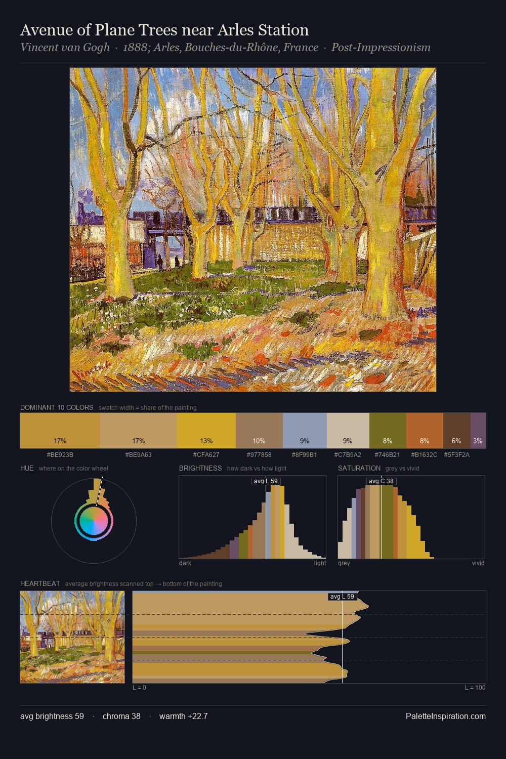
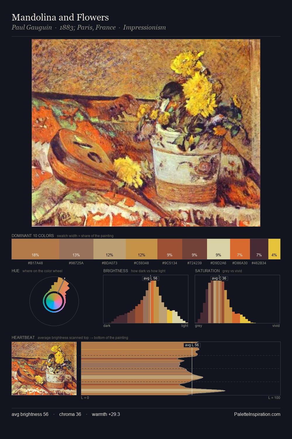
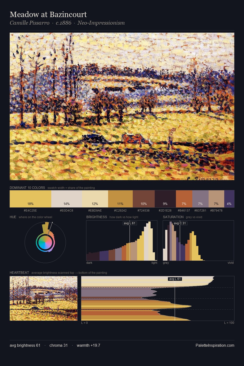
Palette Analysis
Values in Cloisonnism tilt decisively toward white, giving the palette its luminous character. The palette balances warm and cool with remarkable evenness, giving the composition its characteristic vibrancy. Mid-range chroma keeps the palette grounded - colourful but not strident. At 7.7%, #9A5424 carries the palette's sharpest chromatic charge: an accent that earns its place precisely because it is withheld. The value range of 54 units sits in the comfortable middle: enough depth, enough light, neither extreme. The combination of mid-to-high key, balanced temperature, and elevated chroma is characteristic of Impressionist observation: light broken into its component hues.
Example use cases
- publishing
- corporate identity
- consumer apps
- hospitality
- design agencies
I Love This!
Use This Palette
Copy, export, or download for your project
Copy, export, or download for your project
Copy:
Download:
Share: