Cloisonnism Palette 2
Soft Bloom
Soft Low-contrast, gentle chroma - mid-key values and low saturation, approachable and calm.
Bloom Soft pinkish blush - the delicate flush of petals or morning cloud.

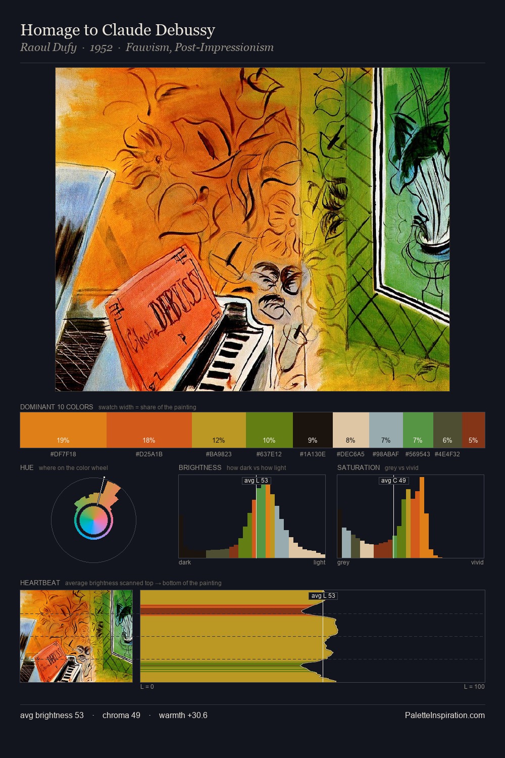
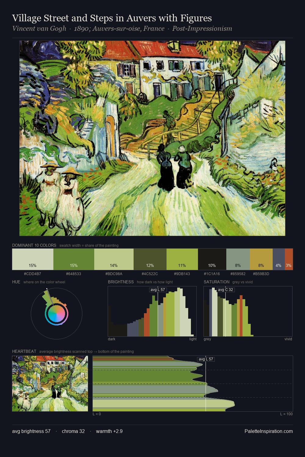
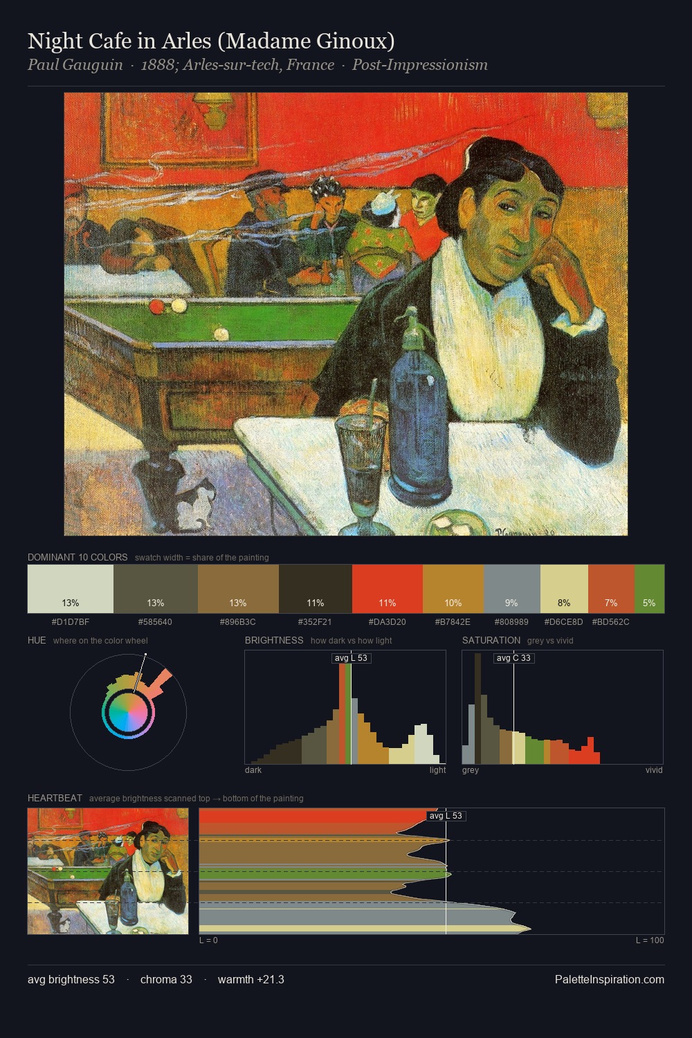
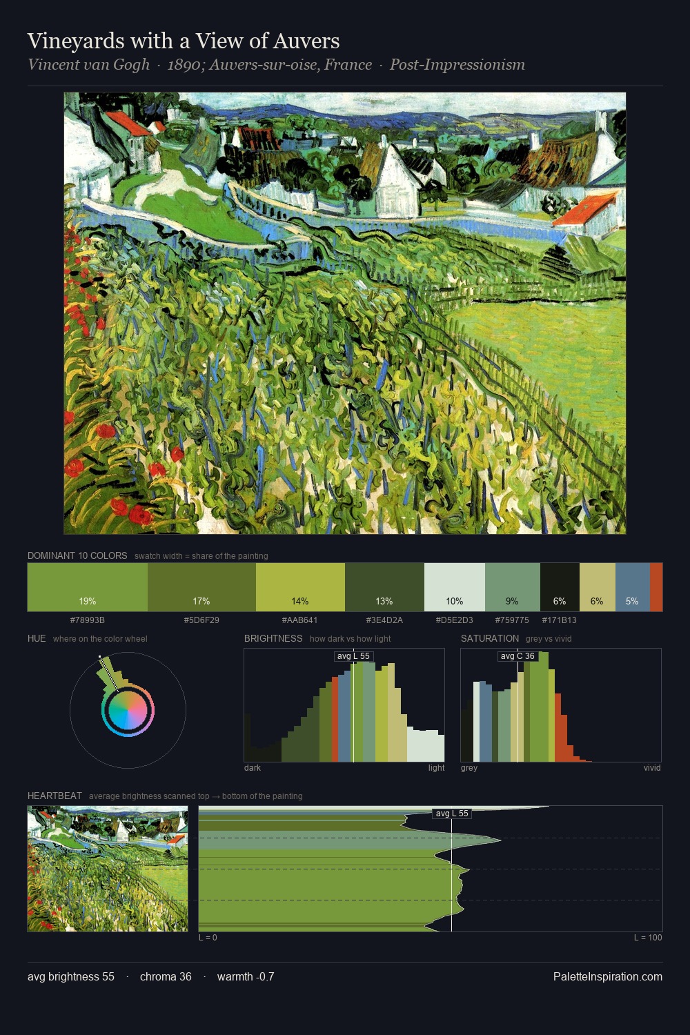
Palette Analysis
Cloisonnism is strongly light-biased - shadow is suggested rather than declared. Cool hues prevail: blues, greens, and greys anchor the palette's emotional temperature. A restrained, mid-chroma palette: every hue is present and legible, but nothing shouts. #E9E8DF at 30.4% of the palette: an overwhelming presence that pulls all other colours into its gravitational field. Rather than a studied accent, #D9C060 takes 3.5% - a bold allocation that saturates the composition's atmosphere. 71 units of value range underpin the palette's structural clarity: the eye always knows where light falls. High luminosity and cool temperature suggest the plein-air condition: unfiltered daylight and open sky.
Example use cases
- garden centers
- natural beauty
- park & rec design
- sustainable fashion
- sustainability
I Love This!
Use This Palette
Copy, export, or download for your project
Copy, export, or download for your project
Copy:
Download:
Share: